
List of concepts at the time of design a logo to make our brand work correctly and reach a greater number of users thanks to a more efficient communication, we must not forget that a corporate image must act in a way that represent what we are in such a way that I acted like the clothes we wear every day.
In this post We will see a practical case of a corporate image with the intention of mastering those basic knowledge necessary at the time of create a corporate imageIn this case, we will talk about this example image and the relationship of concepts behind it.
Before starting to design a corporate image we must be clear about what we are and what what do we want to communicate, This is where the first step to create our graphic image is found. After being clear about this is when we can start with the graphic part, Before this we will only work the theoretical part.
STEPS TO CREATE A CORPORATE IMAGE
Know your brand
The first thing we have to do is write down the characteristics of our brand and make us a whole series of questions That they help us to get to the essence of who we are: what does my brand do? What does it do? What are its goals? Where does my brand move?
Look for relationships and connections
The next thing we should do is look for relationships with concepts of all kinds that can help us identify our brand. This part is essential to get a efficient communication that works correctly: what is our brand like? Does it have any outstanding value? Can it be related to an existing brand? In this part we will look for that relationship that we will later develop in the graphic part, for example if our brand is dedicated to the ecological world we will look for relationships that they are inside that green world. In this part the use of images It helps a lot to establish a content relationship and work more effectively.
Un example it would be this:
Our company is green but with a touch of glamor. In this case we will seek a relationship with the green world but also with the world of luxury, translated graphically it could be as follows: green + gold colors. From a graphic point of view yes we relate this to images we would talk about leaves, diamonds, gold ... etc. It's about looking for those relationships.
Create an image and reference map
Search images that relate to your brand and create a visual map to better guide you in the development of your corporate image. The visual maps they always help us to work in an easier and more practical way because they help us to create those content connections.
Translate languages: from conceptual language to graphic language
Theoretical conceptual language can be translate to the plastic world, This is undoubtedly the final part of any design project, as it is essential that all our theoretical information collected so far see the light graphically. To do this what we have to do is look for similarities between theoretical information and the world of images, shapes and colors. For example, if our brand is dedicated to the world of sports, we should think of fine organic lines that evoke movement, strong colors that transmit energy ... etc. This part should always have many filters: For example, if our sports brand is luxury, we must be very careful when using saturated colors because it would be out of place.
CORPORATE IMAGE DOX: CASE STUDY
Now we are going to see a little the route of the development of corporate image DOX.
Dox is a channel of Youtube staff offering design and art content, its main action is to offer audiovisual material by way of training from the platform Youtube.
What should the Dox corporate image represent?
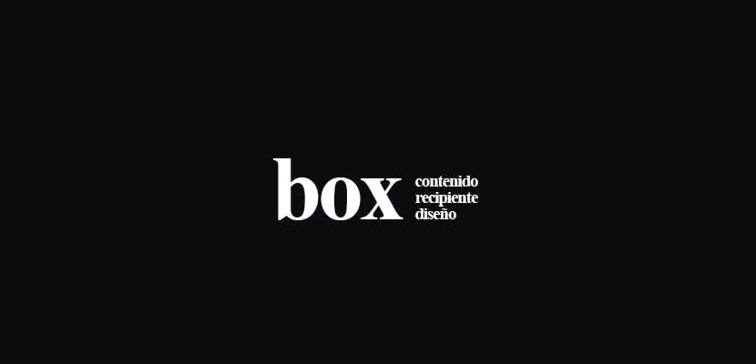
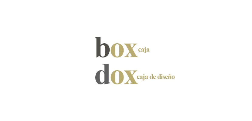
Is a place that contains a lot of content: in this case we focus on the idea of box or container that stores something. After this, a relationship with the brand's own name was sought, the idea of box (box) to the idea of dox (design box) by changing one of the letters it is possible to reflect that conceptual feature.
With this simple change in the original word you arrive at a good result with background and conceptual support.
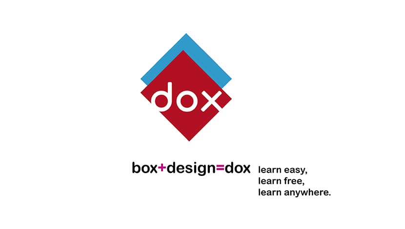
The next thing that was done was to create the visual graphic part of the brand, for this we sought to represent the idea of the box in a fairly abstract way in order to show that concept in a subtle way.
Whenever we work on a corporate image we must be clear about the relationship of concepts for more effective communication, look for a justification For everything we do, in design, nothing should be left to chance. The use of shapes, colors, fonts must be based on a series of needs that we have previously detected, if the previous work is well done we already have half of the work done.