
El Responsive design is vital today due to the different formats which a user faces from his tablet, mobile and even computer. This responsive design in email marketing and landing pages is more than important for omnichannel communication with our clients.
So you have to take it seriously to take different templates with different widths to arrive with the best design possible those newsletters or that landing page where future clients that we want them to convert from our ads on Google or Facebook will land.
Responsive design in email marketing
Email marketing is one of the ways to announce product offers or those new posts created on our blog to thus narrow in a deeper way with all our followers.
That these newsletters are responsive means that they can be seen perfectly from a mobile, a tablet or a computer. So we have to try to have the necessary tools so that all the visual elements are harmonious enough for an easy reading of the newsletter.
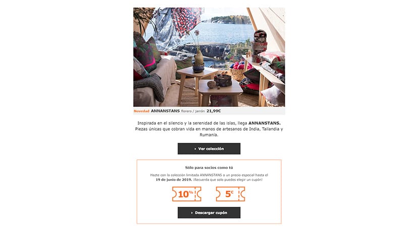
IKEA Newsletter
Responsive means that the display of a page on different devices is always correct. For this we have tools of email marketing that help us to test the newsletter created in different formats and thus modify values such as padding or margin so that they are perfectly repositioned as we reduce the width of our browser.
At web design with CSS "Media Queries" are used to design a website according to the format. Up to 360px would be for a mobile phone, and from 360px to 650px we could make modifications for all those users who view our website from a tablet.
Some of the principles for our email marketing newsletters are:
- A clean visual hierarchy: a title in H2 to leave the text in paragraph format.
- Two different sources: one for the title and one for the text makes our newsletter better readable.
- El use of color to differentiate title, text and other elements: we can gradually go from a dark gray to a lighter one.
- Un CTA (Call to action) clear and distinguishable: if the logo of our company is in red, the CTA could in this color while the rest in a complementary color.
We give you a clear example of a great responsive design in a newsletter carried out by Filmin and that you can see in the image provided. Clear typography in white, and the text in a very light gray but that allows us to quickly visualize the different spaces in which we are invited to read if we want to. The CTA is not that it is from another world, but it helps with that play icon and that makes us see what awaits us.
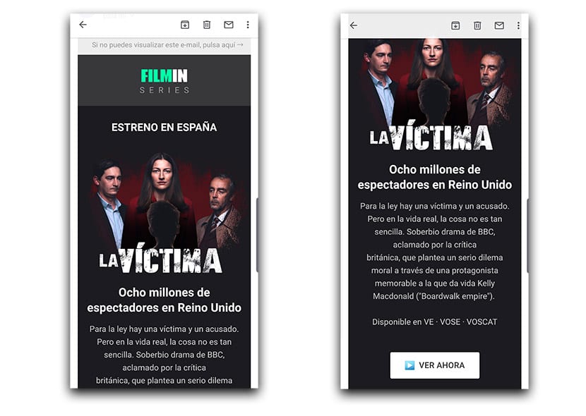
Sufficient spaces in the margins, white as the main color for text and that fits perfectly with the logo Of the brand; surrounded by that gray that makes it stand out. An eye-catching image that sets the stage for a newsletter that hooks you from the start. Spaces are also left on the sides so that the entire width of the screen is not "eaten".
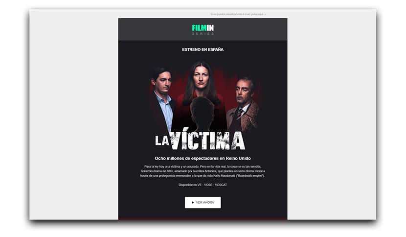
In the desktop version maintains those principles, even leaving more space in the texts and leaving a large margin on each side:
Responsive design on a landing page
The same principles can be used in responsive design of a landing page. It is extremely important to take all the time in the world to properly choose the template and follow some rules in the design:
- Visual simplicity: We are talking about keeping blank spaces to put the focus on CTAs.
- Beautiful and engaging images to the reader, without forgetting the resolution and that they look perfect.
- The importance of color and that we emphasize again.
We have to work on the responsive design of a landing page for a mobile, tablet and desktop. Take the time needed to try again and again as each change It is seen in those three formats, since we can trust ourselves and forget that those changes made in CSS will look horrible on mobile.
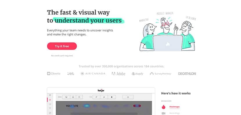
Hotjar Landing Page
It is work that can be tedious, but it is vital that we take the time to test each change. The use of side margins and try, as far as possible, not to miss the rules in the CTAs or action buttons:
- The fact that the distance in relation to the text and the button margin is progressive in all three formats. Neither it is small nor large and that it is at the same height.
- La ratio in CTA button size with the rest of the elements where it is located has to be provided.
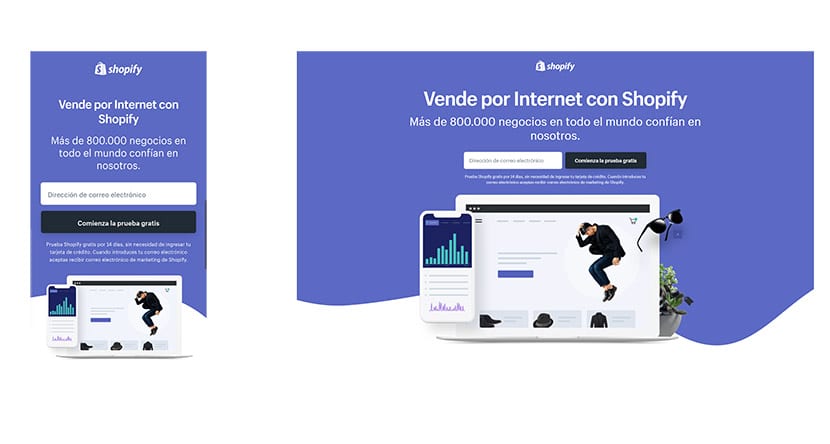
A clear example of this is the work done by Shopify on your landing page on desktop and in which you can see in the mobile version. Attention to the use of colors, white spaces and those texts with their appropriate sizes and typography:
A series of tips to have a better landing page for your business or online store and those newsletters so important to get the updates and those promos to your users.