
If you are a lover of both typography design and knowing the history and evolution behind each one of them, this publication is for you. Today we are going to talk about the famous Museo Sans typography, we will know the story behind its design, its creator and we will give you both combinations of this typeface and alternatives, to inspire you in your future designs.
Thanks to the designer Jos Buivenga, we can talk about the Museo font family. An excellent typography with a very careful design and that with its creation, took a great leap in the world of design. A typography, which in a very short time has been able to adapt to current design needs. The Museo family was considered by MyFonts.com as one of the main typefaces of the year 2008.
this typeface, has been used and continues to be in a multitude of different web or printed media. In many brand identity designs, it can also be found. Museo Sans, is a typeface with a lot of personality. This type of letter has become a font that brings together design, influence and vision of the future.
Who created the Museo typeface?

As we mentioned at the beginning of this publication, the designer who created the Museo family is Jos Buivenga. He was born in the Netherlands in 1965, more specifically in Arnhem, where he works four days a week in an advertising agency as an art director.
His relationship with graphic design goes back many years, when messing around with an old mac thinking what would happen if he added his own font to the computer. With this idea in his mind, his first typeface family called Delicious appeared.
For José Buivenga, you have to dedicate time to typography design and, be willing to immerse yourself in a new world within the creative process to achieve what one is dreaming of.
The designer himself is the one who says that the design of the Museo family came through a dream. In that dream, visualized the letter U with a unique style, some bent endings. So, for him, the design process of this family began with a letter.
Between each of its characters, both individually and in a composition, two characteristic features of this typeface can be observed. One of them the little contrast in the layout and the simplicity of the shapes of each of the letters.
Museo, having a fairly heavy weight, due to the layout, is a font only intended for the use of capital letters, since the design of a lowercase with this weight was a quite complicated process according to its creator. But this did not stop him and he came to propose making changes to the layout.
Another characteristic aspect of this fountain is that your ascending characters are aligned with the height of the caps. This is also the case with diacritics and caps. This balance, what causes is that a harmony is created when these signs are used.
Sans Museum; history and characteristics
https://www.fontspring.com/
We already know that the Museo family was carried out by Jos Buivenga, in which different styles are included as they are apart from the original; Slab Museum, Sans Museum and Sans Rounded Museum.
Museo Sans, is one of the styles that shares some of the main aspects of the original typography. One of them is the low contrast that occurs in the layout, this leads to the personality of the Museo Sans being more marked towards a more geometric style.
It is a typography combines adaptability, solidity and above all a high readability. These three fundamental pillars make it fit perfectly with the Museo typeface. These combinations of both fonts in the same composition are usually used for continuous texts and presentations.
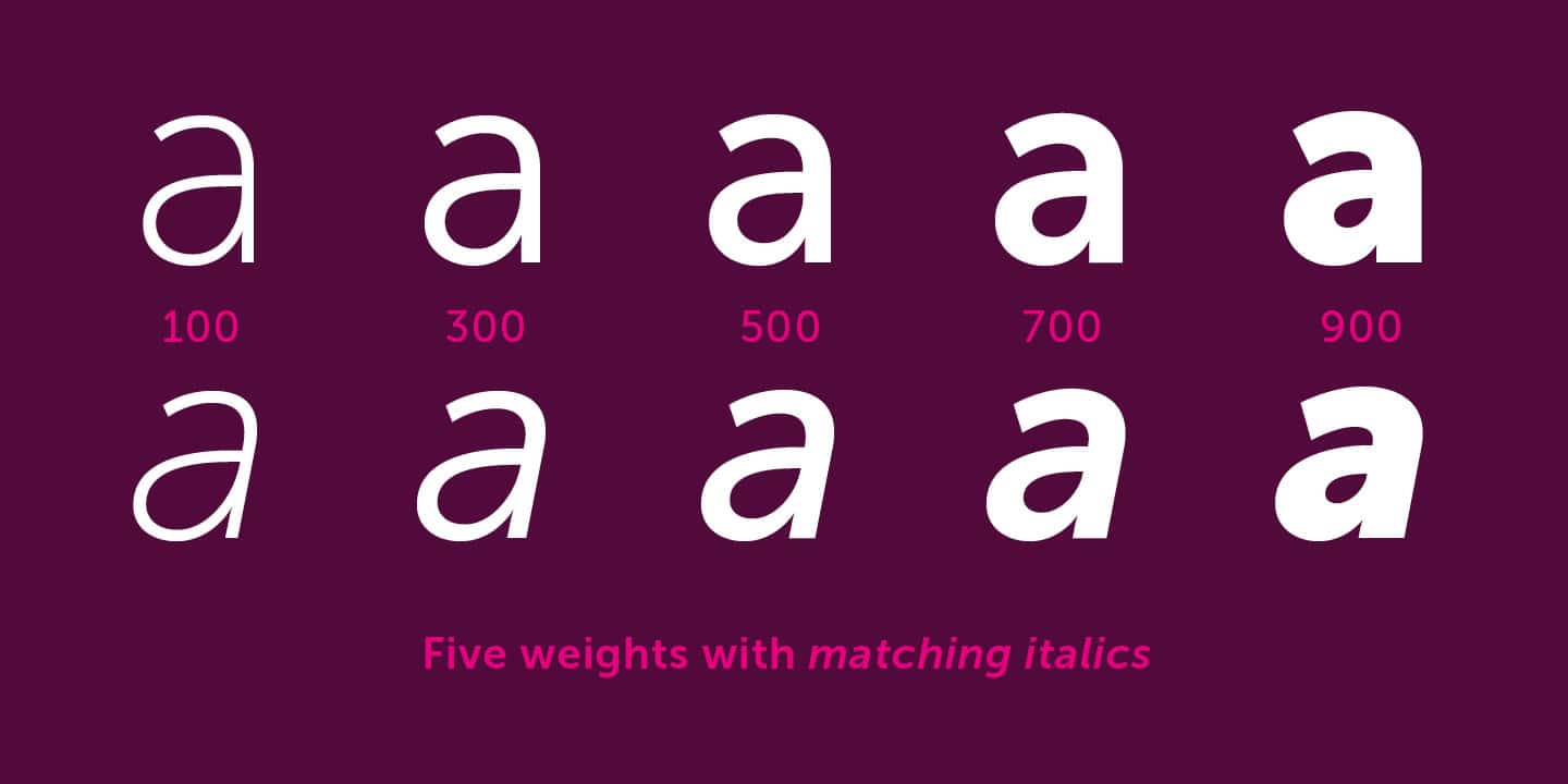
Like the original, Museo Sans has different line thicknesses, it also has matching italics. In total you can find five pesos with which to work.
As we have mentioned, we also find Museo Sans Rounded, which originates from the forms of the Museo Sans typeface. One of the aspects that differentiates one from the other is that in the Rounded version the closings of the characters are rounded as its name indicates.
In this case, Museo Sans Rounded, has a total of six pesos of different layouts to create unique compositions.
Combinations with Museo Sans that you should know
We have seen that Museo Sans is the sans serif version of the Museo typeface. At first glance, they may seem like the same typeface to many, but each of them has unique features between its letters. Next. we are going to give you some examples of font combinations using Museo Sans so you can use it in projects that require a typography of this style.
Museum Sans and Stardos Stencil
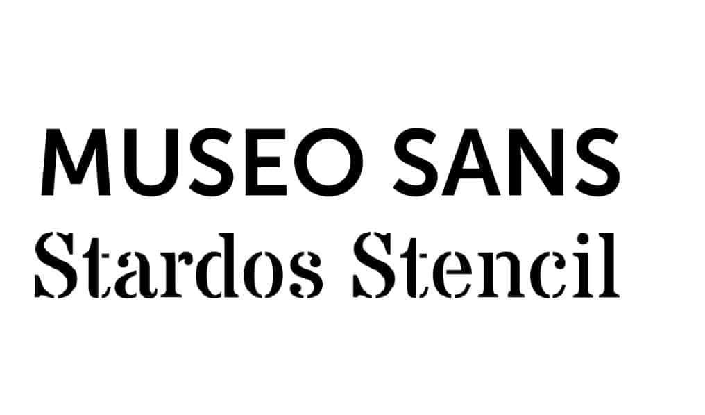
Combination that brings together a sans serif typeface with high legibility both in large and small sizes, such as the Museo Sans, with a military style typeface such as the Stardos Stencil. It is always a winning combination to combine a sans-serif typeface with a serif typeface.
Sans Museum and Museum
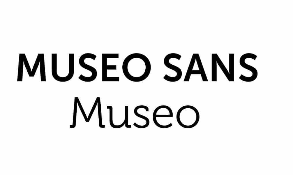
As we mentioned in the previous section, the combination of these two fonts is a safe bet. A piece of advice that we give you, if you work with a typography family that has among its fonts one with serif and another without it, combine them without hesitation.
Sans and Lusitana Museum
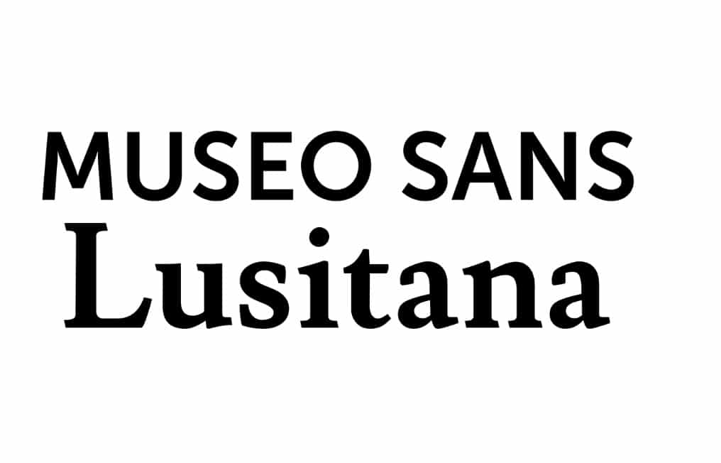
The union of these two typefaces, will add warmth and readability to any design you make. If you work with them to create a brand, be sure that it will be welcoming and realistic thanks to this combination.
Alternatives to Sans Museum
The Museo Sans fountain has some alternatives that you will be able to find in this selection that we have made. In many cases, you will realize that many of them are similar to the original, but in others not so much but even so they are much more similar than you think.
Raleway
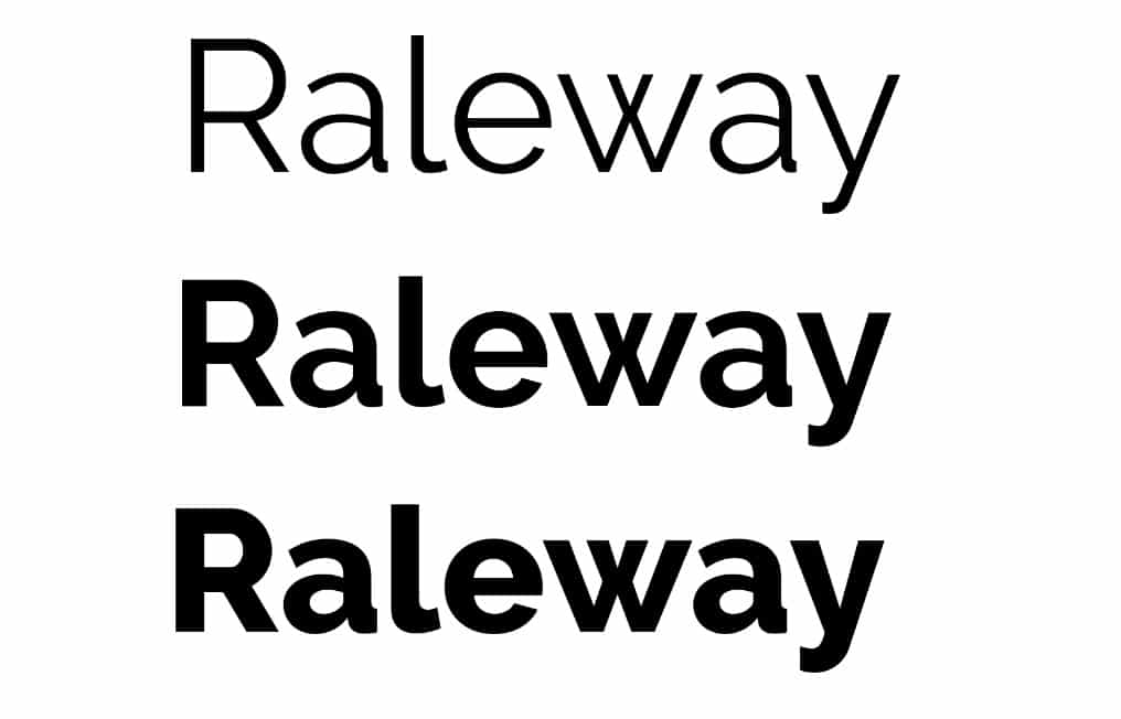
Typography that you can find in Google Font and that is very similar to the typography that we are talking about in this publication. Some of the most notable differences between them are found in the design of the letters J and I, for example.
pluto sans
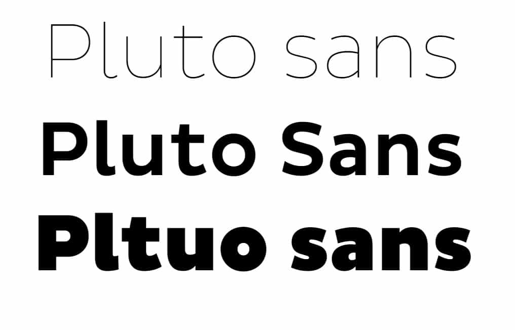
Another alternative to Museo Sans, which you can use without any problem. The The difference between them is that one is heavier than the other. and the design of some of its characters.
Muli
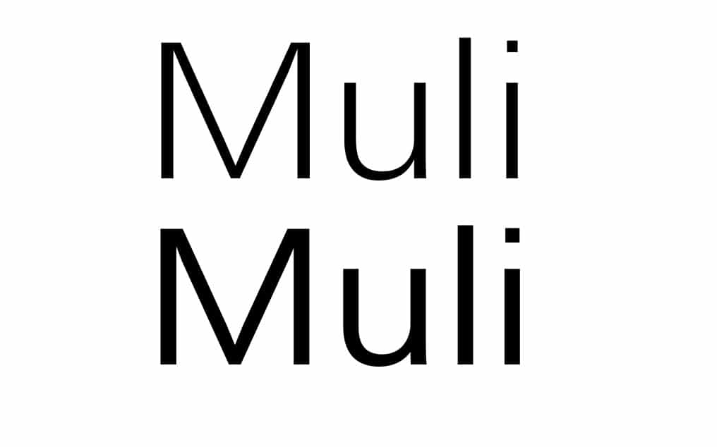
Regarding the design, of the previous alternatives, this it may be the least similar in appearance to Museo Sans, but it turns out to be a correct alternative to it for any design.
As you have seen, the Museo typeface and its different styles are very versatile and this means that its use in different applications is infinite. Don't hesitate to add style, elegance and modernity to your designs with the use of these typographic fonts.