
As a good designer, one of the resources that you should have with a high number is that of fonts, because you never know what type of client or font you are going to need. Among them you will have romantic, old letters, some types of terrifying letters (ideal for Carnival posters, Halloween...).
In the latter is where we are going to stop to give you some resources that, perhaps, you did not know and may be interesting for your work. Want a few terrifying fonts? Well, take a look at the ones we have compiled for you.
scary fonts
Terrifying letters are characterized by being a font that makes us imagine a situation of fear or pure terror. To do this, the typography can be elongated, dripping, and even turning each letter into a classic character from horror movies or literature.
There are actually many of these fonts, from free to paid. For this reason, we have dived a bit between the pages to find some that we consider may come in handy. Do we see them?
exorcist
Who does not remember the famous movie The Exorcist? Well, this font with terrifying letters is based on it to create an alphabet with punctuation marks, ideal for posters or titles that are not too long because it is in capital letters.
You find it here.
Pumpkin Brush
This one is a bit more fun, but based on pumpkins. Actually the term looks like it was done with a brush and you have three versions: normal, italic and speed (with a more horizontal slant and elongated strokes).
It catches our eye for posters because it looks like you just painted it. In fact, if it could be mixed with a few drops of paint, it would be almost indistinguishable from the real thing.
You have it here.
Wild wood
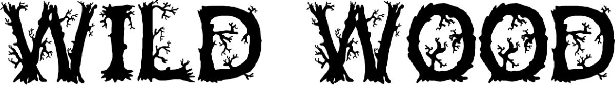
We liked this one because if you look at the typography, each of the letters looks more like branches or trees from which dark branches come out (no leaves, just the “skeletons”).
Thus, it can simulate that it is a dead forest and it will undoubtedly attract a lot of attention.
You find it here.
buffed
The first impression that this terrifying typeface has caused us is that of a vampire sensation. And it is that by lengthening the strokes of the letters it seems that way. In addition, it has both uppercase and lowercase letters.
The downloads here.
Face your fears
In this case the letter seems somewhat blurred, as if they had wanted to erase it or it had been rubbed. And that's why it's one of the terrifying fonts to keep in mind.
Of course, you have to use it for a few words since, if you abuse it, the text will be more difficult to read.
You have it here.
october crow

This font has made us think of elongated nails, the kind that leave a very characteristic mark when they mark you. So it can be ideal for a monster Halloween.
Mind you, it only has uppercase letters and numbers, but no lowercase or other punctuation characters.
You have it here.
spider font
Who says spiders aren't scary? Tell one to panic. So this type of letter, which allows us to have very well defined letters, are "adorned" with spiders and cobwebs that those who hate them will not like very much.
The downloads here.
shlop
Another of the letters without lowercase or punctuation marks. Of course, the letters will seem either freshly painted or that they are melting as time goes by. Or that they are made with blood; actually we can venture to say many things.
The downloads here.
another danger
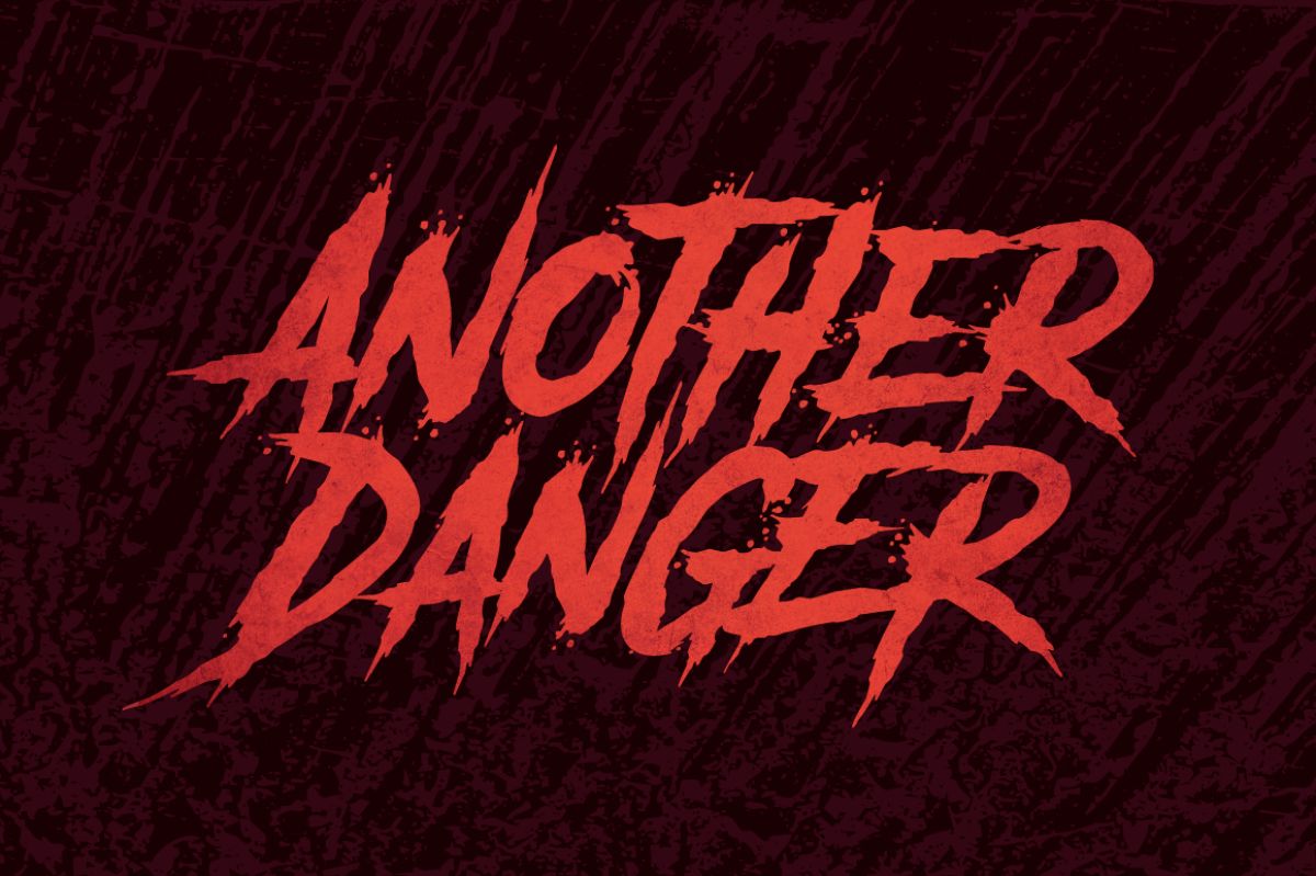
It is one of the best, which also reminds you of many of the ones you have seen in series or movies. Between the stains, the scratches and some scratches that look like the letters, you can combine it perfectly with the colors of terror.
The downloads here.
CF Halloween
We have loved this type of letter because it mixes the drops with characteristic elements of terror, spiders and of course the characteristic skull (which will be the letter o).
You can find it here.
Skulls
How about one with skulls and skulls? Well, in this one you find in all the letters a skull accompanying them. So be careful not to abuse this font because it can get heavy.
You find it here.
Horror Joys
This terrifying typeface draws attention to the blood that you can put around the words. It simulates being handmade and is written in a certain way that causes terror when you see it.
It is not convenient to use it in very long words because it is difficult to read.
You have it here.
Ghoul
Ghoul reminds us of ghosts. But to the good ghosts for those thick letters (on one side more than the other).
You can use it for both titles and subtitles and since it is very readable you will not have a problem putting it on for long words.
You find it here.
Macabre Tango
Another one of skeletons that we liked because, at first glance, you may not realize it, but if you look a little closer you will see that each letter is made up of one or two skeletons, which makes it very original.
The downloads here
american horror story
If you know the series, surely the characteristic font sounds familiar to you. Well, you know that you can use it for your designs.
You have it here.
cute monster
How about a typeface that is not too scary, and suitable for children? Well this is one of them. It is a children's typeface but with a horror theme, or at least that is what the letters will try, to scare you. Just a little.
You have it here.
Tips for using scary fonts
If you want these types of letters to really scare you, it is important that you take into account several important aspects such as:
- Don't use too many fonts. One of the mistakes when making a brochure, poster, or any project related to horror is to use several fonts to make it more “scary”. But the truth is that if you use more than two different fonts, you will be overloading the design and dispersing the attention of the users. So try not to mix too much.
- Less is more. And in this case even more so. Here you must prioritize fear with colors and images, while what the font should do is emphasize the message.
- Bet on colors. Orange, white and black; these are the characteristics for a terrifying night. And of course, they must be in your project. If you combine them you will even get a very good result.
Can you recommend us some more scary fonts?