
Inclusive design is an important issue and the selection of an accessible font for your website it is essential for every brand, not just public entities and charities.
So in what way could you know what kinds of letters are really accessible What if it means a compromise in relation to design?
These are some recommendations that you should follow:
- Avoid falling into the trap of choose a design that looks childish, because it is not necessary.
Although it may seem obvious, however, this is one of the most normal mistakes that tend to be committed. Personality is as important as design, so you should look for a font that fits perfectly with design and be practical.
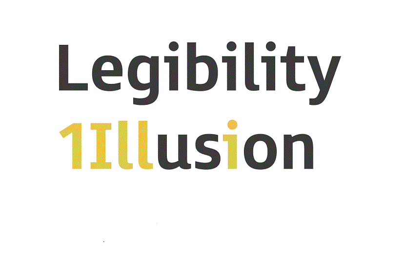
- It is essential that you avoid choose styles in which there is ambiguity between some of the characters; The ones that you should take into account mainly are the capital letter "B" and the "8"; the number “1” and the letter “I” in capital letters; the number "1" and the letter "l" in lowercase.
Selecting a typeface that has 2 lowercase "a" letters will help you eliminate confusion that may exist with the letter "o".
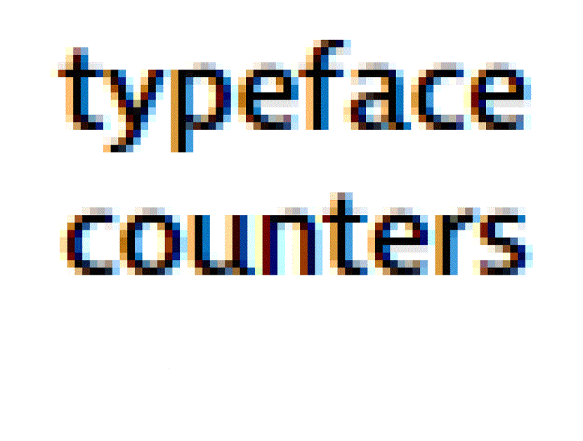
- If you find yourself using some small texts of 16pt or higher, such as making headings or subtitles, we recommend opting for a without serif that has large open counters, as it is considered to be the most suitable.
- Search some type of letter that has a great heightas it is essential for webfont selection. Descenders and Extended Ascenders will help you make the letter shapes are much clearer.
- Look for some open terminals and counters, because these they will help you with the clarity of the letter, since if they are very closed they begin to fill in much smaller sizes.
- The numbers have to be different, specifically when it comes to the “0” of the capital letter “O”. In the case of "6" and "9", it is necessary that they also have open terminals.
- There is a excellent ratio of x height to stroke width. To achieve optimum legibility, it is necessary that the width of the line be 17 or 20% of the height.
- The tail of the uppercase letter “Q” visibly sticking out of the letter's circle helps improve readability.
- El space between each letter has to be balanced and rhythmic, since in this way you can easily recognize which characters it is.
- Try testing the font on top of a dark colored background, as this way you can see what it looks like. Practically in these cases the spacing tends to look much tighter than it is, making the shapes that the letters have look like they glow, which has the consequence that the source looks more recharged than it really is.
An accessible and well-designed typeface it has to be elegant and have personality, however, at the same time must have readability at its core, to attract a greater number of customers.