
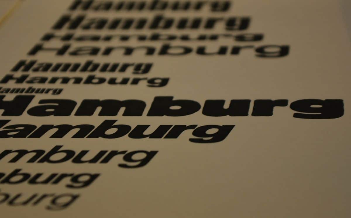
As you know, and if we haven't already told you, there are different fonts, and depending on the project you have in hand, some are better than others. Many times the first big decision you have to make is between two, Serif vs Sans serif. But what is a serif typeface? And a sans serif font?
If you have doubts and do not know what the similarities and differences between them are, or which one is better for each project, we will tell you about it below. Take note!
What are serif letters

Serif letters, or serif typography, is a type of font in which the lines join the letters but, at the same time, have an ornament-like finish, always at the ends of those lines, to give it a little more of elegance. This does not mean that they are difficult to read, on the contrary, they are very easy because that small detail is minimal and, in addition, it serves to visually enrich the text without harming its reading.
Examples of serif typefaces could be Georgia, Garamond, or the one commonly used in Word, Times New Roman.
When the serif font is used, the aim is to give a perhaps authoritarian professional image, both of the text written with it and of the person who uses it. In fact, this typeface is usually similar to the one offered by typewriters and, although you may think it is old-fashioned, the truth is that it is still used, and a lot.
The experts make it clear that this font is much more legible when it has to be placed on small scales because the letters are better distinguished and the reading will flow much better. In addition, for scientific, historical, institutional issues, etc. may be the best choice.
What is the typography Sans Serif
Despite everything we've said about serif typefaces, sans-serifs aren't a bad choice. It is also very good.
Its name is related to the previous one, not only because it has it in its nomenclature, but also because it really mentions the detail that characterizes the serifs, that ornament at the end of the lines. But, the word sans, which comes from French and means "without", already makes it clear to us that they are sans serif, in other words, without embellishment.
In case it has not been clear to you, sans serif letters are those that omit the final decoration and are based more on a functionality of writing the letters without anything else that can make them elegant. The maximum objective is that they can be read and little else.
It is a modern typeface that simulates handwriting. But after going through “editing” since this typeface offers the natural form of the letter, but nothing more. It is as if a person had written it.
For experts, the sans serif is a happy, safe, but neutral typeface, because it does not want to represent anything else, simply to facilitate reading.
However, when the texts are very large, it can be difficult to read since the strokes tend to join together and make it more difficult to visualize the letters correctly. This does not mean that they do not respond well to low size, quite the opposite; but they are always recommended in not too short texts.
Similarities between Serif vs Sans serif

Now, although we can say (and you will see them below) that both fonts are very different, the truth is that they also have points in common that should be known.
Among them:
- They can both be the same letter. In fact, they differ in adornment, but if we remove the serif, this will be a perfect sans serif.
- Both are for large and small sizes. And for upper and lower case. Taking into account that we have better screens, they can be used interchangeably, both in large and short texts.
- They can be read perfectly. Before it was thought that the sans serif was more complicated to read (because the letter shrinks more) but now this is not so difficult because the screens have improved. Now, on a "physical" level, there may be some difference.
Serif vs Sans serif: The big differences
With the similarities said, how about we look at the differences between Serif vs Sans serif? These are what we see:
Formality versus informality
If you have read all of the above, you will have noticed that we have said that the serif typeface is considered a formal, professional and serious typeface. On the other hand, sans serif letters are more modern and are usually said to be informal.
But beware, because this also comes from the old. Since serifs are older letters, they are said to be more formal than sans serifs. In reality, this is no longer the case. In other words, both can be used interchangeably for formal or informal use.
But it is true that sans serifs are more flexible letters to combine with other letter fonts, while serifs are more difficult for this.
Serif typeface draws more attention
Due to its endings and final decorations, it is true that it draws more visually than a sans serif. Both have good readability, yes, but aesthetically the former wins over the latter, even when combined with other background colors or on banners.
Both work well on texts with small size, but not on large texts
Imagine that you have a text in 7px that you have to read in serif font. This should not give you any problem because it reads very well.
What if instead of that font you used a sans serif? Well, there may be more problems because the letter is closer together and that means that, sometimes, words or lines can be put together, making reading and understanding more complicated.
At this point, the serifs win.
each has a use
Although both types of letters can be used, the truth is that, in terms of their functionality, they have different approaches.
For example, serifs are more recommended for print media like newspapers, books, banners, etc.
On the other hand, sans serifs are the most suitable for web pages or digital designs (such as creatives on social networks) because they are easier to distinguish and read quickly (and keep in mind that people spend 3 seconds to know if a publication interests us or not).
Is the relationship between serif vs sans serif clear to you now?