
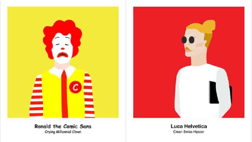
In the same way that Helvetica has become one of the most controversial typefaces and all thanks to its defenders and detractors; Comic Sans has become one of the most hated typefaces within the world of graphic design.
So much so that it is possible to say that hating this typeface is part of the same profession and it is quite difficult to find a graphic designer including Comic Sans typography in some of their projects, not only because they do not like it, but also because for some years a I hate within this profession towards this type of font, so that design professional who uses it could possibly be called into question.
But why is this font so hated?
Currently there is a movement against this typeface known as Ban Comic Sans, which is led by Dace and Holly Combs, two designers whose main objective is to try to "cope" with the typographic ignorance, rebelling and going against bad taste.
The actions of both designers managed to reach Google itself, to whom They requested to remove the Comic Sans topography of the sources that are available when composing an email. But where does this rejection come from?
To begin, it is necessary to know a little about its history and it is that the Comic Sans font is a typeface designed by Microsoft's graphic designer, Vincent Connare in 1994. The main objective of this typeface was to be used in the text balloons of an App that was aimed at new users of Windows 3.1.
The fun interface of said program needed a font that could be adapted to its characteristics, as well as being close, pleasant and accessible for these users. To achieve it, Connare I take as inspiration the typical typography of the comics, which resulted in a font that has a slightly casual and childish touch, which was soon included in the Windows 95 font catalog.
Comic Sans was for users a different alternative, more cheerful than Times New Roman and it was at that moment when this typeface managed to be known and used constantly for anything. It is in this last aspect, where the mania that designers have towards this typeface is focused, since the downside is not actually the font, but the excessive and incorrect use that users have given it.
Using Comic Sans to make reports, professional presentations, releases, among others, it is clearly about an unacceptable mistake. Since it is not possible to use a typeface with childish reminiscences when writing professional and serious texts and not in information brochures, obituaries, among others.
Comic Sans it was not created to be used in all things And neither to be printed on some paper, instead, it was designed to be used in interfaces. However, unfortunately for many people, today they can be found anywhere.
A type of font that gives little play
While it might look like a nice and fun typography, It is essential to be aware of when, how and for what to use it, however and as we already mentioned, the general rejection suffered by Comic Sans is such that all designers basically they have banished her, so it should not be used even to create birthday party invitations or to write childish messages.
You can even find images on the Internet that show texts like: “When using Comic Sans, a graphic designer loses his wings”. But despite the fact that every day the detractors are more, there are also certain people who defend this source.
However, it is clear that the rejection and hatred that exists towards this source will continue to increase and be controversial. Since although it is about remove it from the typographic stage, Comic Sans will always be a protagonist.
Why is it so hated? Because, why? Because….
I think that Comic Sans is a nice type of font, but because of its origin from the comics, it doesn't give a sense of seriousness, and I think that's the reason why it's not used very often, unless what is being done be something related to something funny.
I think that Comic Sans is a nice type of font, but because of its origin from the comics, it doesn't give a sense of seriousness, and I think that's the reason why it's not used very often, unless what is being done be something related to something funny.
The truth seems to me "bulling", it is a tendency of people without profession. We all love the source, but like a few in the beginning, they took to saying that they hated it, headless people just joined them, for human beings it is easier to join for unproductive things than for good things. It's like with Arjona's music, I've always liked it, now it's also a tendency to hate it! What's happening to us?
comic sans is hated for in work that gives to beat sans from undertale
I remember that my teacher where I study banned me and almost dropped me for using the comic sans, in my project. Honestly, I don't see anything wrong with it. Obviously the comic sans would not use it in a cover letter, but it is not to hate it so much. I am currently studying Graphic Design, and although other designers hate me, comic sans is my preferred typeface before dry sticks.