
As we continuously analyze in Creatives, logos are the fundamental part of every graphic designer. That is why we give so much importance to making the right image. The Internet and the digital world have intensified this value by exposing brands in every corner we navigate. Each application, service and any other element has a distinctive image of the business behind it. Let's see where the story begins social media logos.
Social networks as new as mythical of our time have undermined a great space that did not exist before. Facebook has long led that space with its network for meeting and connecting with friends. But there are also others like Twitter or Instagram, each with its own story, short but intense. Since we can see how the market value of all these networks did not exist before 2006 and how they now hold the top positions.
In fact, this is because the number of telephones, internet access and the businesses that have grown around them are unstoppable. Even the business model has radically changed as a result of its history. Due to this, we are going to analyze their history, how they were born and why they chose those logos precisely.
The Facebook logo
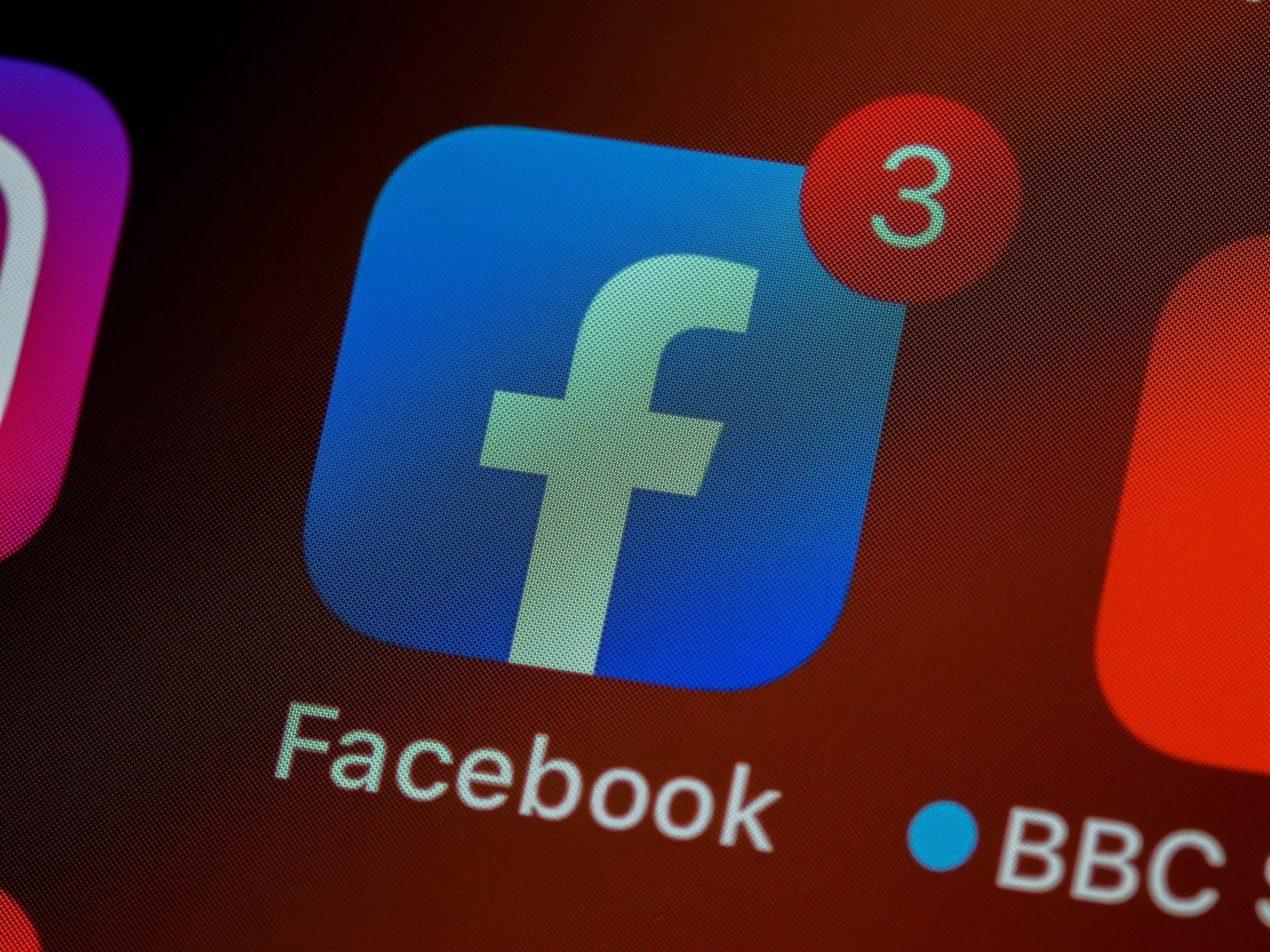
The main social network for many years, we can even say that the "first", at least worldwide, has a very simple logo. This was born from the company The Cuban Council, which was the one that devised the word Facebook with an edited typeface by Klavika Font.. These letters would be white on a very characteristic blue background. It is said that this color was chosen by Mark Zuckerberg himself, who is color blind and distinguished this tone better.
It really is curious, because years later, the logo has been modified by a lighter shade of blue. And what is called a "blue pill" is changed to a round "pill" and a size more adjusted to the formats of social networks. Since we can see how all network profiles have accustomed their users to use a rounded profile photo.
In fact, the company that created the first logo and that would be the most famous of all social networks, in the style of big brands like Pepsi, regrets not having received shares in the company itself. Since Mark offered them as a method of payment, being a company that had not yet generated the benefits that he generates now.
A blue bird for 180 characters
The social network Twitter is a microblogging network very different from the rest. Since although images and videos can be included, their grace does not depend on them. Rather, and with the evolution that has taken place, What he likes the most are what have been called "Threads". These threads are a series of written tweets that tell a story. And so, in just 180 characters per tweet, it has managed to establish itself as a very large social network.
In fact, now the owner of this social network is the richest man in the world, the creator of Tesla and Space X, Elon Musk. But before that, this social network was invented in 2006 in California. Although its logo was somewhat very different from what we know about him when this social network was born. Since they asked the designer Linda Gavin for a proposal, which she could do in just one day. But luckily, before launching the network, the logo was changed to "Twitter" in light blue.
First it was just the lettering, rounded out with a light sky blue and more simplified than the first proposal which was in 3D. And four years later, they added the best-known symbol of the network, its bird. The messaging app makes sense to set a bird as a symbol, since homing pigeons are the ones that carried out this type of work years ago. This bird is born as the representation of the tweet itself: Quick and in a short limit of words. Now, although the business name remains the same, the bird occupies the space of the entire logo by removing the word Twitter.
Instagram and photography
We all know Instagram. Instagram is the social network for photography par excellence. If Twitter expressed itself only with text and Facebook had personal connections as its strong point, Instagram was born as a network to show through images first and videos later, everything we like and see daily. The first Instagram logo was a very characteristic full analog camera.
This camera was an explicit message for the intentions of the network. This icon was designed by Kevin Systrom, co-founder of this social network in 2010. And although the typical Polaroid was a great tribute to the representation of this application, it was very difficult to adapt to small formats. That's why a short time later, the logo is updated to a flatter, smaller Polaroid version, where it reads "Insta" and not "gram."
Four years later and with great controversy, Instagram decides again to make a logo change. This generated much laughter, since the drastic change was imagined that it would not go well. A camera that is made up of a couple of lines and a point and some colors that have nothing to do with the above. But over time this logo has proven to work very well and the colors of the old Polaroid are reflected in the background of this logo.
Tik Tok and Tic Tac
Another company that has grown on a large scale in recent years is Tik Tok.. The most different company from all the others, not only because it was created in China (unlike the rest of the United States) but also because its short and continuous videos have made this network a hobby stronger than traditional television. Something that we already saw with other networks, but that this one absorbs even more among young people.
The most recent social network, created in 2016, is represented by a vibrant logo. Starting with the eighth note that stands out as a logo and with some shaded colors that make a glich effect that results in movement in the logo itself. This is because the content of the Beijing company ByteDance Ltd is mostly short music videos.. This logo has little change, since in 2017 they added the name Tik Tok to recognize it better than just with the symbol.