
The Olympics in Rio continue to happen and all the sports events these days lead us to be in front of the television to see our athletes compete for the medal table. An unmissable event for millions of people who will have all kinds of sporting events of all disciplines during these days.
From here on Creativos Online today we share the sports pictograms of all those disciplines that have passed from Tokyo 1964 to Rio 2016 in which different illustrators and creatives have worked who have put their skills at the service of sport. Let's get to know them.
Tokyo 1964
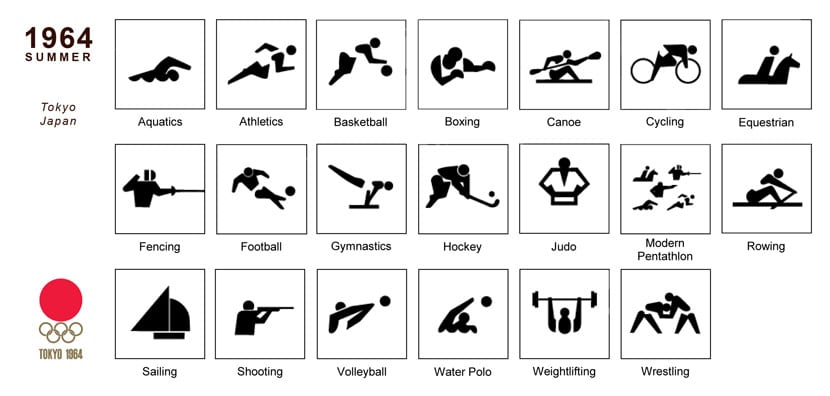
The designers are Yoshiro Yamashita and Masaru Katzumie. The goal was to develop visual communication capable of be effective to inform both the participants and the spectators as the number of nationalities to the games increased. This is the reason why the shapes are so simple and straightforward.
C.P. 1968
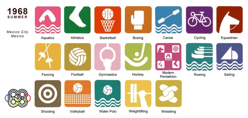
Group of creatives from the Department of Urban Design for the organization of the Olympic Games, which includes Lance Wyman. One of the distinctions of this sports pictogram is that it only a part of the body is taught of the athlete or equipment needed. They refer to Mexican culture and its history.
Munich 1972

It follows the context of Tokyo 1964 to represent the silhouettes in typical poses of all sports disciplines. The emphasis is on geometric and graphical rules to make it a standard. This is that angles are 45 or 90 degrees and the silhouettes are produced with a limited number of body parts.
Montreal 1976

The designer is Otl Aicher, and it was adapted by Georges Huel and Pierre-Yves Pelletier. Here the continuity of graphic symbols predecessors. Modifications were made for some pictograms, particularly for services, although these do not appear in the shared image.
Moscow 1980
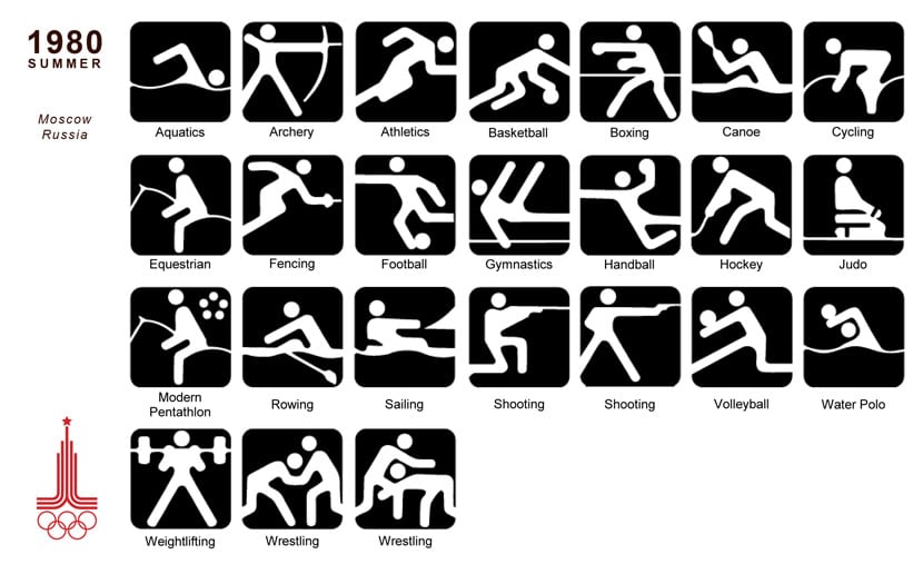
The designer is Nikolai Belkov and the lines used are at 30 and 60 degree angles to give the impression of flexibility to the image. The angles of the silhouettes are rounded and the body is in one piece, except for the head.
Los Angeles 1984
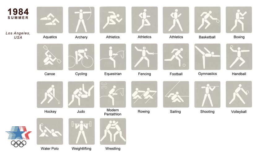
The designers were Keith Bright and Associates. Attempts were made to obtain the rights to the Munich games pictograms, but being cheaper creating new ones, this final decision was made. The design principles were: clarity, communication, consistency, readability, and practicality.
Seoul 1988
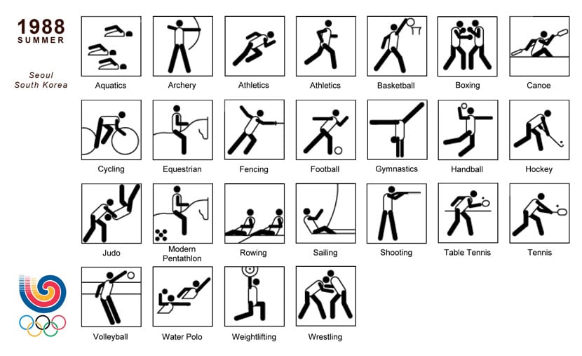
It was the organization in charge of the games itself that commissioned the designers. Created a new set of pictograms for Asian games. Treaties in four parts: head, trunk, arms and legs; special attention was paid to the connection between the different parts of the body.
Barcelona 1992
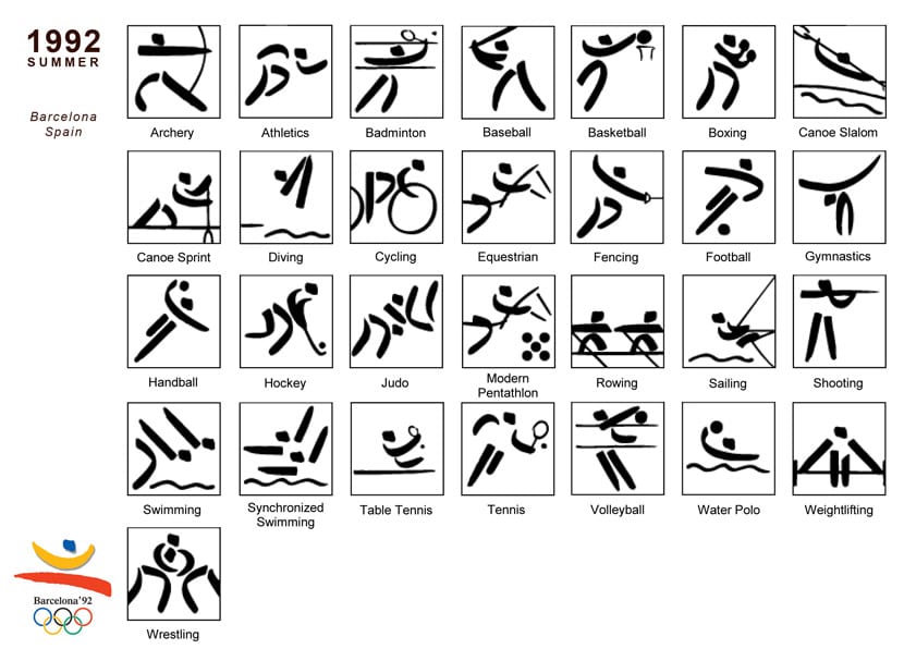
Josep María Trias was in charge of the design. Put on the accent on the artistic aspect at the same time as the analogy with the emblem of the Olympic games, which was also designed by the same designer. Like the personality of the Olympic emblem itself, three parts were used to make up the pictograms: head, arms and legs. The trunk was never depicted, but is suggested by other elements.
Atlanta 1996
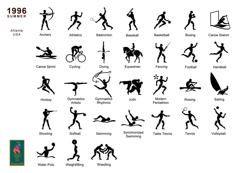
The designer is Malcom Grear and he inspired by the figures of Ancient Greece. Classic design with a link to the ancient origins of the Olympic Games. The style of the silhouettes tries to be realistic and is close to human forms.
Sidney 2000
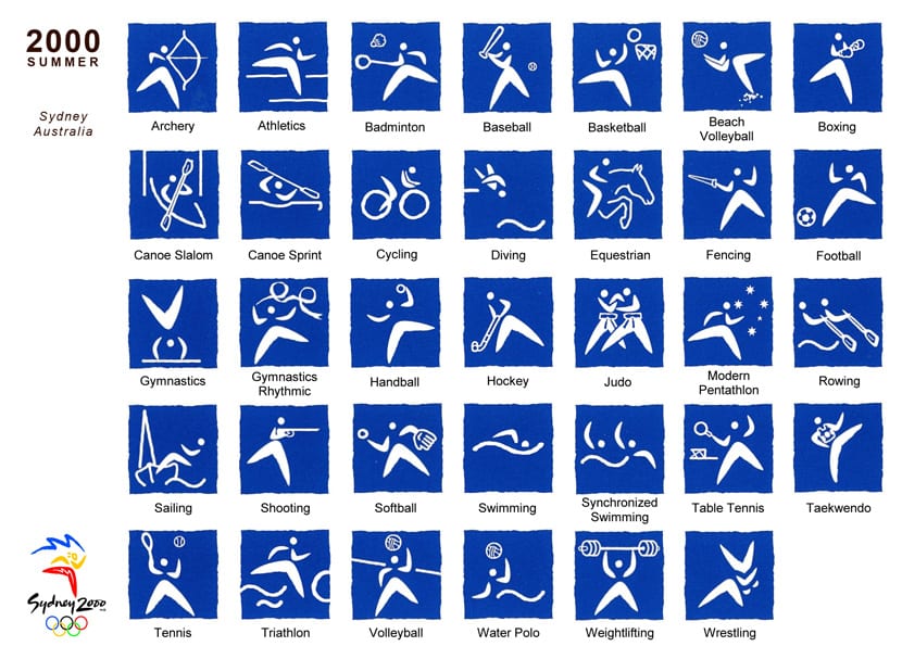
The silhouettes of the pictograms are made as if they were boomerangs, one for the legs and two smaller ones for the arms. Particular attention is paid to Australian Aboriginal culture. The objective is to be dynamic to find the adjectives of the agility and speed of the athletes.
Athens 2004
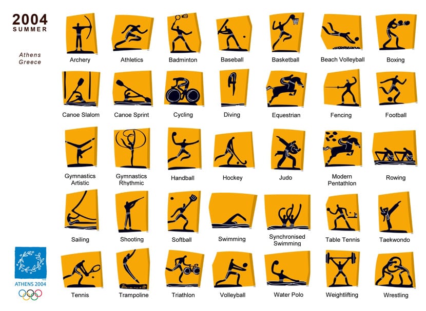
The designer was ATHOC 2004. Inspired by the culture of Ancient Greece, the athlete's silhouette and the detailed lines try to bring to mind the vessels of Ancient Greece. The fragments of these ancient vessels served as inspiration for the irregular shape of each of the pictograms.
Beijing 2008
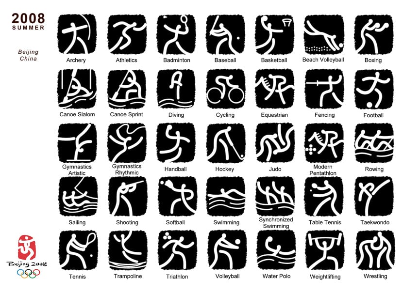
The design was commissioned for Tsinghua University. The pictograms were inspired by the inscriptions in bone and bronze of Ancient China adapted in a more modern and simplified style.
London 2012
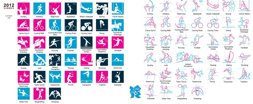
SomeOne Design Agency was in charge of the design. Created with two different formats: a silhouette version designed for standard use and a dynamic version that was inspired by the London Underground map and that he incorporated lines that extend outward from the figures.
river 2016

The same entourage for the organization was in charge of the design. The athletes' silhouettes are formed based on the official Rio 2016 typeface. This typeface is inspired by the emblem of the Olympic Games and the curves of the Rio XNUMX landscape. The fluidity of lines focuses on simulating the movement of athletes in action.