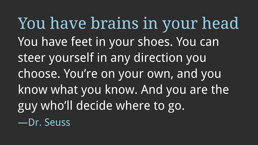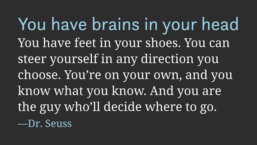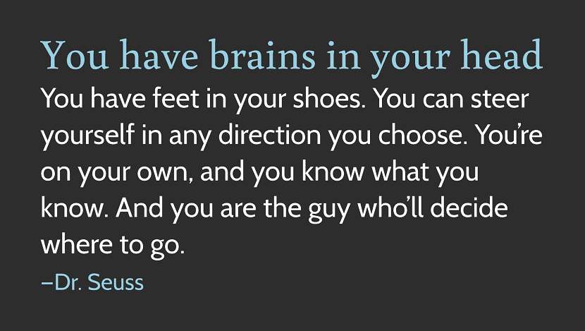
There are many ways to combine fontsSome more useful than others, however, the ideal place to start is to understand the role of each typeface and focus on the qualities it possesses.
How many are too many?

There is a rule that says no more than 3 fonts should be used for a single design, since the logo uses 1 or 2 fonts, commonly is restricted to 2 faces. Generally, in order for headings to stand out the moment you scan a page, you have to use one font for the body of the text and another for its display. However, you could highlight your headlines using a bold variation or accent tone - in other words, the fewer fonts you use the better.
How to choose a practical font

Commonly, your choice of initial source can get out of hand, because companies tend to establish some type of letter or group of fonts, as part of your brand guidelines. Sometimes, it is possible to find a job that has certain requirements, such as limited space which may need a much more compact face or a large amount of text that must be readable within very small spaces. However, if you can find a completely blank page with a unlimited variety of options, the ideal place to start is clearly the largest proportion of text, which is possibly a copy of the body.
When choosing a font for the body of the text, your main concern has to be its readability.
How to choose a personality font

El choose your first font for a good readability it is usually a case where you need to choose a really reliable tool. But when choosing the second font, there are 2 things to consider:
First, this typeface should not be chosen for its practicalityBut to give personality, so it is necessary to understand that it should not only be chosen for its own personality, but that 2nd typeface has to show the personality of the first.
Each type of character has a personality, most of them have multiple features. If you select 2 of them that have the same characteristics, when combining them, these characteristics will be multiplied.
Second, this typeface requires you to look at it pretending that works properly with the first, since in this way a very coherent voice can be elaborated. You need to look for faces that have similar proportions, that is, the ratio of height X to ascenders It has to be similar, also the shape of the counters.
With these premises, you have 3 alternatives to choose the 2nd font:
Safe bet
Various characters are found designed with serif or without serif for example, Meta has Meta Serif and Scala Sans has Scala Serif. The value of combining fonts that complement each other is that typical letter shapes they are usually the same and the level of contrast is very small, though enough to explain the extra http request.
Contrast a feature
If you chose the readable body face, then you could choose a screen face that is not readable. If you opt for a geometric face for the body, you must take into account the humanistic side of the presentation. If the body face is warm and welcoming, try a more powerful and distant screen face.
Contrast styles
The way to do this is by identifying the main characteristic of the first typeface, and then get a second that only shares that characteristic. This is by far the most challenging approach, as much of it is subjective, although it is also the option that allows you to create amazing combinations.
Thank you very much for the information, Jorge. Perhaps the writing of the article could be improved and it would help to understand it better. A hug.
Good recommendations, but the translation of some terms does not help, for example, counters? I imagine that it refers to counters by the meaning, which would be the counterforms or negative spaces ...
"Cara" faces in English ... refers to a typographic design, a font, a typeface, let's go to a typographic selection ...
The web is huge. I don't need to bore you with statistics on how much information there is, but you can be sure that the content you have to offer on your website is available elsewhere. Running a successful content-based website becomes a matter of balancing the never-ending process of creating great content while adjusting the user experience.
Typefaces play an important role in all of this.