
The history of the most famous chocolate brand in the United States dates back to 1941.. Since then, this brand has positioned itself as a very popular snack among its customers. It is because of that the change of the M&M logo is essential throughout its years, adapting to what the demand demands then. Her trajectory does not go unnoticed by all those who know her, as she has been highly recognized in the world of sweets.
Your first big milestone, in fact, has nothing to do with your own sales.. And it is that, no matter how many advertisements they send, there is no greater announcement than the one that happened in the 80s. Where one of the astronauts who traveled to space carried a bag of M&Ms with him. After this event, they become the "Official Snack of the Olympic Games". Sponsoring the Los Angeles Games.
In addition to these milestones for the brand, which make its importance relevant, the brand has established itself in many aspects. Its expansion throughout the world and the new iconic characters that they show in their image are already known throughout the world. That is why the brand known as Emanems continues to be a benchmark for sweets at an industrial level. and today we are going to see how its logo and brand have progressed since its birth.
The first visual identity of the M&Ms brand
When creating the brand, they introduced the first M&Ms label that would mark a before and after. Something that is still valid today as we all know, but that has been changing colors, shapes and even typography. Of course, the details of these small modifications are not very appreciable. The brand has been preserving its essence since it was born. And since it was born in lower case, it has stayed that way, except for when we expressly wrote it.
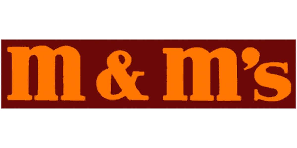
The first logo is a brown, chocolate-colored rectangle that fits the double m&m and the s. The two E's are further apart and the box delimits the frames very tightly. Since it practically has no air on any of its sides. The letters are orange, which doesn't match the background color very well, at least on a digital screen. These clear deficiencies mean that this logo does not come out officially and is modified.
The first logo to go on the market
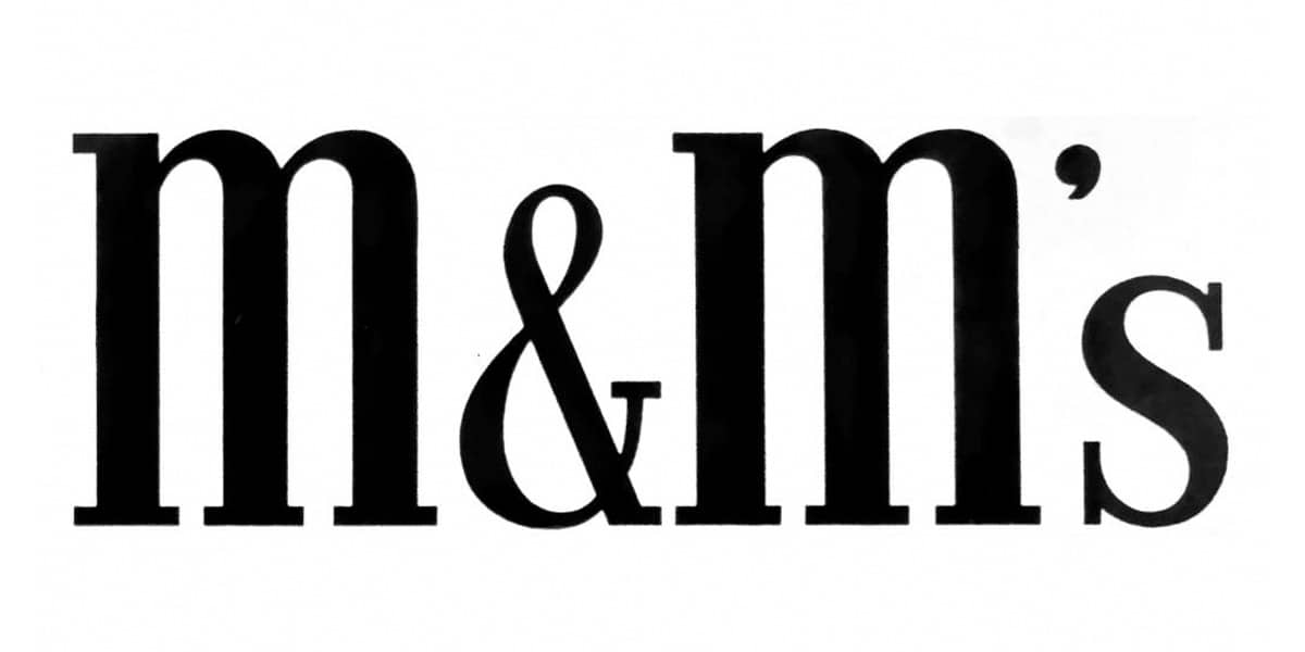
This logo is displayed differently than the previous one, as they decide to go with a black monochrome and no background. The letters are a traditional serif with the ems cased higher than the "'S" and "&". This one is more versatile than the previous one, since you can place it printed on any support without too many alterations. Packaging must be white or lighter shades and all lettering must be visible.
The frame returns, with a different color
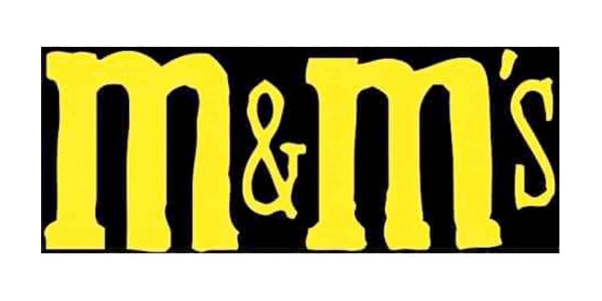
Years later, in 1954, they made a change to the logo again.. As we can see in the image, the frame of the first visual identity created shines again, but this time with a solid black color. The letters however they once again have a greater drop and the "S" and the "&" are smaller. Placing these in the middle of the logo, subtracting importance with respect to the ems.
The typography changes completely. In a very striking yellow tone, the letters are presented as if they were written by hand. But it looks more like they were sealed and double printed on the black background.
The colors of now started in 1970
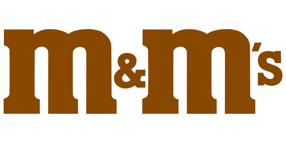
In another of the many changes that the brand has been making, this is the most characteristic. Since thanks to this change to a color more in line with the sale of your product, such as chocolate brown, all subsequent logos would change without abandoning this one. Now without a background, with a cleaner and stronger line, Emanems presents a simple but forceful logo. Since this image manages to project what the brand sells.
The letters will change little from this change. Since the role of the "MM" will always be greater and will match the "S" and the "&" in the middle of the logo. But, in 1986 and later in 1990, these letters will change their tonality. Making this color look more like chocolate. With more intensity and greater credibility to associate it with the product that is sold from the brand.
The 2000's: the era of M&Ms
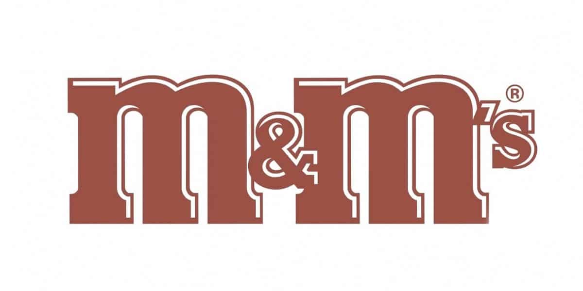
For the brand this was an important moment. Which was logical that they reflected it in a new image, more modern and entering the millennium. LThe M&Ms brand, in a resignified Roman, means 2000 for the two ems in its name. That is why the change was natural. With time, it was evident that the brand was going to create an outline on the name. It is something that in those first years of two thousand was done in many other brands.
This brown and white tone outline gave the name more volume. The registration letter “R” that many famous brands have was also added for the first time and indicates that this name is protected and cannot be used by anyone else.
In 2004, another change
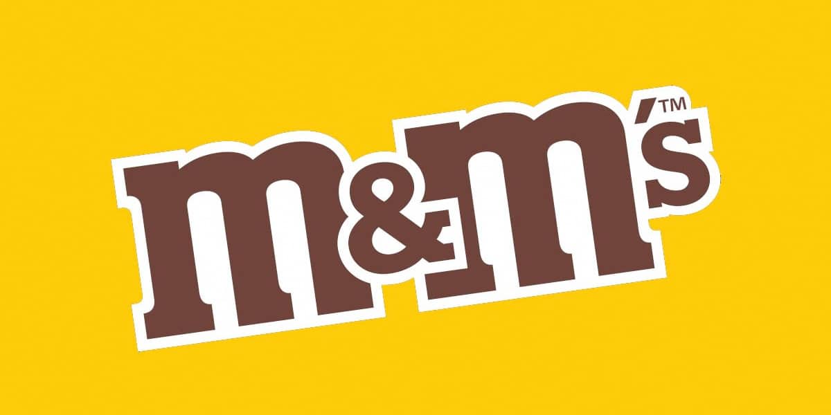
In this year he sees an obvious modification again and that is that they add a background color, as in 1954, with a yellow background. This yellow background gives strength to the logo, and can be unmarked when necessary from the logo itself. In addition, they introduce a change in the letters since the outline becomes thicker and remains in a white tone, which makes it more legible on that yellow background. The font for the first time flips and stays at a 45 degree angle.
the current logo
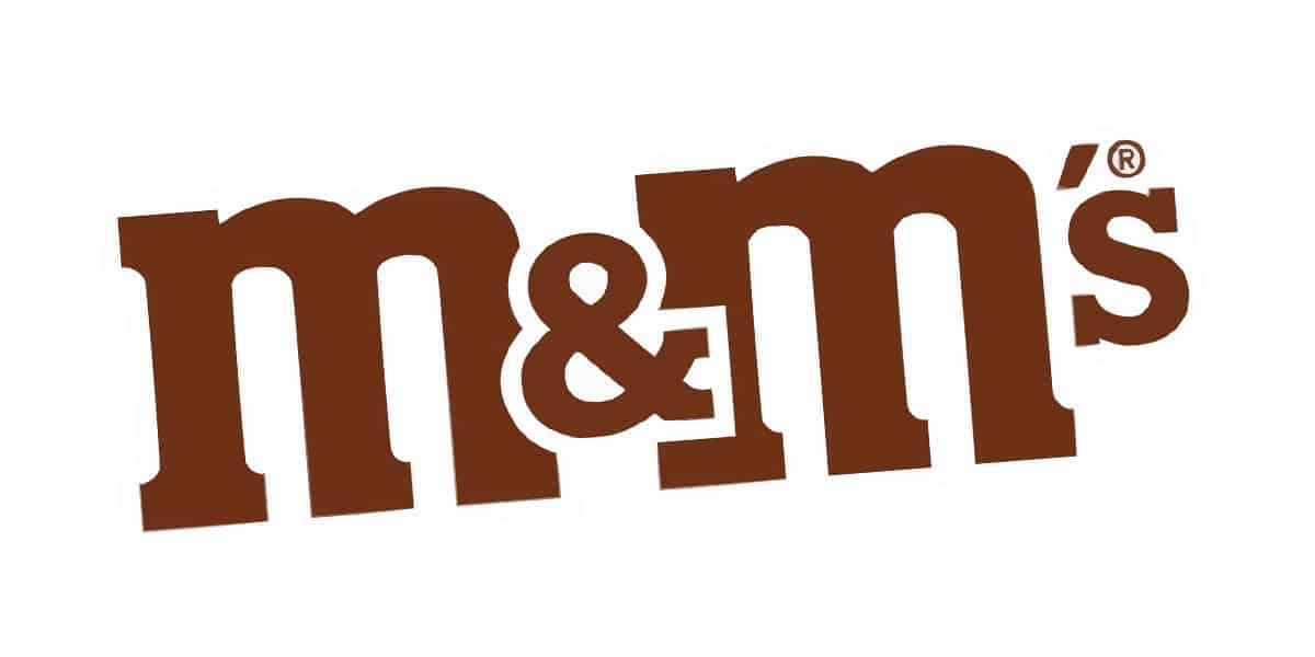
The design that was carried out in 2019 and that is still in force was modified to return again to a flat iconography. Eliminating the outline that made it two-dimensional and now makes it flat as design trends are now. The letters are still diagonal but it looks cleaner and fresher.