![]()
Star Wars is one of the best-known franchises in cinema worldwide. Since its creation in 1977, it has had fans and followers from different generations who have passed the baton to each other. That is why, in such a long trajectory, there is an evolution of the Star Wars logo like the one we have seen. Having to adapt faster and faster to new technologies and new ways of reproducing your image. The formats, as in almost every franchise, have been simplified, polishing lines and eliminating objects for greater readability..
As is logical, it has also had to be affected by the new vision of the young public to interact with it, for generations. In this way, and quite successfully, it has managed to last over time.. Today it continues to have incredible potential and it is that in its publication of 'The Book of Boba Fett' it has surpassed the Marvel franchise. 1.7 million viewers in the first weekend in the United States alone confirm this. They do not stop growing and the evolution of the Star Wars logo continues without stagnation almost 40 years after its launch.
The original Star Wars logo
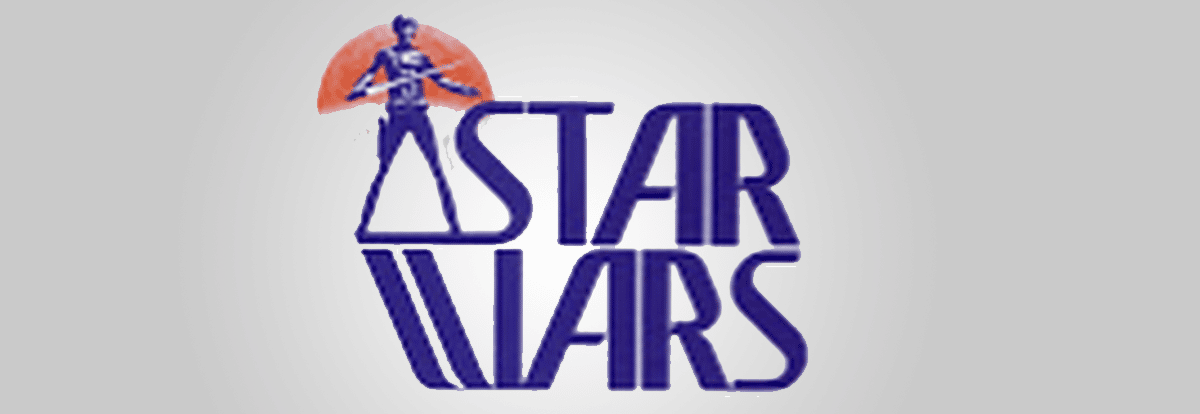
As we said, Star Wars was born in 1977, but before taking it to the big screen, the brand had to be created. Ralph McQuarrie was in charge of this in the pre-production of the first film. The logo back then already reflected the hero of the plot and the name of the franchise: 'THE' Star Wars, which he would eventually eliminate to leave only Star Wars. The first logo was intended to be reproduced only on the film tape, which later did not have a good adaptation for corporate signage and stationery.
Due to this need to print the logo, Joe Johntson was later commissioned, designer and creator of special effects for films like 'Raiders of the lost Ark' as art director. This logo had clear references to the previous one, without eliminating Han Solo, although if giving greater prominence to the name. Eliminating the 'THE' at the beginning and establishing the logo in two lines. The typeface in this case is a Precis URW Slim, although somewhat modified. All this we must tell that it is even before the premiere of the official film. As we said before, it premiered in 1977. Well, It wasn't until December 1976, before the release, that the official logo was introduced to the iconic scene in the film.
The official logo in promotion
At the presentation of the new novel by George Lucas "Star Wars from the Adventures of Luke Skywalker" we see the title as an example of what was to happen next. Star Wars is presented in yellow and with the font that would later become the official 'Helvetica Black'. This time without any modification. But this did not fully convince Lucas and hired Dan Perri to create the logo that would later be seen on all promotional content and movie posters. In this logo the main characteristic is not only to 'knock down' the letters, but the first union of letters between the 'S' and the 'T' of STAR already appears. What would later repeat this also in WARS.
And, although all this promotion was exposed with Dan's logo, it never made it to the film.. Being an icon, for George Lucas something was missing. And it is that according to him, the interaction between the S and T makes no distinction and seems to say TAR WARS. That is why a new order was made to Suzy Race, then hired as the film's art director.
The curious request of George Lucas
To remove those flaws that Lucas believed the logo had, he made a request to Suzy Race (Elizabeth Race) to make the logo look "very fascist.". As you have read correctly, this request is due to the fact that George Lucas, to create the 'Evil Empire', was using information from Nazi Germany, using names and uniforms for the soldiers in the film. Race thought that Helvetica Black reflected well what he wanted to evoke., but to fix the defects it used extensions to that ligature. Also adding at the end to the 'R' of WARS. He also modified the 'W' with even more right angles, thus making her more aggressive as requested by Lucas's request, wanting to appear more 'Nazi'.
return to origin
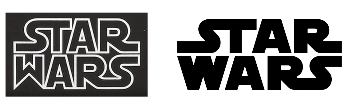
According to creatives and people related to the George Lucas team, they considered some parts of the logo illegible. That is why Lucas sent the creator of the logo for the first billboard, Joe Johntson, to correct some aspects such as the Kerning (space between one letter and another) and unify the letter 'W' that they thought was not adjusted to the rest of the logo.
There is a big difference between the logo made by Suzy and the later modification by Joe. As we can see in the image, the letters are further apart in the final logo than in Suzy's previous one. Whether in the word 'Star' or 'Wars', the 'A' and 'R' are stuck together, something that changes radically by adding air to all the letters equally. The 'W' is modified because the lines before the logo were aligned to the right while the 'W' was aligned to the center. Is the W more important than the set?
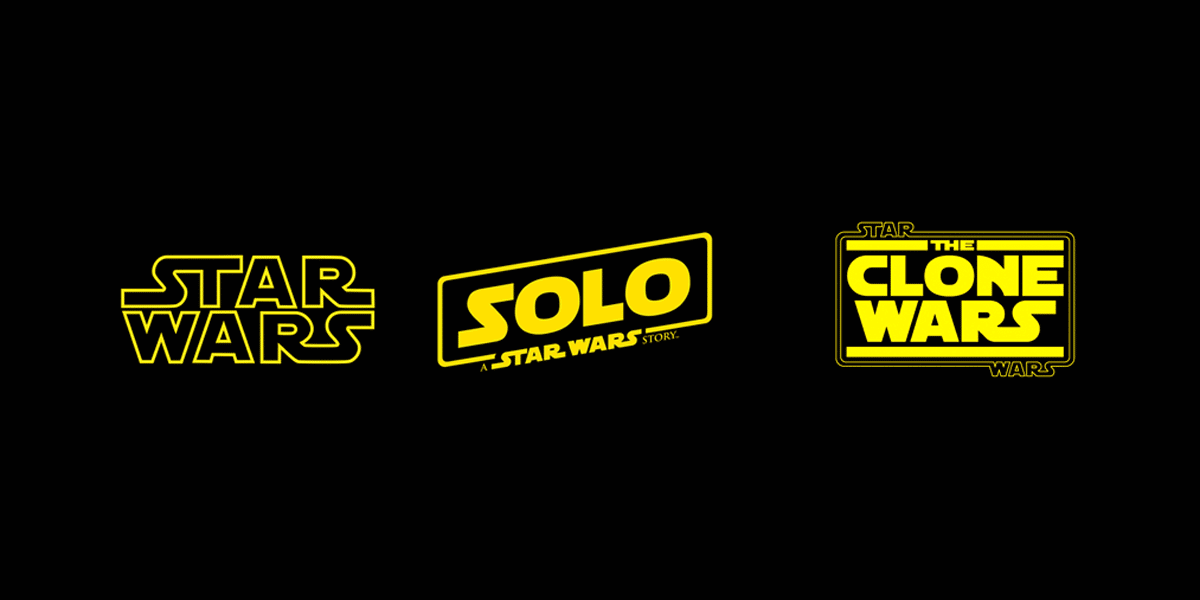
Following this and with the release of Episode V, the Star Wars elements of the logo were placed above and below the main film title, cleverly using a key line to frame the title, joining the words by means of their ligatures. The use of the Star Wars logo, incorporating it into the name of the film, has become the standard approach for subsequent films, although adopting different variations
the marvel logo
As a curious fact, the logo was not adapted only by the requests of George Lucas or by the environment of the movies. The evolution of the Star Wars logo went through Marvel and at that time its publisher, Stan Lee, which received the Suzy Race logo to make an adaptation to the comics. Back then Stan Lee was not a follower or fan of the Star Wars movement. And when he saw the logo he felt that the 'W' was not going to fit with the marvel universe, which he asked to adapt it to give a more comic-like image of him. Jim Novack, who worked on 'The Avengers', 'Daredevil', 'The Fantastic Four', among others, was in charge of this.