Internet has changed since it took its first steps to how we know it now. That is something logical, since the needs and the doors that have been opening are infinite. From its beginnings with simple lines of code until the average user was able to navigate Google, a few years passed.. Then entertainment platforms were born, including YouTube. Here we are going to explain the evolution of the YouTube logo.
At the beginning, it did not even belong to the great power of the Internet, but was created by three former employees of another platform known as Paypal.. Which they decided to make one of the pages that have changed communication the most in recent history. A platform seen by one in two people who enter the Internet on a daily basis and which has created a different vision of business related to entertainment and information.
Any of us knows YouTube today, but to get to where it is today, it has required an evolution like no other. Starting with a simple platform, which today would be considered a video bank, up to what it is today. A communication channel very similar to the television news.
What is YouTube and how does it start?
YouTube is a video platform where an almost infinite amount of content can be viewed from the website or the application.. In fact, the users who upload these videos are called “Content Creators”. But this is something that does not start like this, at least not initially. When this platform goes live, people upload random and even personal videos to send to their friends for them to see.
YouTube was not dedicated to placing advertising or paying to post them. People uploaded it, others saw it and thus a large number of people began to have an account on this platform.. Such is the "boom" of the platform, that just one year after its creation, Google acquires 1650% of its property for no less than 100 billion dollars. This means that Google already saw the potential it had, so it is making a strong commitment to a new stream of business among all its subsidiaries.
After the acquisition by the technology giant, Google begins to introduce non-invasive advertising in the best-known and most played videos. Until now, anyone wants to be "Youtuber" as another means of work. Something that has been possible thanks to introducing advertising in the Youtube framework and in the videos. Now YouTube is another platform for opinion and entertainment, where each channel is a different television.
The first Youtube logo
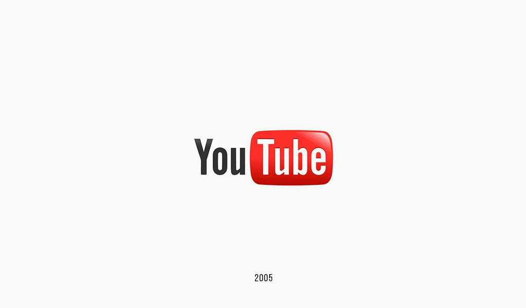
Both the platform and its logo were born in 2005. And as we have commented before, a year later Google acquired it. But even with the change of company, this logo was still valid on the platform for several years.. Since removing this iconic logo is difficult since it has a very striking image and is easy to associate. This logo is divided into two parts «You» and «Tube», the latter is inside a box.
If we separate it like this, we can translate as “Your television”. A name that had the intention from the beginning of creating a different television from the conventional one through a simple web page on the Internet. Also, we can see how the logo the first part is in black and the second is an interior relief of the red box itself. This red box has rounded corners with an intense red color and highlights to highlight.
Years later, a little touch up
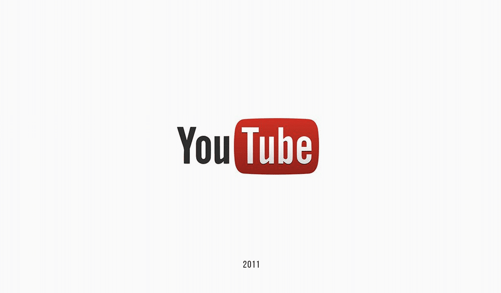
Later, this Youtube logo had to be modified due to the adaptations that the brand needed to the new design records. Thus eliminating the previous lighting of the logo and a color that is too flashy and that does not age well with respect to what we can see in terms of current design canons. Red is darker and features a light to dark gradient. Although it still features a bit of highlighting and shading.
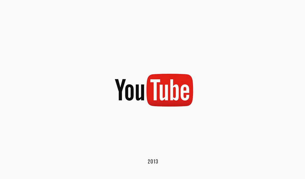
This first change occurs in 2011, but it would not be the only change that the brand makes in the following years. The design was similar in all of them, but they made small tweaks as it looked more updated. The color tone, shadows and other small nuances but without changing the typography or the way in which it is read.
The recognition to play
Once a strong community arrives, great income and publicity announcements that support all this amalgamation of projects, the logo change arrives to how we know it now. The red frame had to take a step forward and the "Youtubers" community managed to make it clear through the prizes awarded. Since every hundred thousand subscribers, every million or now every ten million, there are buttons.
These silver, gold or diamond buttons made more sense if the word Youtube came out of the button itself. Since it doesn't make more sense to give more prominence to the word «Tube» than to «You». That is why in 2017, Youtube change the logo to have two elements. The word and the isotype. Like many other big brands, the isotype already functions as a single brand. And it is that the characteristic button of the "play" of YouTube is already an icon that needs no introduction.
Although this icon comes from the first VHS, that playback icon is timeless and continues to be used today in digital players of all kinds.. Such as Spotify, iTunes or the YouTube player itself. The typography becomes completely black and remains on the left side of the button. And this button becomes a rectangular shape with rounded edges in a flat icon, with no shadows or tweaks, and the white “play” button in the middle. In this way, we can see the isotype only as Mcdonalds does and recognize for the moment which company it is. This is something that many companies seek to do.