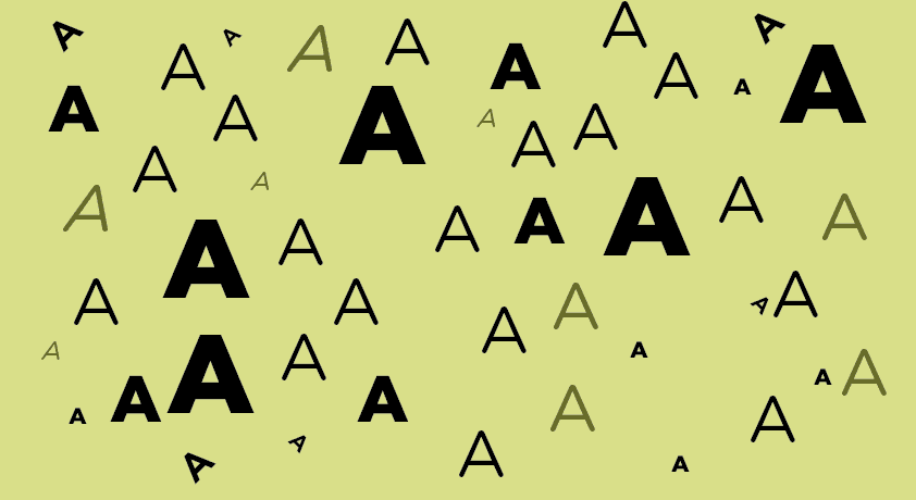

The hierarchy is the order that the different sections adopt. The visual hierarchy within the design determines the reception and the impulse of the message. Taking this concept into account is key to creating an effective visual image. One of the aspects within the visual hierarchy that you have to know and know how to take advantage of is the typographic hierarchy.
The most important words show greater impact, so users can get the key information more clearly.
This hierarchy creates contrast between the elements. To achieve this contrast, one must take into account the different tools with which a typeface can be worked:
- Fonts
- The Body
- Upper case and lower case
- Thickness and styles
- Orientation
- Color
- Location
If you master these different elements, you will be able to perfect your typesetting and build a clear, direct and effective message:
Combine original fonts with more basic ones
The user is used to finding conventional fonts. Whether serif or sans serif, they are usually readable and popular fonts. If fonts that flee from these categories are used, such as handwritten or calligraphic, they will create a greater visual impulse to the viewer.

The more important the information, the larger the body
The size of the letter will indicate the degree of importance. Larger letters or words will attract more attention so they will have a greater degree of importance. Using a small body for less important information is a very common resource.

Capital letters attract more attention than lowercase letters
The use of uppercase and lowercase letters is something basic, so it is undeniable that those letters or words that are written in uppercase will create more visual impact than those that are in lowercase.

Combine styles and create contrasting strokes
Creating contrasts through the thickness of the letters is another way to generate a visual hierarchy. Letters with a thicker line will be more striking. Most fonts have various styles. Depending on the style used, it will create more or less impact. Letters written in bold or bold tend to attract more attention. On the other hand, italics or italics are often used to specify some type of information.

Words vertically and diagonally are more striking
Placing letters or words in an orientation other than horizontal is a way to position them above the typographic hierarchy. The user's eye is not used to finding letters or words in an orientation other than horizontal, so if there are words or texts vertically or diagonally, these will be the protagonists.

Hints of color vs chromatic homogeneity
Imagine that all the visual graph is in black and white and only one word is in color. It will inevitably be the first thing users see. This resource is very broad and very impressive graphics can be created.

The upper part of the composition is what attracts the most attention
The natural placement of the text, from top to bottom, is a clear way to create a simple and effective hierarchy. The letters or words that are in the upper part, will be the first to which the user pays attention.

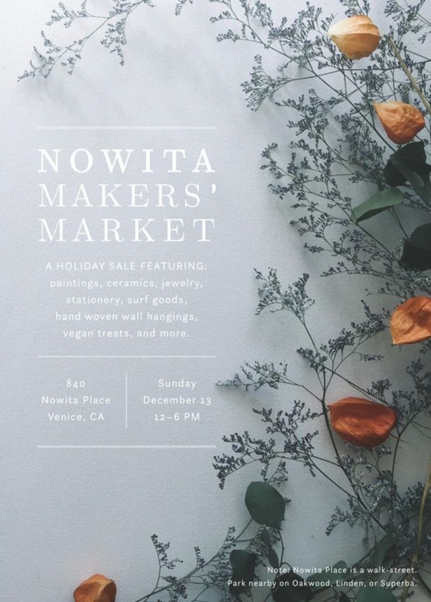
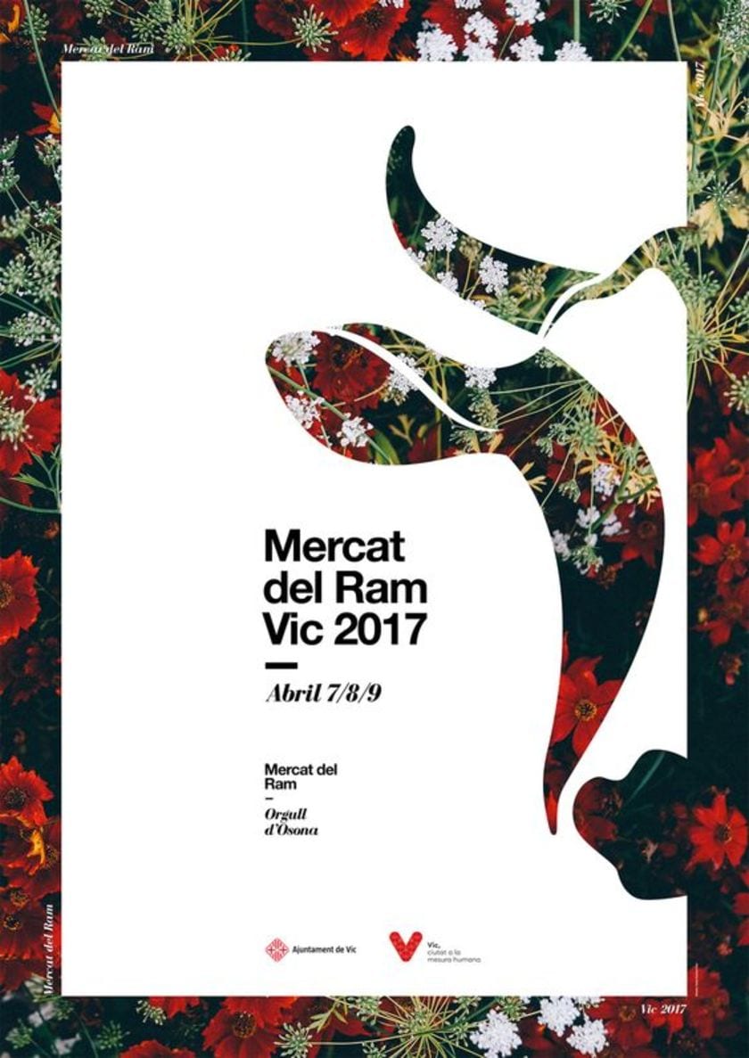
Let's see some real examples:
-

- Fair event
-

- Flower market
-

- Jazz event

In these different posters we can appreciate the different levels in which the information is found (owner, date and place of the event and finally relevant information). Here they have used the clearest and most concise tools - size, thickness and style.
These tools are essential when it comes to getting an impressive graphic message.
Catch the post, but please change "against the more important the information" for the correct spelling expression. A greeting.