
According to the ranking of “Best Global Brands”, Apple managed to be the best brand in the world during 2014 and all thanks to its innovation within the world of computing and practically obsessive special care, with which they have treated and protected the brand by paying special attention to the industrial design of each of their products.
And it is that the graphic design of the same, the sales in Apple stores and the specialized attention they offer to customers, have allowed Apple to become the mark number one around the world, being recognized by the popular “little Apple”, Which has become its emblem.
Creators of the Apple logo
Ronald Wayne-1976
It was a design created by Ronald Wayne who was the 3rd co-founder of Apple Computer, although it only lasted a year, because Steve Jobs did not like it at all, since it was very complex and serious, it consisted of an image of Isaac Newton reading under an apple tree.
rob janoff 1977
After 2 weeks of meeting and only a test of the logo was enough for Rob janoff persuade Steve Jobs and make history by redesigning the apple logo, which surprisingly would hit the market with the launch of the Apple II.
Based on the suggestions of Steve Jobs, Janoff, I simplify the old Apple logo and designed a bitten apple.
It is a design that is not totally free of urban legends and a few meanings, this design has stories that tell about the apple being a representation of the poisoned apple with which he killed himself Alan Turing, the mathematician and father of computing, is also said to have more biblical meanings, such as the apple of the tree of wisdom which is bitten by Eve or which is about representing daring and temptation, etc ...
However, all these theories are very far from realityAs Apple has never confirmed any of them and in reality, their true meaning is so secret that it is even currently unknown, possibly because it may not have any.
According to Janoff, the only I believe the apple bite in order to be able to differentiate it through scale and proportion from any other fruit. In fact, in the original logo, the apple manages to adapt to the letter thanks to the bite.
Steve Jobs wanted to bring computers closer to homes, I wanted them to be more familiar, comfortable, interesting and attractive to the little ones when they were in their schools and because of this and because of the fact that Apple was the only computer that had a color screen, they decided to add color bars to the logo.
From 1998 to the present
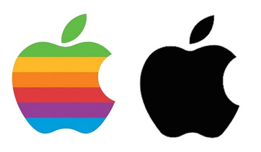
The change that occurred in the Apple logo in both its shape and color was made in 1998 and began to go monochrome, which perfectly coincided with the return to Apple of Steve Jobs, the arrival of Jonathan Ive as Executive Vice President of Design and the first launch of the iMac G3.
By making the logo monochrome he had a greater flexibility, which is why it was used in different places in Apple products, such as on the sides of the PowerMac G3 tower, on top of early iMacs, etc.
That same year, the logo was again simplified by creating a black monochrome version, which was replaced in 2001 by the logo that had the new look of the graphical user interface in the operating system. Mac OS X which was known as Aqua.
In 2007 the logo was chromed and is currently simplified again to be neutral gray. So as you have been able to observe, the logo has been changing through the years.
Good morning,
According to your previous articles this would be an ISOTYPE and not a logo.
Thanks for your articles, they are very useful.
Oscar