
The importance of branding in a graphic project It is a fundamental element in design. A corporate image must represent correctly a series of ideals and bases of a brand, this representation must be seen in all aspects related to the brand. A brand is a living entity which grows, changes and has personality, for that reason we must define correctly what the brand is like and what it does.
As a person has personality and her actions make her what she is, the same happens with a brand or product. In this post we will see an example of Branding, an example where we will check the union between design and philosophy and essence of the brand that is represented.
A good brand is always linked to a personality that determines their way of acting before the outside world. From philosophy own up to all your advertising must be focused on this end to show what they really are and what they want to be. We will look at examples from some great brands and discuss some of their main key points.
The essence of the brand
Every brand has its own essence, a way of acting that manages to represent what it is in itself. Define the brand values It is certainly the first step. The brand coca-cola It is not a simple brand of sugary soft drinks but a brand that represents family and happiness. Coca-Cola does not use the color red because it is a beautiful tone but because of the psychology of color that this represents, that is why brands must be based on something real, This does not mean that we should put creativity aside but rather that we should focus it in a specific direction.

If you look closely at the ads for coca-cola we will always see the same pattern:
- United Families
- Friends
- special moments
- happiness

Other brands such as Nike they use concepts like energy, strength, power, overcoming when it comes to identifying with the world of sport. It is a brand intended for athletes and this We can see it in its corporate image and in all its advertising. From name symbolizing victory, its icon represented the speed, and its advertising showing the human power and energy, Nike has managed to define its values correctly.
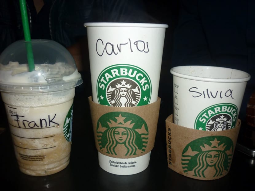
Other brands such as Starbucks focus on show a more united personality to the public you want to reach using the user experience as its main strength. They They do not sell coffee but they sell experience, comfort and modernity, a bubble where you can be in a cozy and attractive environment.

Represent the essence of the brand graphically
Making the essence of the brand visible is the key to get to a good mark. Thanks to the use of graphic language brands manage to extrapolate their entire theoretical essence in graphic visual language. Either well with the use of a correct corporate image or with advertising based on the brand's way of being, the goal is to translate all values into images.
Coca-Cola represents their family values and positivity through the use of advertising graphics and spots where they show those concepts.
They translate their values into spots loaded with emotion where people are the main element. Planes of happy moments, love, unity and a very positive atmosphere. It is curious to see how the main element of your brand, the soft drink goes to the background. It is no longer about selling something but about sell sensations.
Nike uses the force of photographs of elite athletes, stories of personal improvement where anyone can excel and be better.
Nike advertising graphics show self improvement messages where anyone can do oneself, this is one of the pillars of this brand sporty.
Use people with an athletic body doing sports, showing skills in improvement and leadership. If we look at all the Nike advertising we will always see this same style.

"A simple signed glass is not a simple signed glass" A signed glass provides a concept of belonging, the glass belongs to the user who bears his name. This achieves relate the user to the brand, It is no longer a coffee but the coffee of such a person who was taken in a place where they call him by name.
As we see brands always have something behind that makes them strong and solid brands. To make a brand work you don't need to be a multi-millionaire multinational, all you need is afinalize the brand and represent what it is graphically With the help of specialized professionals, this is where the figure of the designer comes into play.