
The hidden messages in corporate logos When it comes to representing a brand or product, it is essential if we want reach a larger audience in an effective and real way. The logo is the pvisible art of a brand, It is treated as a face that users see when they address us, for this reason we must show a face according to who we are, representing the values and characteristics of our brand.
Some logos they have a message behind Although we do not see it with the naked eye, it remains in our mind in a subjective way, when we realize these concepts in a logo we value it more as a brand because we see a positive aspect that is attractive to us.
Anys very famous logos They have behind a message that manages to further reinforce their essence and their main action as a brand, an example of this is the logo of the well-known company Amazon. In this logo we see what it looks like a simple smile just below the typography, everything seems very normal but if we look closely we see how the smile goes from a to Z thus managing to represent the idea that his available books are all those that exist. The logo Amazon It is simply great on a conceptual level.
![]()
Other logo with a very powerful conceptual message This is the case of the transport company Fedex. If we look at this logo we see how among its letters there is an arrow pointing to the right. This company is dedicated to messaging and its job is to go from one place to another, this idea is perfectly represented by an arrow.
![]()
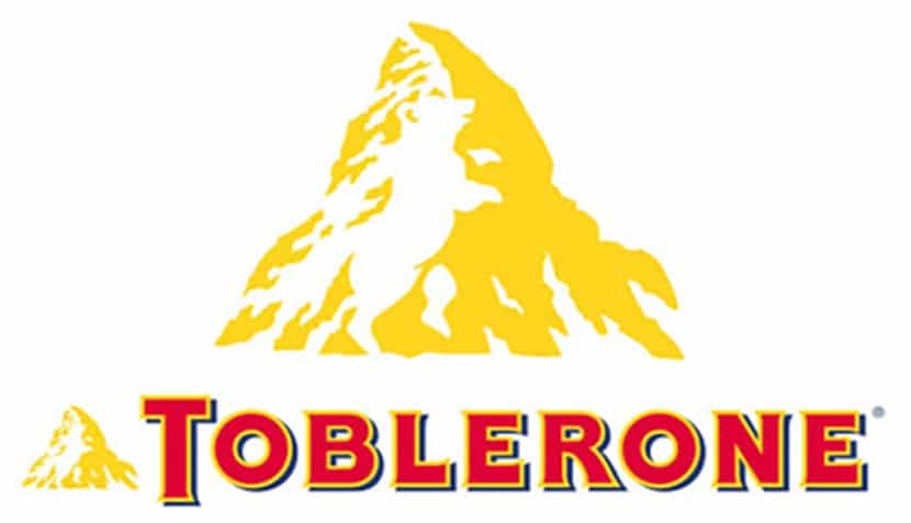
The well-known chocolate bars of toblerone have in their corporate image a secret that few know because it is much more subtle than the rest of the logos we have seen. If we look closely at the mountain we can see the silhouette of a bear.
Whenever we are going to create a logo we must know the values that we would like to represent in our graphic image, once we have this clear we can start working on an interesting and clean design line, as is the case of the following logo.
We have to be very clear about the idea that a logo is not a simple drawing that accompanies our brand but is a face that everyone will see and that must meet the objectives of communicate correctly what we want it to communicate. Let's imagine for a moment that a person wants to communicate seriousness, it would be a mistake for that person to be dressed with a clown nose, red pants and yellow jacket. The same thing happens with corporate representation, we must know the brand and know the design language to transfer all these concepts to the graphic world.