
Often, we consider for any type of product or business how will its image be. It seems that the most important thing is always the color, since they tell us that depending on the business, some colors are valid and others are not. Blue is often used for social media. And it is true. But it's not by chance blue gives the impression of tranquility, success, security. Depending on the tone it also determines the age of the people who visit it. Perhaps that security is what makes Facebook have a more adult audience than Tuenti had at the time. The importance of shapes must also be taken into account.
But the colors are not only what you need understand to create an image. Shapes are very important when creating a logo. Since you will need your audience at a glance to remember whose logo they are seeing and what they sell.
Forms
![]()
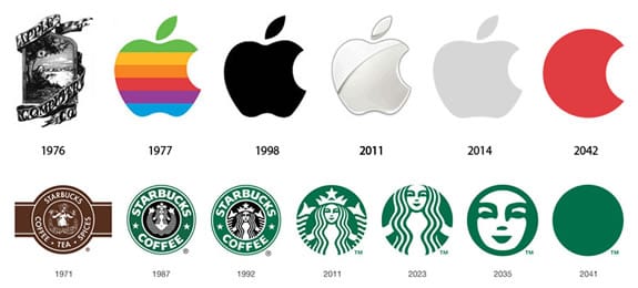
If we name brands like Apple, Microsoft, Nike… Surely you know what logo they have and that its color matters little. Since one will be the bitten apple, another a square divided into four equal parts and another a unique symbol. And sometimes, depending on the years, they have changed colors to show one thing or another. But always remaining the form. The brand itself or its designer has to create a brand that will always be remembered. That is the difficulty.
Different shapes such as circles, triangles, straight lines ... They can transmit very different messages and you have to be careful not to find different sensations. The greatest professional must mix these types of forms to find the specific message of the brand he is representing.
Circles
Today, they are used a lot. For almost everything. Profile photo and other different options in any application are used for this. They suggest an association, strength and endurance. A clear example: The design of the rings of the Olympics. Representing the unity of the five continents.
curves
A curve will have a positive and comforting response. The best example for this feature is Amazon. Which, your logo is a smile, which is where it is usually used. Since it gives a feeling of closeness, friendship, affection and different positive emotions.
Horizontal and vertical lines
The vertical lines give, above all, security. Stability, strength and balance are represented in the precision of a straight line. The logos that benefit from this psychology are usually corporate images. With this they achieve reliability before customers and efficiency. However, some of these lines are difficult to achieve and may twist the message you want to give.
The horizontal lines on the contrary represent tranquility and calm. Many of them are used to separate even the logo from the brand name to give stability. Used to combat threat vertical lines. If you want stability for your business with respect to the logo, you can use a grid shape to give it a solid shape. Sometimes mixing is the best option to demonstrate reliability.
Triangles
Beware of them. They are difficult to get and maintain in a logo. Triangles are often used for religion, law, or science, promoting a sense of power. Although they are also found in logos for a solely male market.
3 Basic rules to create your logo
Of course, the shapes are not the only thing, also the color and its composition. But you will have to carry out a series of rules if you want that as a whole, everything is in accordance with what you need and hit the nail on the head when creating a logo. So we are going to put some on the table To make it clear that minimum, you should not overlook.
Target
El Target o target audience is the most important thing before putting a finger on the paper. Since you will have to know what type of audience your brand limits you to. If it is a children's product, you should not use vertical lines or dark colors. You use uniformity and bright colors, and conversely, if it is an adult audience. If your target audience is wide with a range of 15-40 years you will have to create a mixture of shapes that can be circular or squared. In addition to a color that is not so dark or so light.
Vista
Note that whatever you do has to stay on the retina of the one who sees it. This is always easier to achieve with a simple logo. Without so many lines and with a simple outline. Remember that if someone says: I would do that too. It is that you are on the right path. That's how Nike, Adidas won ... Images to remember.
Colors to select
Look for a good color range and try not to get out of there too much. Keep in mind that if you take yellow and blue, it will be more difficult than if you subtract opacity from green or add. Playing with the same color. In addition, your eyes are less tired and if your business is going to have some type of online support, such as a website or mobile application, it will be easier to combine a website with the same tonality than if it had a variety. Thus, the color would also be important for who visits your sites, since they would quickly associate it.
You need to put it into practice, if you did not know these before tips and you started to design like a "madman" you may now be closer to achieving it. And most importantly, never change your logo abruptlyIf you do, that is when you are consolidated as a company and you do a renovation that does not have much to differentiate, because it will be difficult for your audience to remember it.
I am very interested in what I read.
I would like to learn