
La visual hierarchy It consists of one of the keys to design and that is that when creating images for printing or digital use, the content must be well organized. That is, it is not only useful to be creative, but it is also necessary take into account all the subtleties that a composition presents, as are, for example, sizes, directions, color, contrasts, locations and mainly, knowing and / or recognizing what it is that has to be left out and what it is that should be included within the composition.
La visual hierarchy could be defined as the appropriate way to organize all content, with the purpose of convey the message to the public in the best possible way.
Types of page viewing
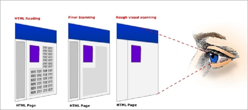
It must be said that everyone read from top to bottom and generally it does it from left to right; although it actually takes a bit more than that to see how a page actually reads.
Some recent research reveals that readers typically begin "scanning”The full page and then start reading it; this scan has 2 shapes, which are f and z:
The F shape
It is the one that applies when it comes to heavier pages, that is to say, those that have a very extensive text, as is the case of articles or blog content.
The Z shape
It consists of the reader begins by checking the top of the content of the page, since that is where the main information is usually located and then it continues to descend diagonally towards the opposite corner of the page, and does the same process at the bottom of the page.
Size
Generally, people read large print first and is that the size, especially in the text, turns out to be a very powerful tool, which sets aside the rules of reading the text of a page from top to bottom and left to right.
Space and texture
If you leave enough negative space around a button or if you leave the lines of a paragraph with enough space between them, the elements will be much easier to read.
The white space in the same way helps the content to be read more easily and it is that in 2004, an investigation was carried out in which it was revealed that the use of the blank spaces between side margins and paragraphs It increased the understanding of the content by up to 20%, because it is easier for the reader to read.
The texture for its part, refers to organization and spacing that the text and some other elements must have when preparing the content of a web page.
Typography
The selection of typographic fonts for page content, is essential when establishing a good visual hierarchy and is that in this case, one of the main attributes to look for in the font is style and weight. Also, the application of italics it is equally important.
Colours
The bright colors catch the eye to a greater extent than soft or gray colors, so it is advisable to make the most of this, in order to capture the attention of readers, which is the desired end goal.
Direction
In general, the page layouts tend to be carried out according to grids both horizontal and vertical.
Within this system a new form of visual hierarchy, which usually breaks with said grids, in this case, those texts that are placed in curves or diagonally, usually manage to stand out more than the rest of the structure in which the text blocks are located.
Hierarchy perfectly managed through the use of a focal point, one of the strongest design concepts.