
Types in metal.
La typography in graphic design has always been a powerful ally when it comes to transmit messages. From its beginnings in the Gutenberg press, typography proved to be the basis of graphic communication, being the first tool to be used as an element of information communication both in advertising and in other media.
Due to all its history and the power it has shown to have when transmitting information we can find today a great variety of web resources where download fonts. We must bear in mind that each typeface has been designed for a specific purpose (many of them for a single use) that is why when using a typeface we must know what it transmits and what is our objective in the graphic message.
A typeface can act as a brand, a distinctive that brings with it a series of characteristics that can reflect emotions and other sensations when it interacts with the recipient of the message, it is for this reason that it is necessary to know what we want to transmit and for whom the message is addressed. On some occasions we can find unique fonts created to be the corporate image of a brand, this is the case of logos that have a font explicitly designed for your brand.
When talking about fonts we must always keep in mind the bases of the graphic message: readability and operation. The typography must be legible so that the message can be transmitted in an effective way and at the same time work within the graphic language used without forgetting to comply with the characteristics that we seek to represent in our design.
It is important to know some of the basic characteristics of the typefaceand how it interacts in the graphic medium in which it is located, because it is not the same to use a font with a large body (bold) than to use a font with a low body (light), each of them transmits something different and has a contrast higher or lower within the message. Contrast is a fundamental value when making a typesetting, a correct typographic hierarchy must be established based on the needs of the importance of each part of the text within the design, the most correct being the use of few typographic fonts. If we want to establish a correct typographic hierarchy, some basic concepts can be used when working with typography, in the photograph at the bottom we can see some of the most used hierarchies when working with text in design. We can also see how each typeface brings with it a series of characteristics that will make the graphic message "better" or "worse" if it is used incorrectly.
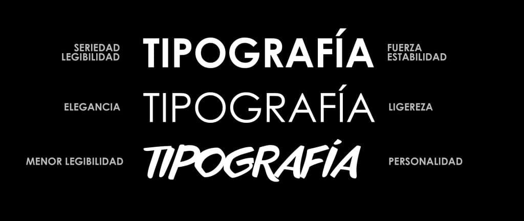
Typography styles.
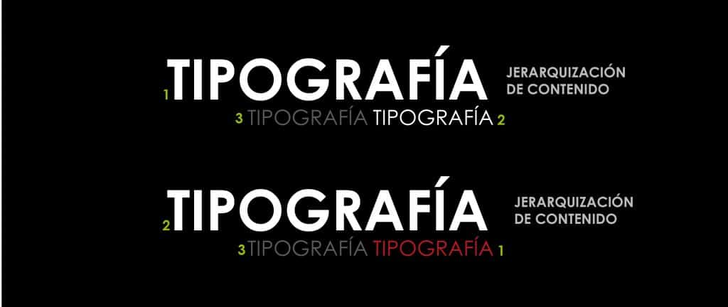
Basic typographic hierarchy.
An example of the use of a correct typography can be found in movie posters, this support offers a great variety of references to typographic compositions. Each poster has a very elaborate typographic work to correctly fulfill its objective. Next we will see some examples of the use of typography in this medium. You can see more movie posters in this websites.
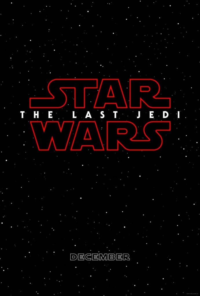
Unique typography that acts as a brand and distinctive.
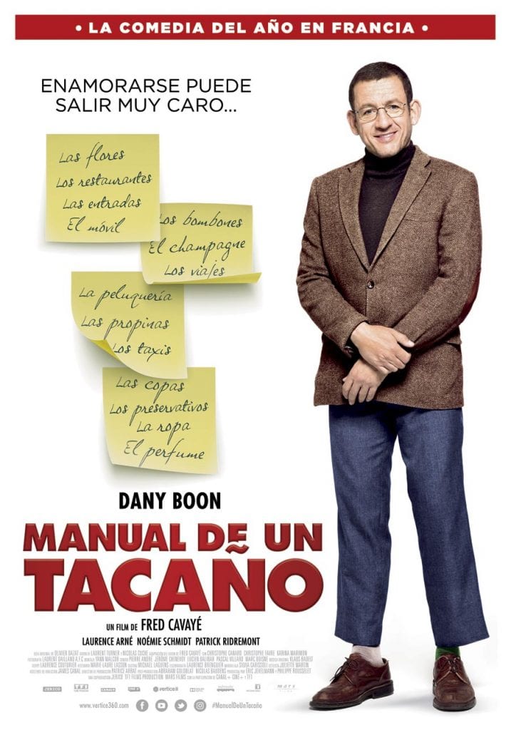
Digital typography combined with calligraphic for a personal touch.

Typographic contrast through the color and size of the typeface.
After this (basic) preview of some of the fundamental points when using a font, we can start looking for fonts in some font banks available at Internet, these resources are very useful when designing. In this post we are going to highlight one of them (the best known) DaFont.
DaFont It is a web platform that has a great variety of fonts with a catalog ordered by style, this system is very useful to download fonts quickly because we do not need to make any type of registration on the web to download a font. Another important aspect, the legal part that involves the use of a font created by a third party, is secured on the web thanks to a section where we can see what private property rights each type of font has. At a functional level it is very useful because it has a search engine where we can write any text and see how it looks with different fonts, this is very useful to try not to fill our PC with fonts (it usually happens hehe). Next we will see some screenshots of this website.
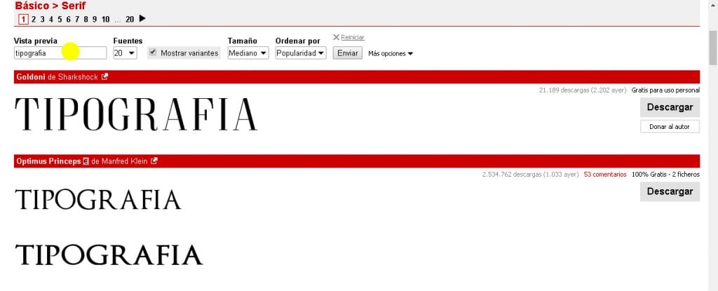
Download fonts.
With the basic information provided on the use of typography and a sample of a powerful typographic resource, we are ready to start investigating the world of typography.
Good article, until you get to the recommendation of Dafont, a typographic garbage can.
If you are a creative director, illustrator or web developer - whatever your discipline, typography is an essential part of design. There are hundreds of paid and free fonts available these days, but when it comes to type art, you can never stop learning about it or improving your typography skills.
Keep implementing yourself to the next level.
I completely agree, typography is one of the most important elements in the design field and it is important to know how to select fonts for each design and use different weights to create contrast.
Very good !!!
Could you give me the bibliography