
A few days ago we did a small review of the most striking trends of the last year in web design and today we are going to see how all these features have been applied to the sites of different companies, organizations and artists by the hand of Awards, a website that awards mentions to the most attractive and inspiring pages every year. If you visit their website you will discover a huge number of very creative websites that will inspire you when working.
Here is an analysis of ten of the best most inspiring web pages that 2015 has given us:

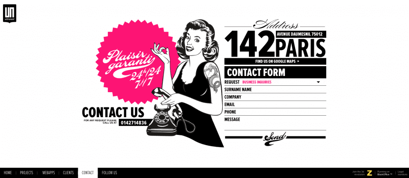
In it we find a flat, minimalist and very digestible design. It is a parallax design in which the screen is divided in half and in which the background of the background responds to the movements of the mouse. It presents light, striking colors and a deep scroll that will reveal each of the pages into which the web is divided. It also offers the possibility of navigating through a classic menu if we prefer it and for this we only have to click on the button in the upper left area.
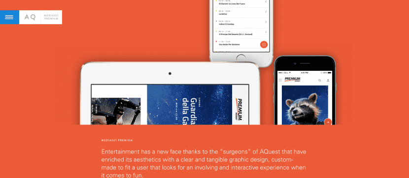
It presents a design where the presence of images and photographs carries a lot of weight. It offers different display modes to navigate through the contents and a large number of elements present simple animations such as the logo that is displayed in a positive and negative way. In addition, fonts are used in bold mode and the buttons are audible. The set is minimalist, avant-garde and attractive.
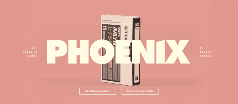
Extremely simple and attractive. It presents a background with flat and soft colors showing an object that rotates on itself as we slide the cursor across the screen. In addition, each time we click, the color of the background and the object changes, turning it into something quite curious and with a fantastic retro touch. Undoubtedly treasures brought from the eighties, mythologized and honored with great elegance.
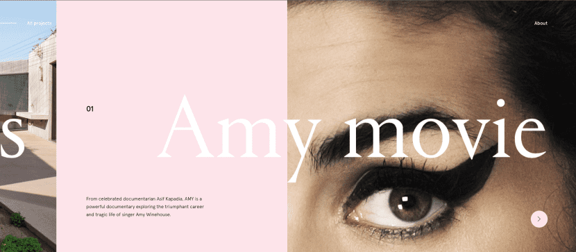
A formal but at the same time youthful proposal that makes use of minimalism and the use of double exposure to show its contents, also presenting certain retro touches. Its background changes every time we update the main page with different shapes, characters, hairstyles and objects like molds.
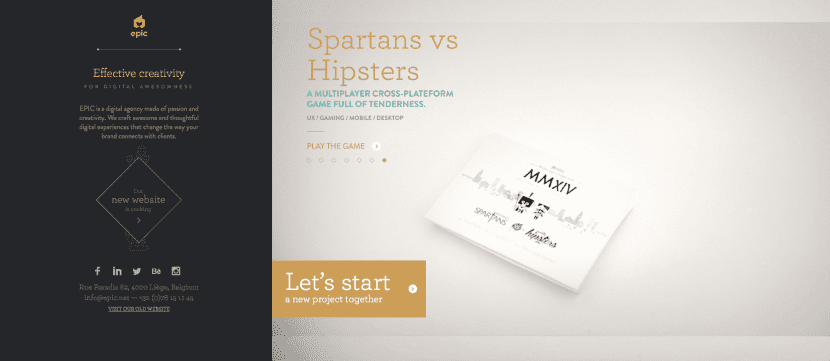
The example of the Epic agency is perhaps somewhat more ornate but no less elegant. In it, animations and videos are used to fill the backgrounds and flipping transitions are used to go through the contents of the web. Almost as if it were a catalog that exhibits his best works, the screen is divided into two very well differentiated halves.
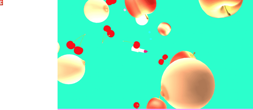
Posterle's proposal is tremendously psychedelic, which uses different videos as backgrounds that are exchanged every time we click on the left button of our mouse and that at the same time leads us through each of its sections. Most of our space is infused with outrageous and striking images: lollipops, breasts, bananas, cherries ... And as its motto: A romantic exploration of the perversions of the digital age. Without a doubt magnificent and remarkable, original. You have to see it!

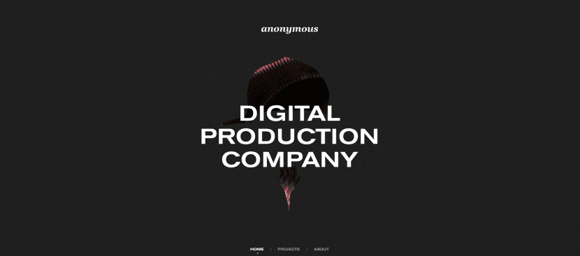
The website of this production company presents a clean and elegant finish in which image and video predominate. The transitions when going from one category to another are very attractive and the main page is infused with a refined combination of black and white.
Benjamin Guedj's website presents a parallax design that reveals its sections with very harmonious combinations of color, fonts and images. Its design is flat, simple, agile and dynamic.

http://www.mediamonks.com/work
If we compare it with the rest of the pages that we have cited, this one may be somewhat more traditional. As a header we find a video with the company logo and vertical slides to present the contents with each transition.
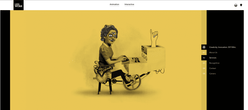
This study is presented to us with different characters of the strangest and a flat background. It is quite original and fun.
Finally, in this example we can see a functional, clear and precise design that will allow us to wander through its contents by scrolling and with a lazy appearance. A style that is a very good option if we try to offer a wide variety of content in a dynamic, clear and clean way.