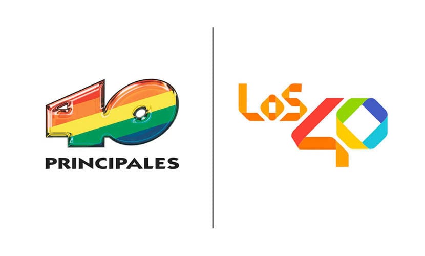
We have recently witnessed the renewal of the logo of Instagram without being able to escape the controversy that it has generated around social networks. However, it seems that we are in a somewhat turbulent month regarding this issue because The Top 40 has become the new public debate among designers and fans. The Spanish radio station has decided to resort to a new, much flatter and simpler design using multicolored strips on the occasion of its fiftieth anniversary by the Gold Mercury International company. In addition to modifying its appearance, it has also changed its name and now it becomes Los40.
Getting used to changes is quite a process that takes time, but from the looks of it, so far it has mostly garnered criticism and negative evaluations. The symbolic weight of this new election hides a link between the different cultures advocating one of their values: Diversity and global music. It is no coincidence that this is the new face of the brand, and it is a strategy to take advantage of these conversion times and change of era to adapt to the new entertainment format in the digital environment. Something that somehow needs to be related to the aesthetics and canons that prevail in web design, and that impregnates brands with a strong load of minimalism and simplicity that are not always well received by the public, especially when it comes to established brands and that come from a much more different, three-dimensional design and with a more recharged conceptual load, as is the case of Instagram and now Los 40 Principales. What do you think? Is it a step back?

As much as I look at it, I can't find anything that I like. Insulte, childish, unbalanced ...
I like the old one better, it had more personality
I like the old one better, it had more personality
making a negative comment seems to be fashionable, I like it, the truth is that it looks more contemporary and is part of the current trends, the other [although it sounds cliché] is outdated ...
I do not dislike it, what if I would change is the way you present "them" since the idea of the tapes overloads
Horrible, and the comment does not obey a strange pleasure in the free criticism, it is simply a TRUÑO, I imagine that seeing the new one from Instagram they have decided to present it
As in everyday life, no one mentions how well you do things… In my opinion, it is a logo that fits well with what is currently being built; it is light, retains personality, adjusts to the sound, maintains balance, there is continuity according to that line that structures it and creates criticism, which is fine for a logo.