
Once again we are talking about large companies that have marked an era for an entire generation. These ideas that arose from the beginning and with little budget, have become great over the years. Today, anyone can recognize the New Yorker logo. And here we are going to tell you its origin and history and how its visual identity has changed to adapt to the new times.
And it is that many will think that the brand comes from where its name 'New York' comes from but nothing is further from reality. Since this brand was born more than six thousand kilometers from New York. Born in Flensburg, a city in northern Germany with a name, more similar to what we can find in Spain as a "lifelong" family store, with local products, which does not stand out for the big brands.
The first New Yorker, she was not a New Yorker
PTo go back to the first New Yorker logo, it is difficult to find it as such., because his name was totally different. Just like here in Spain, we can find neighborhood stores called 'Zapamoda' or 'Las Oportunidades'. In Germany, his first name was 'Jeans Shop Number One'. Or as we can literally translate: The number one jeans store. Perhaps as an SEO description it is useful today for Internet searches, but it does not attract attention or establish a connection with the public at all.
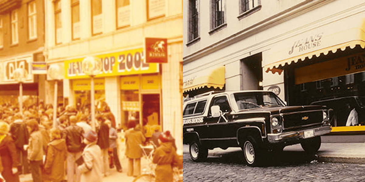
Much less if we talk about a logo, which would be very difficult to create on this basis. That is why there is no brand or anything, only a yellow awning with the name superimposed in black begins this neighborhood store. This store started in the year 1971 and it was not until the year 1976 when they started a second store in the city of Braunschweig with a name change More striking.
The name on this occasion would become 'Jeans House' (literally translated 'The house of the cowboys'). This name was shorter, more flashy and could be understood as a movement to create many stores as a franchise. In this version there is no logo as such either, but there is a more worked version. A more identifiable logo, curiously playing with black on yellow. Something that is far from the current version in red.
Now yes, the New Yorker logo
After several years, six exactly, it changes its name again, this time, definitely.. In 1991 the jean store would become much more, under the name of New Yorker. As we currently know a clothing brand that left jeans behind and became at the forefront of fashion in Germany at the end of the 80s. So much so, that in 1990 he dressed Miss Germany for the first time for the official gala.
But the New Yorker logo didn't start as it appears today. In 1982, the first store under this name was born in Kiel, also in northern Germany. Although the only image we have on this first logo is a red fluorescent methacrylate frame (That's where the color change must have come from) in which it was shown The New Yorker in two lines. This font emulated more of a freehand line with rounded edges.
It is then when they began to create stores throughout the country under this brand, with which they consolidated including garments created by themselves as the first FISHBONE. But it did not stop there, like other companies, they use the names of these brands, which have little identity of their own, to create their own line of products. They also created IQ, ICONO or SMOG among others.
The New Yorker logo
The current logo is made up of a central deformation, by the upper arc that does not affect the 'Y'. Which makes a differentiation between both parts of the name New and York. This makes the name more readable and clearly oriented to its meaning. As we talked about before, the color changes to a youthful red, which catches your eye when you see it from outside any store.
We see the logo represented in most of its stores in a striking way and in a fairly large size. The brand has established itself as one of the largest in the world of clothing in Germany and has represented different football clubs in the German league, placing advertising on their shirts.
Conclusion
The brand has tried to separate itself from its beginnings where a brand of jeans can only be represented. Now it is an international brand with a big name in many countries. Its image, although reminiscent of HM, has very different endings and style in its logo. In fact, this difference is seen in the style of their clothes, which they try to sell. Much more underground and casual.