
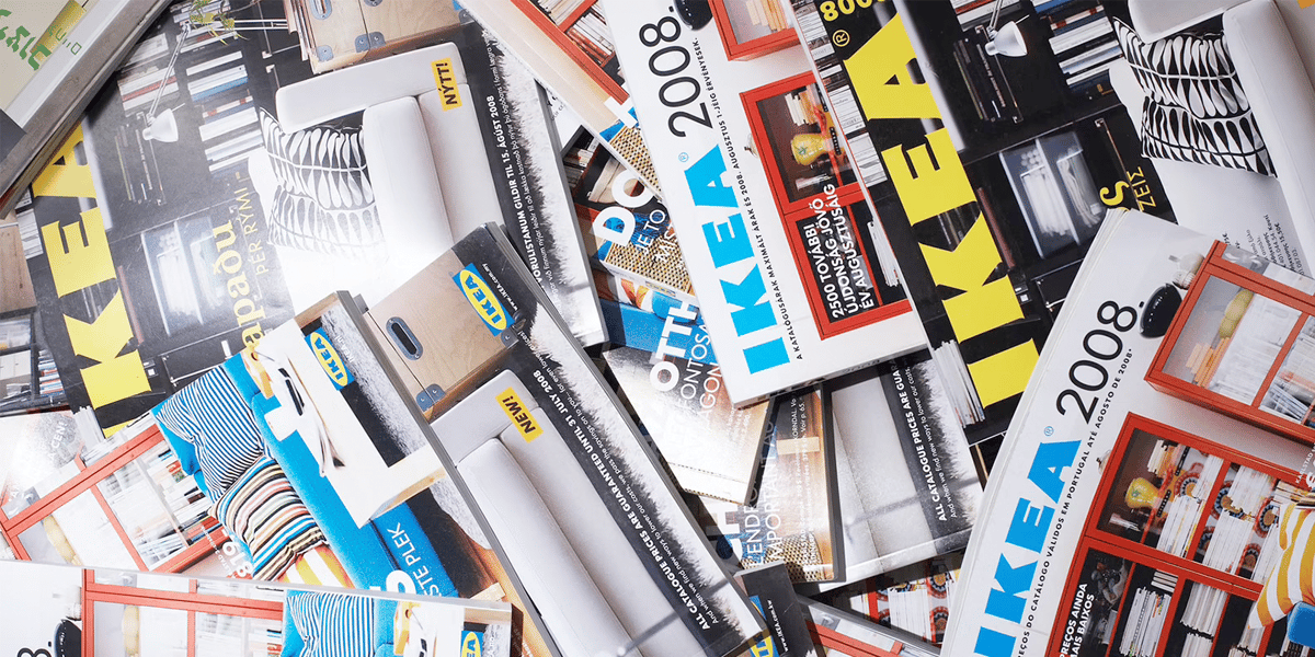
When we talk about a brand with so much experience, we forget where it all comes from and how it started.. Sometimes we take it for granted that it is there and we do not know the origin of how it was built. We can even imagine that the brand has been created as we see it today and has not gone through a complex development process to position itself where it is now. That also happens with IKEA. The origin of typography, its evolution and how it has led to the recognition it has.
The largest of the best-known furniture chain in the world was born in the south of Sweden and his design headquarters continue there. The set of its colors with a rounded shape inside a rectangle does not need any further introduction, since we could all guess what brand it is, but how did it all start?
IKEA Origin
![]()
The store started as a small business for its founder Ingvar Kamprad at the age of 17. He sold little things, like pens, picture frames, and purses. She did it around the farm where he had grown up, called Elmtaryd, near the Agunnaryd village. From there the history of the company began. Because, if we look closely, the initials of his name, of the farm and the nearest town make up the name of IKEA. So he had nothing more to add to start selling under this brand.
The first logo with the ikea typography was made in 1951. It was a wax seal that read 'Quality Assurance' around the Swedish company name. Also the IKEA typography included a tilde over the letter 'E'. This first typography of the logo is made in lower case and has nothing to do with the following ones.
Just three years later and by consolidating its own brand, the logo is modified, including the font in capital letters and removing 'Quality guarantee' since it was already something more recognizable. At first, the customers who could order from a catalog did not know the quality of their products, which is why it was good to highlight it. After this change, Ingvar held an exhibition so that customers could touch the product with their hands and try it beforehand. to buy it.
Change of logo and adaptation
After these changes came the official logo in 1967.. This did not yet have the current colors of the brand, but it did already have the shape and typography that would accompany us until a few years ago. Sharp, bold corners in a 'bold' font that resembles the 'Futura' font, within the ellipse and the rectangle that has characterized it ever since. This first one lasted 14 years in black and white. To later change to red on a white background.
These changes were already more striking, adding color to the image is also linked to the inclusion of color televisions and the digital image. Those colors were replaced by the current ones that represent the Swedish flag two years later.
IKEA typography for your texts
But this typeface is not only limited to the logo. Each brand must have fonts that they use for different purposes. For example, the typography that is used to name each of the furniture that it sells. A different one can also be used for the explanation of these texts or for slogans.
The curious case of IKEA is that they have never paid for a particular typeface, since they have used free fonts. The normal thing for big brands is that they work with a branding company to design a unique typeface that defines them, but this is not the case of the great Swede. Since it began and as we have said before, IKEA used a font called Futura. After more than fifty years writing catalogs with her, they switched to Verdana typeface. This typeface was chosen for its versatility, since it can be adapted to different countries, such as Asia, which has languages as different as China and India.
But recently, in 2019, they made another change, which was discovered by some Twitter users. ANDThis change continues to have the same discourse as with Verdana and that is that they justify it by being more universal. The new typeface for this is Noto Sans.
Google and Monotype
The curious font created by Google that has been chosen by IKEA has a reason. A project to create a universal and open source font to be used in any language. This font will have no distinctions and its name is most curious. Google Noto stands for 'No more tofu'. In fact, this name does not come from chance, its name is due to the fact that the typography is made in cubes, like tofu remains after cutting it into squares.
This project was created by Google's need to adapt its Chrome and Android operating systems to all users in the world. Since Android is implemented in different technology companies such as Samsung. In this way, IKEA has taken advantage of its open source origin to also implement it worldwide in its furniture chain.
Current logo and typography
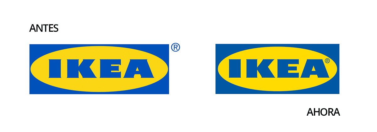
And with all these changes that it has been making, some bigger than others, we can talk about the IKEA logo and typography today.. In 2021, IKEA changed its logo again. This change has been the tiniest to date, since we actually have to look very closely to notice anything.
With respect to the previous one, we can appreciate a change in the typography, in the color and even in the trademark icon, but why is it almost imperceptible? Well, this is because the changes have been minuscule and mostly for a visual improvement. The only thing that changes in color is the hue. Before, they were more vivid colors, which made printing and signage not so effective.
The space has been optimized, modifying the oval and the rectangle that surrounds the IKEA letters. Distributing the same space on each of its sides. The horn spaces of each of the letters are larger, so that when the logo is reduced it can be seen clearly, as is the case with the letter 'E'. And the trademark icon is no longer left out, as an external element, but has been integrated with the brand. That makes a more uniform logo.
These small changes have been made by Seventy Agency, which is a branding and design agency for companies of Swedish origin as well.