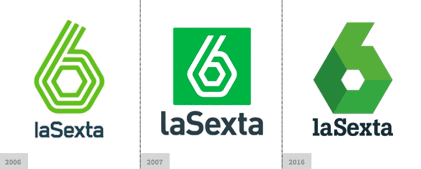
The Spanish television network has made a change in its corporate image due to its tenth anniversary which has aroused some controversy: Some understand it as a step forward in reaffirming their identity and style, although others have perceived it as a nonsense that will play against their image. As you know, this chain is a generalist chain that belongs to the Atresmedia group and it is something that has wanted to underline in its new appearance by adapting a more harmonious tonic with the rest of the members such as Antena 3 or Neox. To do this, a flat and geometric solution has been used, which over the years has become a little more simple.
The final result has been a reduction to a structure formed by cubes arranged on the silhouette of the 6 and that form a gradient of greenish tones from a lighter solution to a finally quite darker one and freeing our six from the green background which provides a more solid presence to the concept. For the chain name, the slab typeface has been used, Button.
In terms of color green remains the undisputed protagonist although now the bluish tones that touch the black take on a greater presence to highlight the green tones. Below you can see its evolution and a video where the new identity of the chain is shown. Personally I think it has been a very successful option, what do you think?


ºhttps: //www.youtube.com/watch? V = bDXXHKW5F94
Well, I don't dislike change. They have simplified shapes and brought it closer to the polygonal style that has the own media arts logo. To put a snag I liked the San serif font better.