![]()
Creative compositions can be made by all kinds of graphic schemes, bombastic lines, bezier curves or brushstrokes to create the different forms of expression.
But what first draws attention to our psyche or our emotion are the colors and the use of these in their due proportion. A graphic designer must properly know the meaning of each one and what relationship it has with the others in order to give the final touch to his work, whether it be the composition or technique used, or in this case in creating a logo.
If we go to the use of color in well-known brands, in their logos, we quickly see different associations and examples of the use of different colors. Ferrari with its red color is the clearest example of passion and fierceness, hallmarks of this Italian brand. We must not forget about black and white, since knowing them wear often accentuate certain elements of a logo.
RED
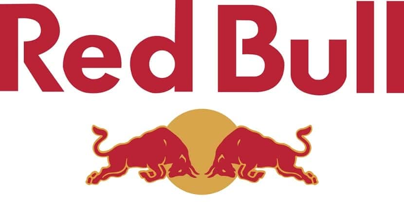
It implies passion, force, risk, danger or aggression, or even fierceness. It will not be a coincidence to see it in different brands of food such as fast food restaurants. The Foster's Hollywod star or the red that appears everywhere in Coca-Cola are other clear examples, apart from the one I gave about Ferrari.
Orange
The color of the innovation and modern thinking, but that always draws me back, at least, to the A Clockwork Orange movie poster. A film with a theme of ultra violence but that was all an irreverent call to modernity in the different elements that Kubrick's film contained. Let's remember the club where the leading band is going to have a few drinks. Orange also leads us to youth, fun and closeness.
Yellow
Another color that stimulates the appetite, but has different connotations, going through the sourness of the lemon, until the duller tones of autumn or what the sun means with the heat that accompanies it. Curious that we can see this color in different transport and purchase companies such as DHL and Best Buy, or IKEA itself, not forgetting McDonald's with its "M" in yellow and other composition in red.
Verde
Without wanting and wanting green is something that implies totally to nature, both to freshness, as all kinds of food. Carlsberg, being a beer, is one of the examples in the use of this color and without forgetting GreenPeace either.
BLUE

A cold color but that indicates serenity. One of the most used by different companies and that carries the meaning of professionalism, integrity and calm, apart from the two mentioned. It is also related to success and authority. IBM, General Motors, HP or BMW are among the best known examples that quickly come to mind.
Purple

An ambiguous color that can express wisdom, dignity, royalty and luxury. If we look at paintings by classical painters it will always be related to the upper class of society.
Pink
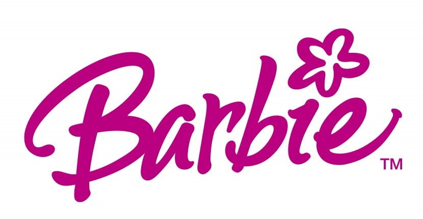
The color pink is feminine, just as fun can also be, although can be used with other types of motives, although not the example given as is Barbie.
Brown

With connotations with the rural and the masculine, the brown can be seen on the UPS logo.
Black
A color with duality, from the strength and sophistication until darkness and death. It is usually seen in a good number of logos to put the check mark on certain elements of it.
Blanco
On the contrary, the purity, cleanliness and simplicity it is for white. It will always have to be accompanied by another so that it is displayed in a logo as the background is blank. Like black, many companies usually have two versions for black or white backgrounds.