![]()
Calling by phone has been a common practice for decades. From the first huge devices, which went through a "cable girls" style switchboard, to the current smartphone. It depends on each country, the old image of a phone has different perspectives. In the case of Spain, the telephone logo is highly recognizable due to the importance it had in the early years of communication.
Since 1924, when it was established as a company, it has been providing telephone lines to many users. First, as a public telephone company in a country and now, as one of the most important worldwide. Nothing more and nothing less than the fourth with the largest customer base and the sixth with the largest capitalization in the telephony market.
What is Telefonica?
This is a company whose main name was "Compañía Telefónica Nacional de España". A company that was born as a state and public part to provide users of the country with telephone communication. It was born in Madrid and its evolution has been a constant ever since. Since now, as many users know, the telephone brand has a greater presence in Europe and America.
In addition to all the companies that have been created since then, with telephone services. Like the well-known Movistar, O2 and Vivo. Each one representing a different market, such as Spanish, European and Latin American, including Brazil where Vivo operates. That is why this company has had, since then, multitude of changes throughout its history in terms of the logo and commercial image which we are going to analyze here.
Public company, country logo
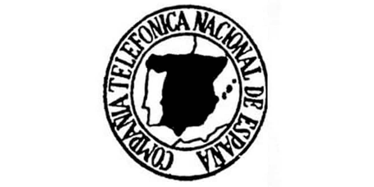
Back then, in the year 1924, the logos were representative shields of the company. They were only used sporadically and in more formal formats. Like the documentation signature, some kind of more institutional approach but with little scaling. That is why we can see a logo with so many elements, in black and white and that does not express much. regarding the brand.
In fact, we can see how the most representative thing is that Spain appears highlighted, as a State company and the name in the circular silhouette "Compañía Telefónica Nacional de España". All in black and white in addition to a small mark to indicate the Balearic Islands but where the Canary Islands are not found. However, despite its little utility in the application, the company did not modify any iota of the shield for more than 50 years.
And it is that at that time, the company was not exactly a brand that went on the market to compete. The public company provided a service that became increasingly essential. Without competition or advertising for you to choose which service or not to choose, he did not need it. Until in this market, other companies began to enter it.
The first change to a brand logo
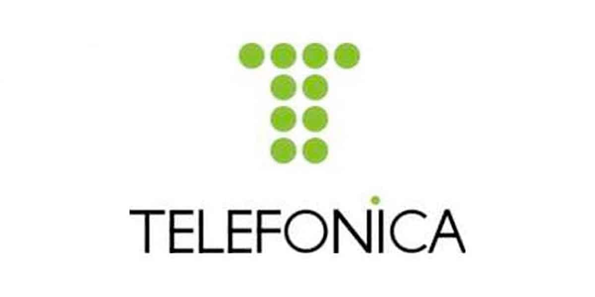
In 1984, just 60 years after its inception, the first change to a more recognizable logo was made. This already yes, it was not only a state company, but it was already a company with different clients and that offered different services. Its logo was going to be none other than the numerical image of the recognizable cable telephone. The sum of 10 points in the form of a "T" of Telefónica.
The 10-point logo had a light green color. The Telefónica typeface was a basic Sans in upper case with the dot of the "i" in green, matching the symbol. Something very simple and recognizable that did not last long in this way. Well a few months later, they embedded the dotted logo inside a blue circle. The word disappeared for several months and only that symbol remained.
Months later, the typography reappears with a greater identity. Clearly the new symbol wasn't as recognizable without the letters yet. The typography was more elaborate and thick and was in lower case except for the letter "T". Which has more prominence throughout its history. This new logo was already more applicable to all formats in which all devices were printed.
A few changes before the current logo
In 1993, the logo underwent a peculiar modification. Since they eliminate the blue and green colors of the brand. Something characteristic since all the cabins that we could find on the street had these colors. The colors became protagonists of the symbol, both of the "T" and of the circle that surrounded it. Its formation also changed, making the logo more informal and close. In a movement that called the new generations.
The top dots, from left to right, were viewed from largest to smallest. And from top to bottom they went from a light yellow to a darker blue. All this, symbol and typography were solved with an italic, which today many people will recognize printed on their first cable phones. This print, in many of them did not have color, but the shape was recognizable in every home, at least in Spain.
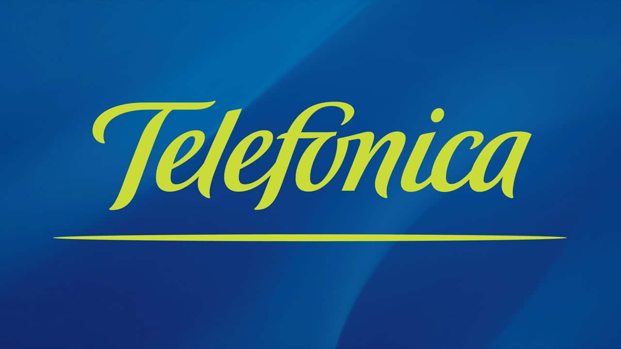
After this, in 1998, the company reverts to its traditional colors of green and blue. Of course, in this change the isotype is removed and only the name exists. This typeface was made in “handwriting” format, in lower case except again for the “T”. The union of the "O" and the "N" simulated the tilde that did not appear in the first symbol of 1984.
current logo
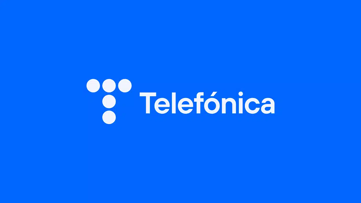
In 2010, the company stopped selling on its behalf and used subsidiaries to provide different types of services.. This is how Movistar, O2 or Vivo appear on the scene and are dedicated to selling products. Thus, Telefónica remains as a matrix of all of them and is dedicated to more corporate issues within the brand. Its recent change in 2021 is in line with this and uses the first logo to be more recognizable in the market.
On this occasion, the logo is cleaner, with more friendly colors and in keeping with its time. Returning to the points from before, in this way they have simplified showing only 5 points. Thus, it becomes just as recognizable but with a more consistent and scalable visual aspect to today's digital formats.