
What would you tell me if I asked you what a bad logo is? I think that a bad logo is one that fails to fulfill its communicative function in an efficient way. Bearing in mind that the main function is to endow a company with a specific positive identity and values, when distortions of these values occur and some ends are left open, a dire brand reputation can be obtained.
Here are some practical cases of it. If you thought you had seen it all, today here you will discover that there were still new atrocities to see.
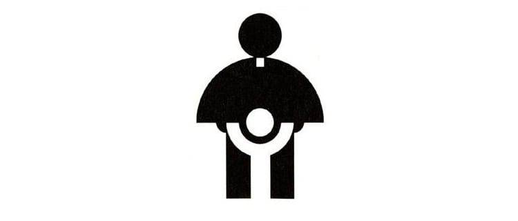
Of course, the designer of this logo did the image of the Catholic Church no favors when he developed it around 1973 for the Archdiocese's Youth Commission. Its purpose was to reflect a beautiful message (as you look at it clearly), since it tried to create a bond between the Church and the youngest. But, seriously? Was there no other way than the crotch of our priest? Logically this had tremendous repercussions and was echoed worldwide.
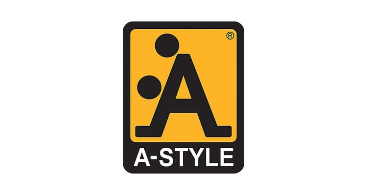
A classic among the most controversial logos. This clothing brand used a capital letter adding two circles that gave it a more suggestive tone.
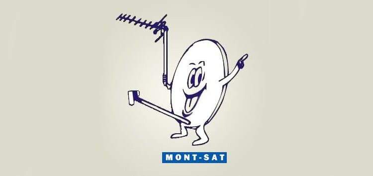
Mont-Sat's strategy was to create a friendly and sympathetic mascot, but once again the crotch of our logo comes out. The strangest thing of all is that it holds a traditional antenna ... Why?
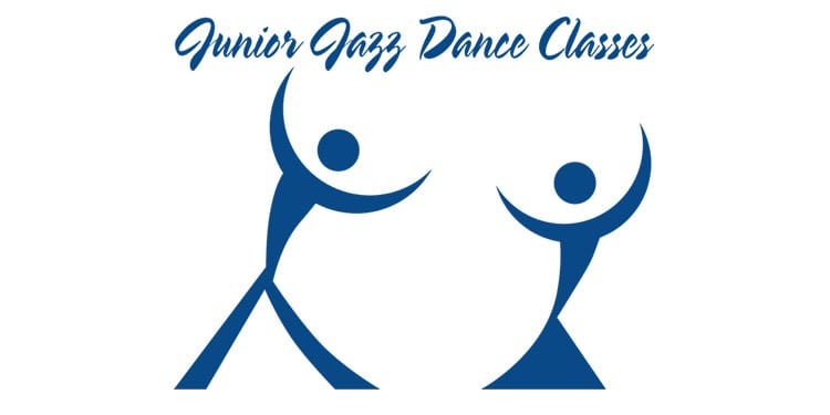
Two young people dance energetically before our eyes under the wake that leaves an unintelligible typeface and that demands an extra effort from us to be able to read the four words. After spending about a minute trying to decode the mysterious message, we found a naked female torso. Again?
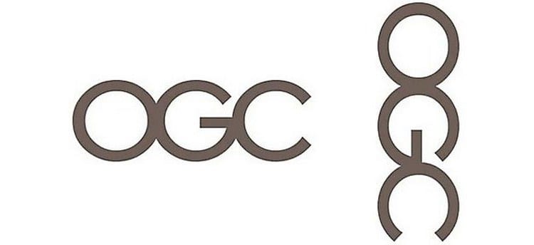
An innocent, common logo. Nor is it an aberration, but by itself it would not stand out ... Unless we decide to read it vertically. Then the message changes radically.
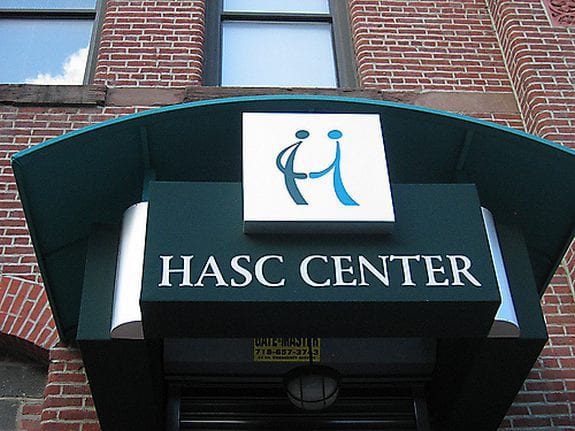
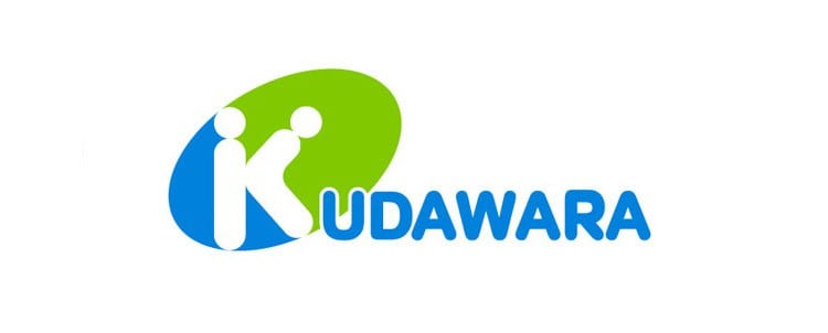
Hasc Center chose to represent their label with a very friendly greeting between two people. Too friendly would you say?
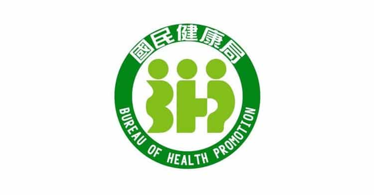
A somewhat strange logo for several reasons. The initial letters of the Taiwan Health Bureau mysteriously blend with the human figure, resulting in deformed or malformed individuals. The letter in the middle, how could it be otherwise, presents a figure protruding from what would be his pelvis, while the one immediately next to him has a cavity ... Again or is it me who has a dirty look?

A minimalist, schematic and even elegant logo. Yet it leads us to a somewhat disturbing reading again. Would you take your children to this pediatrician? I certainly don't.

Double meanings are dangerous, here is the convincing proof: A beautiful golden sunset can suddenly turn into a year. In fact, I first saw a year, then I stopped to observe it and saw that it was indeed an architectural construction on a sunset.
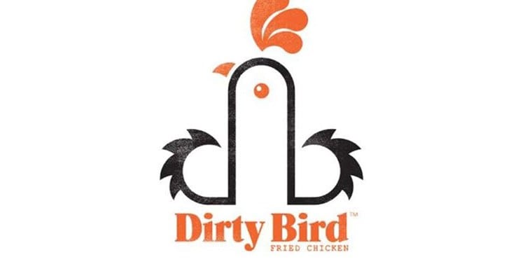
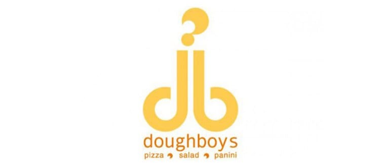
A chicken materializes through the concatenation of the letters D and B. The name of the brand, Dirty Bird (dirty bird). The conceptualization is fine, but it is clear that there is a second reading, quite graphic and obscene.
Here is one of the consequences of the A-Style logo. As a result of its publication, numerous logos began to appear as well as those who do not want the thing that double meanings adding unnecessary points to the capital letters.

This bakery dared with a logo that gave it an unexpected reputation. Although it is a classic family business, its corporate image can make us imagine very different things.
Is it necessary to make any kind of comment? The double meaning is more than clear in this piece.

Overlap can be misleading. Sometimes it is necessary to save space and condense all our shapes in a restricted area. In this case, it was quite an act of bravery and probably made many customers request an extra service. (?)
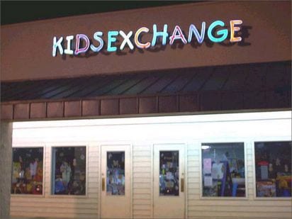
Kids Exchange can quickly become Kid Sex Change, here's the proof. Kerning is for something, right?
Does it sound familiar? It is very similar to the case of DirtyBird, only that in this case the letters d and b are crowned by a question mark (totally unnecessary by the way and that I think has been placed with the intention of accentuating that double reading with sexual content).
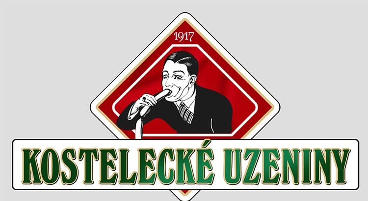
The brief in 1917 said: we want our company to be represented in our logo by the type of client we are looking for; a man, 40-50 years old, elegant who likes sausages. A more literal logo cannot be found on this list. The strangest thing is that after almost 100 years no one has wanted to change it.
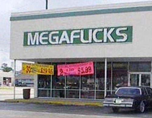
Another kerning problem, leading to reading problems. The owners of this store would have saved quite a bit of headache by just adding a few inches of space between the L and I.
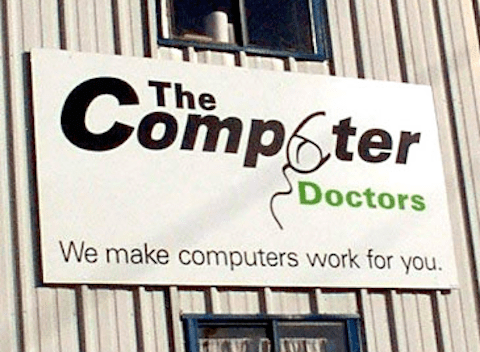
These doctors asked for a logo that clearly shows that they can repair anything and after several revisions they decided to keep this one. They also seem to fix problems in the male genitalia.

This logo seems made by a designer with photoshop in the year 2000, possibly he was also a lover of science who did not know much about color theory.
A suitable typography choice but a bad use of colors. This logo could be a good logo were it not for the damage it does to the eyes.
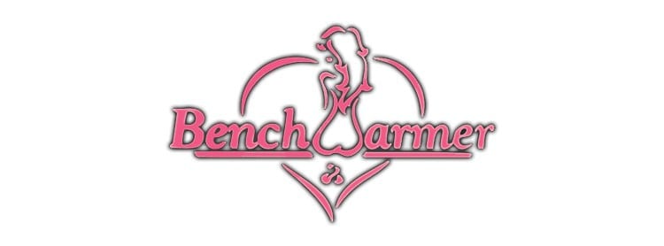
Surely the designer of this logo never thought that a naked woman with a flame under her could look like she was relieving herself. Surely the client did not notice it when approving it and that is why it now belongs to this list.
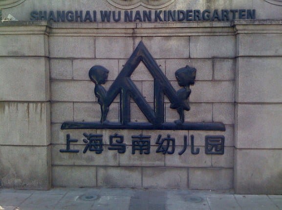
This kindergarten looks dangerous from its entrance. Two children joined by the roof of a house or something similar, make it seem a little scary, but the oriental culture is very different from ours.
What a good compilation!
Until 2002, in Spain the state health system was called the National Health Institute, which is why “INSALUD” (NO-Health) was written everywhere. How are you? Therefore, it is not only Logos that are chosen poorly.