
Choosing the correct typography to work with in any design project is not an easy task. On many occasions, it takes much longer than you think to make this decision, since with the large number of different fonts that we can find, it can become somewhat expensive.
On this occasion, we are going to try to help you in this election, showing you some of the best perfect bold fonts to design corporate identities, posters, cards, etc. All of them have not only a unique style but also a very careful structure and design.
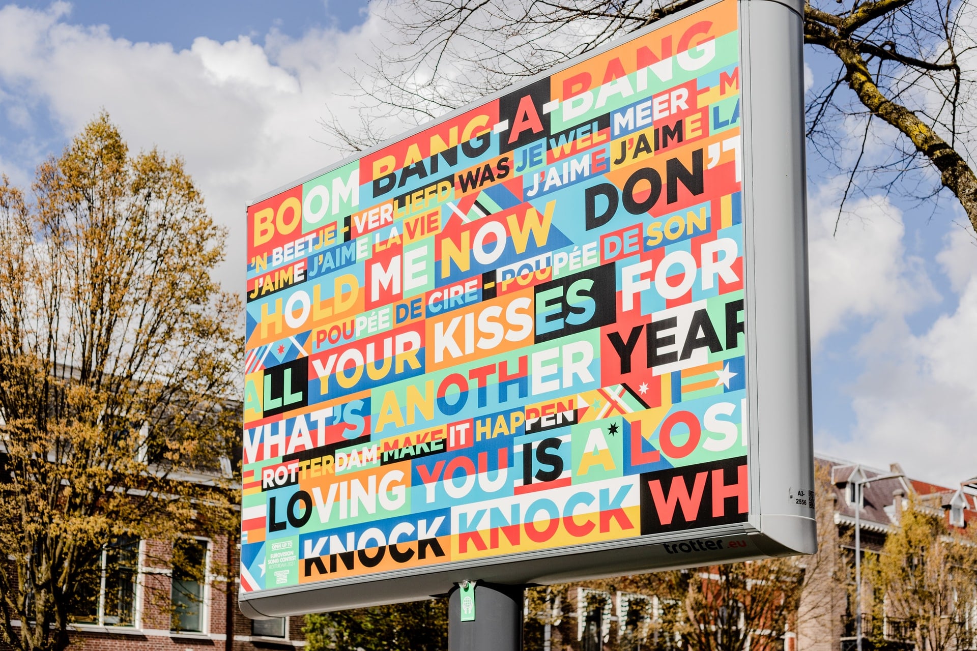
thick fonts, They are the ones to capture the attention of the public.. They combine modernity and elegance between their layouts and this is what we are going to see today. They are very powerful when it comes to getting a message across to that audience we are talking about, they are fonts that will accompany your compositions in the right way.
What is a thick font?
As we all know in typography, bold, thick or bold, as you wanted to call it, It is a typographic style that is characterized by the fact that the characters it includes have a much thicker stroke. than other type weights. The main objective of this style is to highlight and emphasize the textual part.
The use of thick fonts in the world of design has undergone a revolutionary change, becoming a indispensable element of the compositions. This trend in graphic design has had a boom in recent years and as many say, size does matter.
With this type of fonts, the designs are more focused towards a more minimalist style, where the sizes of the letters are very large in order to impress. They are designs, where typography takes center stage in the composition.
Giving personality to the textual part is the main objective of this trend to use large and very thick fonts. You know, If you don't want your designs to go unnoticed by the public, join this trend.
How to choose the right font?

good typography, it helps to communicate both the image and the message that we want to make known to the public about who we are as a company or brand. On certain occasions, a poor typography choice can distort that message and fail to connect with our audience.
To prevent this from happening, then We leave you some basic aspects for a correct choice. Emphasize that these tips that you are going to read are not a magic formula and you will find the indicated typography at first.
The first that you have to take into account is the target audience you are going to address. Both the typography and the design in general must agree with the tastes of this audience. It is not the same, a design aimed at adolescents than at people of 70 years.
La typeface you choose, it must be related to the message you want to launch. For each type of message, there is a suitable typography, think about whether it is going to be informative, educational, promotional, etc.
Another very important aspect is know in which media your design will be reproduced, if it is going to be in a book, a poster, logo, etc. The typography, depending on this and the required style, will be more or less legible. In addition to thinking about the sizes in which it will be used.
One of the fundamental steps that will focus on knowing what you want and what you don't, is the search for references. With these searches, you will compare different styles within the same classification. With this, you will be able to get ideas of what you like in order to facilitate the final choice.
Examples of bold fonts
We have already told you about what these types of fonts are and what their purpose is to highlight and draw the attention of viewers. So the time has come, you showed some of the best examples of this typography.
Big John
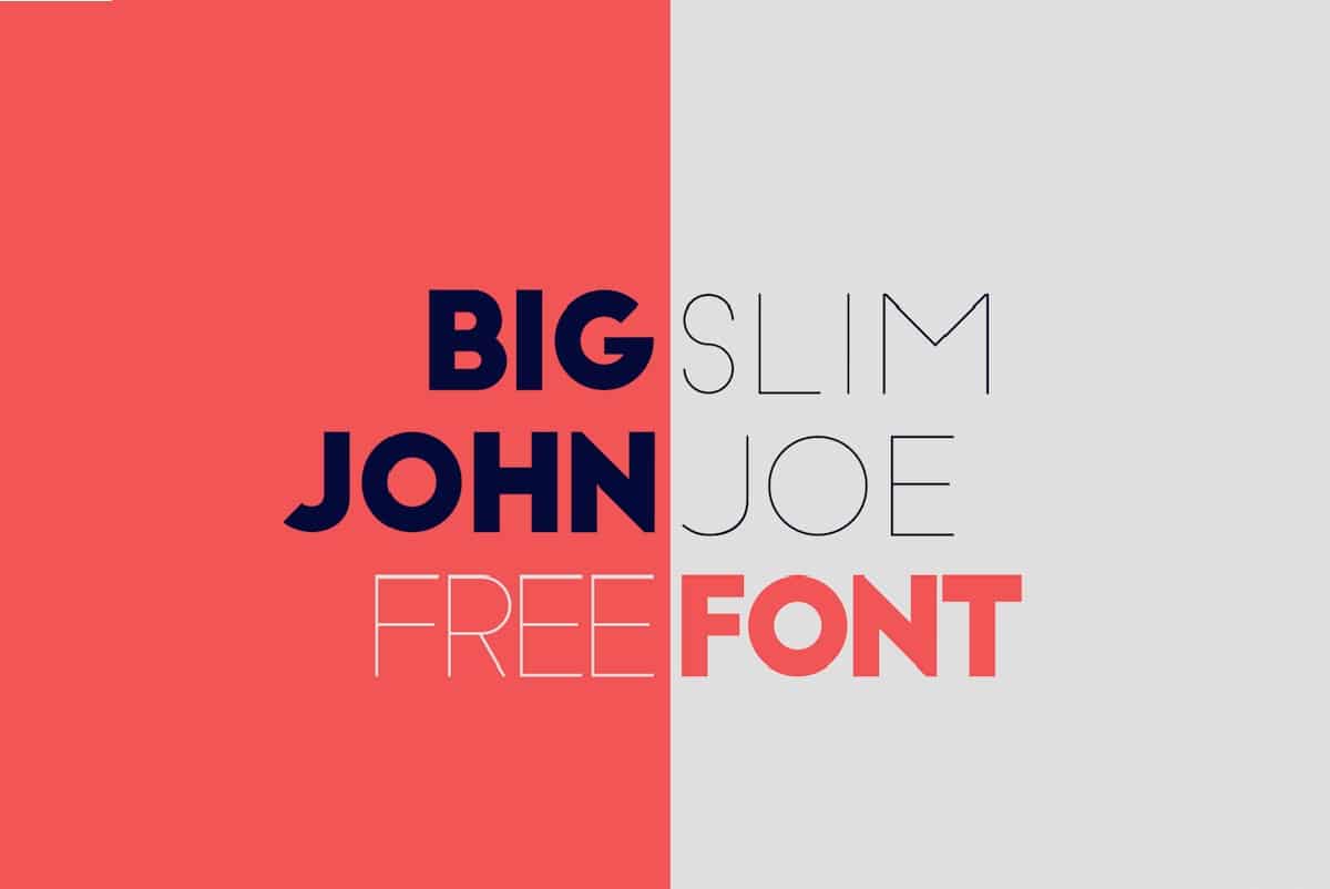
https://www.dafontfree.io/
Available for download on the Behance web portal. It is a geometric typography, in which you can find two different weights, both with a modern style.
Cooper hewitt
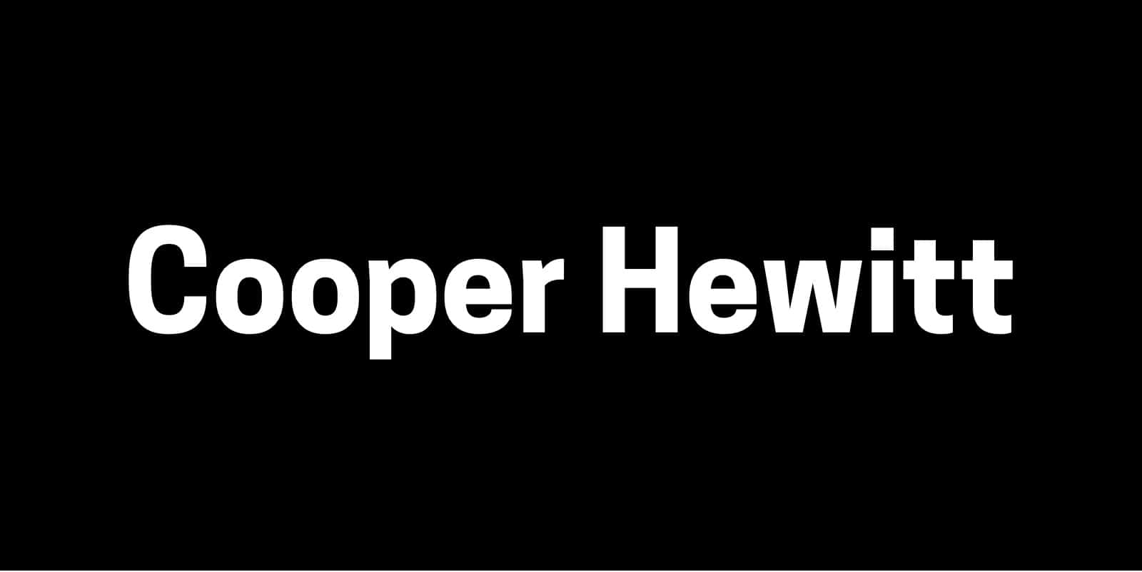
https://beautifulwebtype.com/
Contemporary sans serif font, available in a free version for download. Their Characters are formed by arcs and geometric curves.
bully

https://www.creativefabrica.com/
With a hand drawing style, we bring you this fun thick typography. You can use it, both in titles and in identity designs, since it works correctly in any project.
Future Next
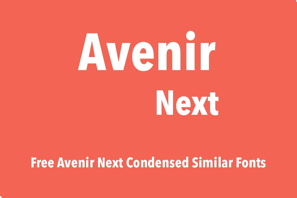
https://www.dafontfree.io/
It belongs to the Avenir typeface family. This version that we present to you, is ideal for large design projects and a wide variety of supports. It adapts very well to outdoor advertising, social networks, advertising designs, etc.
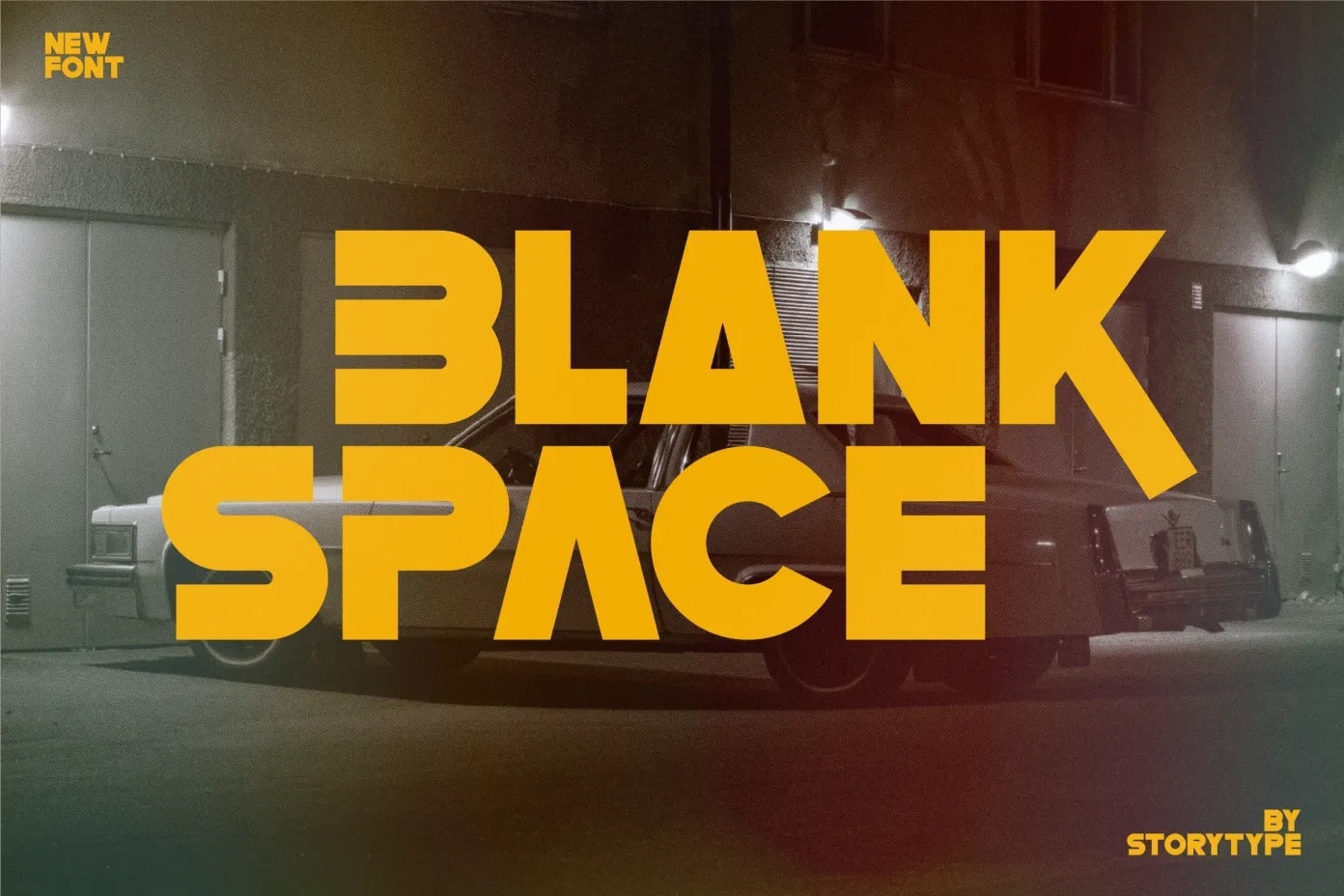
Blank Space
https://befonts.com/
Another perfect example of thick typography, suitable for any project you have in mind. This font is ideal for posters, social media posts, brand identities, etc.
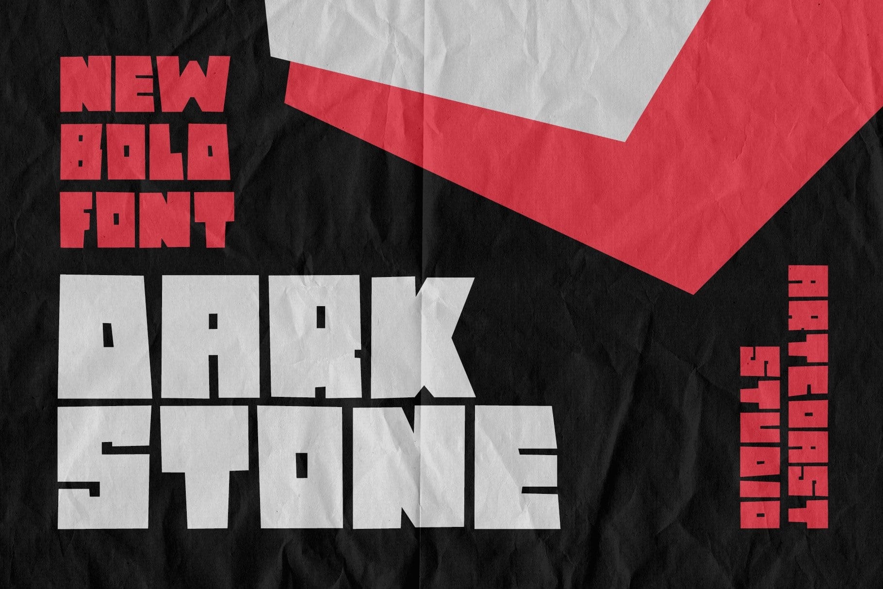
Darkstone
https://fontbundles.net/
Bold typeface, only with uppercase characters. If you want to add to your designs a bold and contemporary character, this typeface is indicated.
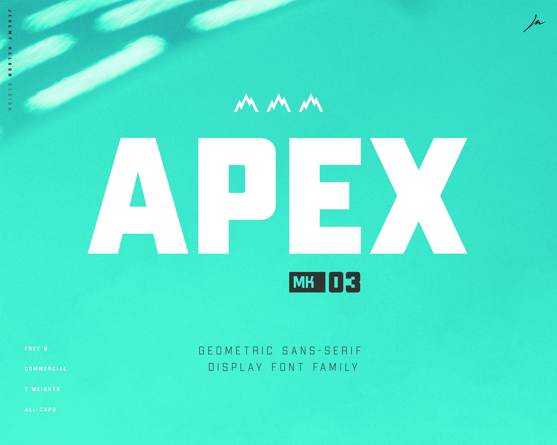
Apex MK 03
https://fontsrepo.com/
Sans serif font, which brings together a very robust display style. For its creation, its designers were based on the classic geometric shapes that we all know. This font will give you a lot of play in both large and small sizes.
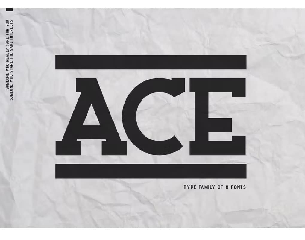
ACE – Ace with Serif
https://elements.envato.com/
Serif and thick, a perfect combination to add to your designs a elegant and daring style. For the creation of his characters, he has played with simple and geometric elements.
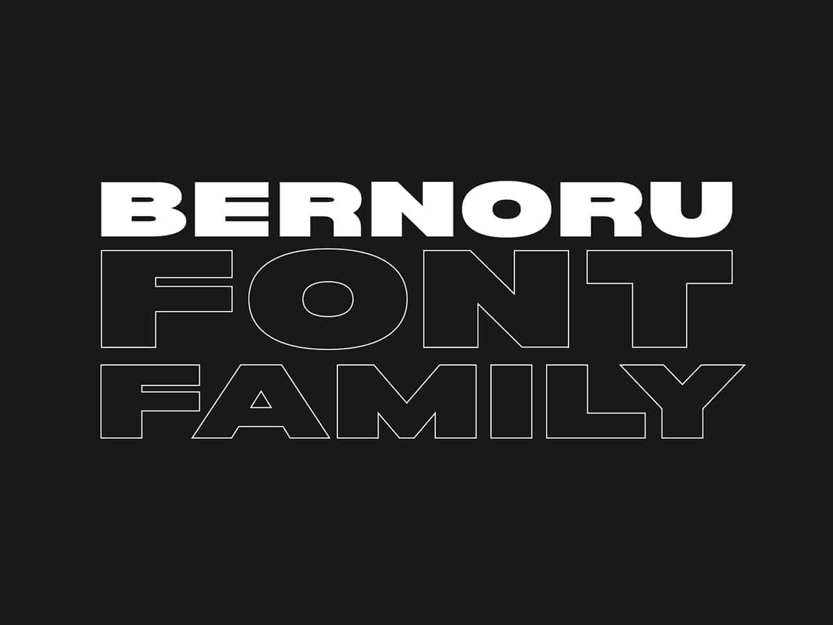
Bernoru
https://www.behance.net/
Striking and perfect is Bernoru Sans. With a very personal style, has been conceived to be used in poster designs, corporate identities or headlines.
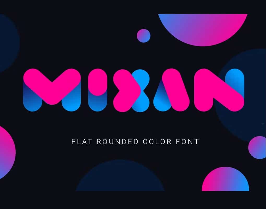
mixan
https://elements.envato.com/
Rounded and thick characters, with a shiny style. Its letters are both bold and bicolor. Mixan, can use you in posters, identities or titles of books or magazines.
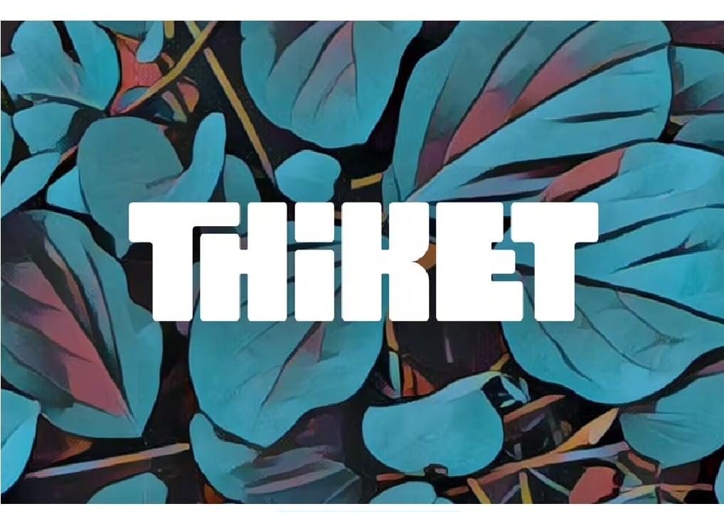
Thiket
https://elements.envato.com/
Let it be clear from this example that a thick, condensed typography can also be elegant. The way in which its characters are combined is very attractive visually.
There are many options and variety of thick fonts, so you must be clear about where you are going to use them and when. Use these fonts when you want to emphasize something.
As you already know, using many fonts with this weight can be overwhelming, but if you know how to combine them, you can create an amazing design.