
Things to avoid in a design when we layout text to make our text readable by users and work correctly. The text in a design is a fundamental element that must be treated correctly if we want the message to reach the user clearly, this is why we must ensure that the text works correctly.
Each text is different depending on the design but the fundamental rule for all texts is to get the information to reach the user. We must avoid visual loads unnecessary that do not add anything to our design and complicate the reading of the text. In this post we will see some basic ideas about what not to do when working with text in a design.
Use unreadable fonts
When we are working with a text the first thing we must achieve is that the text is readable, It is useless if our text is very attractive on a visual level if afterwards the readability is bad. The correct typography depends on the designLayout of a book is not the same as layout of a poster, both are different and require greater attention from the user. If we are working with a long text, the ideal is that it be very legible for facilitate reading. If our text is a headline we can play with other types of fonts but always thinking of a good readability. We must avoid all those very calligraphic fonts which are very beautiful visually but very difficult to read.

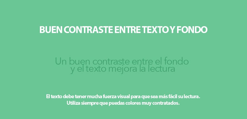
Good contrast between background and text
Whenever we work with text we must achieve a good contrast between background and text for increase readability, a very common mistake is to use a background color very similar to that of the text. If we look at the texts of a book we see that the paper is white and the text is black to make it very legible, if instead of black we used a color it would make reading worse and it would tire our eyes. We have to see the text as if it were a traffic sign, it should draw our attention so that we look at it and know that it is there.
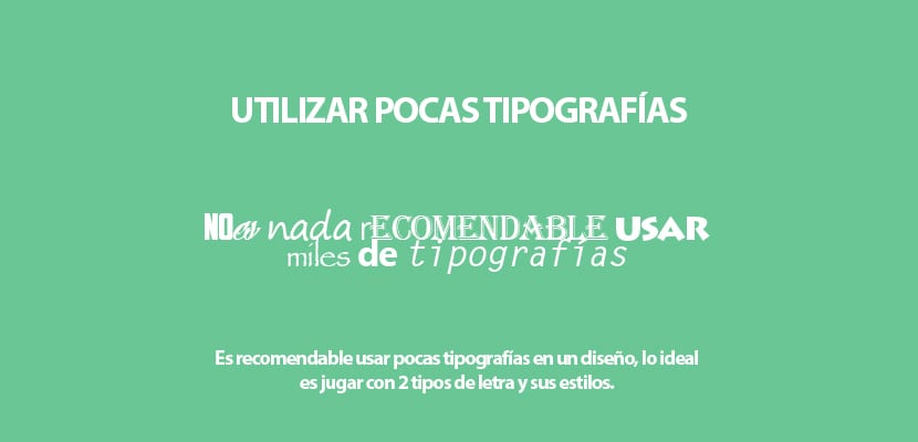
Use many fonts
It is very common to see designs with thousands of different fonts thinking that this achieves a better result, the truth is that this just make it worse all. When we work with a text, it is recommended use a maximum of two fonts and play with their styles (bold, regular ... etc) to create different contrasts in the text. If we are designing an editorial project such as a magazine and we want to add a headline and a subtitle to our design, it is recommended use the same typeface but with two different sizes. The key to good design is to achieve a harmony that works and not a pastiche of elements that do not achieve anything.
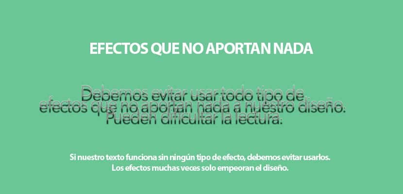
Effects that do not add anything to the text
Must avoid whenever we can use all those effects that are added to the typeface that do not add anything to text only make reading difficult. An effect can be used when there is a reason for it, either because of the theme of the design or for some reason related to style. Avoid applying effects to texts whenever you can and play with another type of contrast to get a better hierarchy.
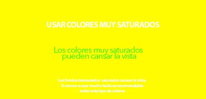
Very saturated colors
When we are designing with text we must avoid using very saturated colors in backgrounds and texts, the use of these colors can tire your eyes when the reading is long. It is advisable use low gloss colors for long texts. We can use these colors in small texts that do not require a very long reading.
Using too many colors
It is not recommended turn our text into a multicolored piñata full of thousands of colors, the ideal is use a single color and if our design asks us to add some in a subtle way to highlight some detail. When you are working with a design ask yourself the following question: Why use more colors? Do the colors contribute something?Using many colors will only break the content hierarchy and drive the user who reads that text crazy. Color can be an excellent contrast resource to tell the user that this text is more important than the rest, if you use many colors this idea is lost ...

Don't establish a hierarchy
Each text in a design has different degree of importance, this is why we must define the hierarchy correctly of content by applying different types of contrast. A very common mistake that is made when working with text is not defining the importance of each text, we must define which parts are most important in our text to later apply contrasts. A headline will always be larger than a sub-headline, the same happens with a long text and some detail that we want to highlight, such as a quote. We can use contrast of body (bold) of size, color ... etc.

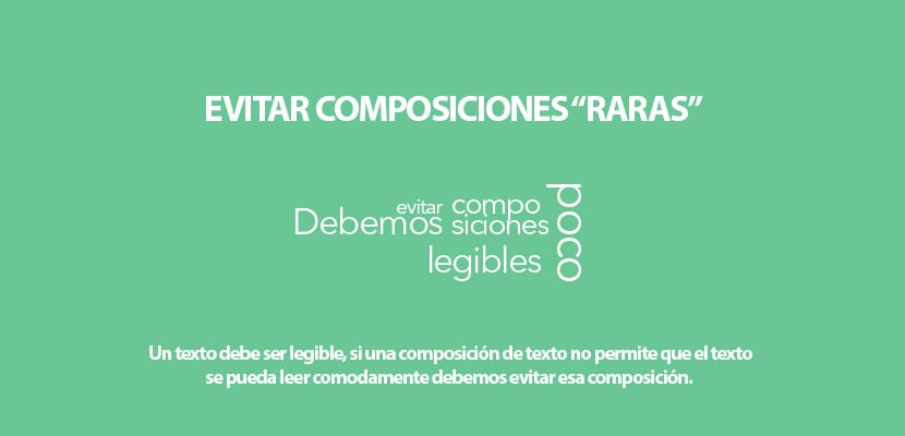
Rare compositions in the text
Many times our creativity attacks us and we create a "highway" with the text of our design creating rare compositions that are very difficult to read. We have to think logically when we work on a text and ask ourselves a series of questions: Is it read correctly? it is understood? Do you have time to read it? A text for a billboard is not the same as for a magazine, the former must be able to be read quickly while the latter is slower to read. Always look for a reason to create more creative compositions with text.
Working with text is something that requires a lot of time and detail, a good text is subtle but striking, a good text draws our attention with whispers and not with screams. When working with text, it is highly recommended that you do a small field study where you see many visual references (magazines, books ... etc) to inspire you.