
With the arrival of Android Q the great G has shown how its developers created the dark theme for their apps just yesterday. A great opportunity to understand how Google designers work with Android apps.
It is in a own dedicated website for these purposes in which the Google Design team shows the treatment received for the dark mode for Google Photos, Calendar News and Android Auto.
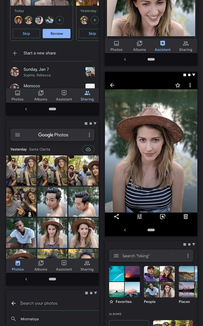
At first, the Google Photos team it was helped by two elements to focus the change on the dark theme. In gallery view, the background is dark gray to reduce contrast, while it is turned to full black to view a photo in full screen. So black is only used in the full screen presentation of a photograph.
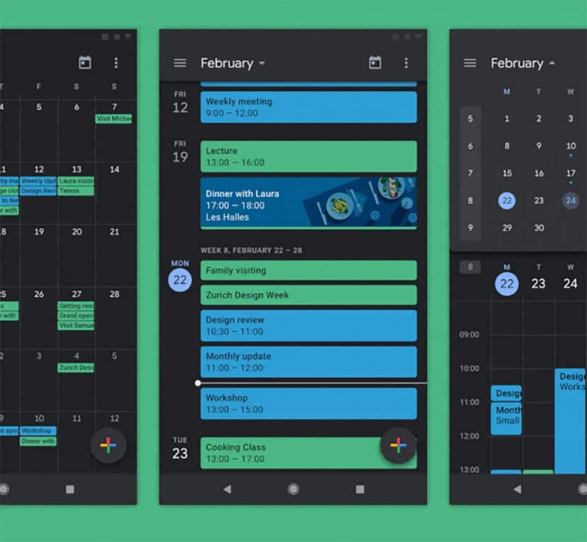
For the Calendar app, they were strictly based on the readability of events in design guides. The colors customized by the users themselves are converted to lower their saturation and thus blend perfectly with the dark gray background.
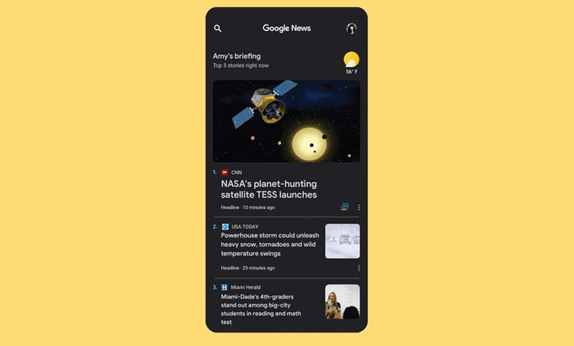
On Google News he was more challenging to lie in the external content of media news. The issues range from icons that don't have proper transparent backgrounds, leaving you with a blank line for media like USA Today, and those featured images that could turn into a hodgepodge of dark colors. They finally decided to choose a lighter gray color that reduces contrast and works in a similar way to what is seen in Google Photos.
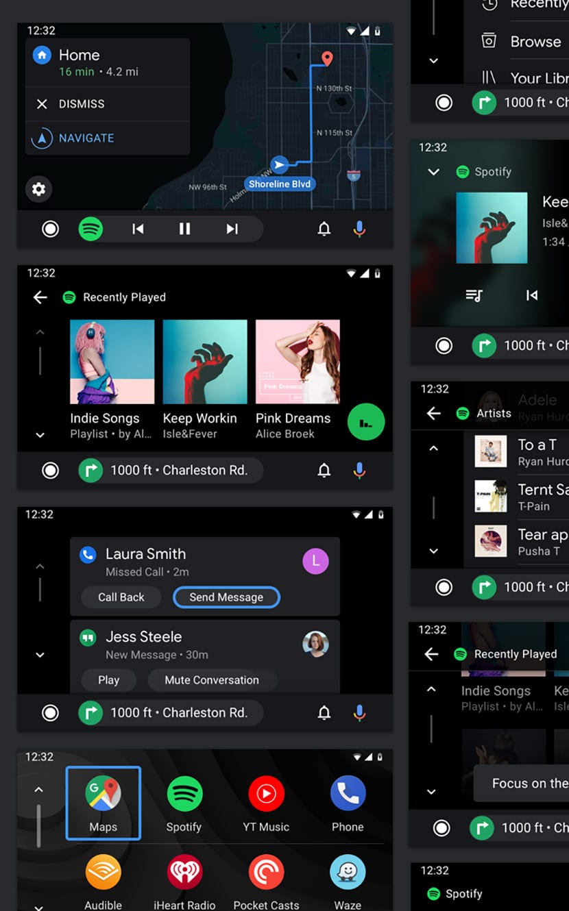
Finally we have the redesign of Android Auto with that dark mode. Mainly were based on having a more intuitive interface and as direct as possible. By using the raised layers with different shades of gray, the team was able to address the hierarchy in information. Here, the black background is the best solution.
El website we referenced of Google.