
Then we will let you know the three wayfinding fonts to fly also known as fonts for airport signage. And is that the wayfinding, also called a signaling system, its main objective is to help develop good guidance systems that have the particularity of allowing people to arrive in a way easy and fast to a destination and although it appears to be invisible to the human eye, it is something that is used frequently.
Usually It is found in large areas, such as, for example, shopping centers, museums, large companies and even airports. In the latter, its use it has become indispensable due to the large influx of travelers, in addition to the enormous space it comprises and the large number of services they offer.
What is wayfinding?

The wayfinding is very Useful, mainly in the international airports, in which the alphabet is completely different from what many people know, so it is necessary to be able to be guided by signs and not of words.
If you pay attention, you will notice that all airports use the same type of typographic font; in addition to using the same details in the signs. Typically the most frequently used fonts are: Frutiger, Helvetica and Clearview.
It can be stressed that it would actually make a little more sense use a sans serif typeface and not one of the ones we mentioned above, because these are usually easier to read being certain distance.
Frutige
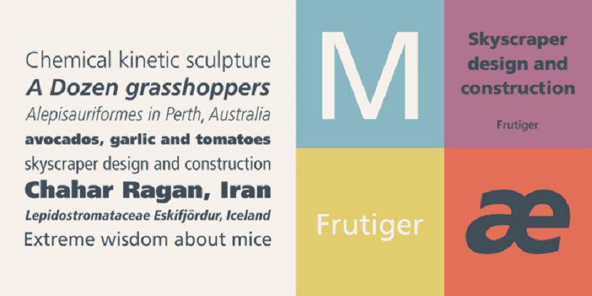
The Swiss typographer Adrian Frutiger created in 1975, this typeface mainly to be used at the airport Charles de Gaulle of Paris.
Before this he had successfully created the Univers typeface, which is a font that comes from the Sans Serif typeface, but he wished to be carried away by a thought “out of the box”, That is, he wanted to get out of his comfort zone and design a fully custom font that would reflect the characteristic spirit of contemporary architecture that this airport had.
Frutiger is a typeface that is known for its prominent ascending and descending, as we can see in the letter "p" and "l", in addition to slightly closed openings inside, as clearly shown in the letters "n" and "e".
Helvetica
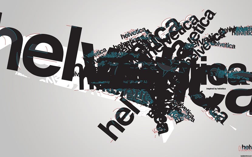
To define this kind of letter, it can be said that it is the oldest wayfinding within the world, because Helvetica is close to having planet century life, from the moment it was first created in Switzerland.
The characteristics of Helvetica stand out for being those of a classic, neutral and familiar. Despite already having a long journey within the wayfinding world, this typeface has managed to stand up to the years and be preserved young and current.
El Helvetica goal is to make it easier read The texts without confusing certain letters, as is often the case for example with "o" and "a", this has allowed the Helvetica typography to survive successfully during all these years, even after going through different redesign processes.
Clearview
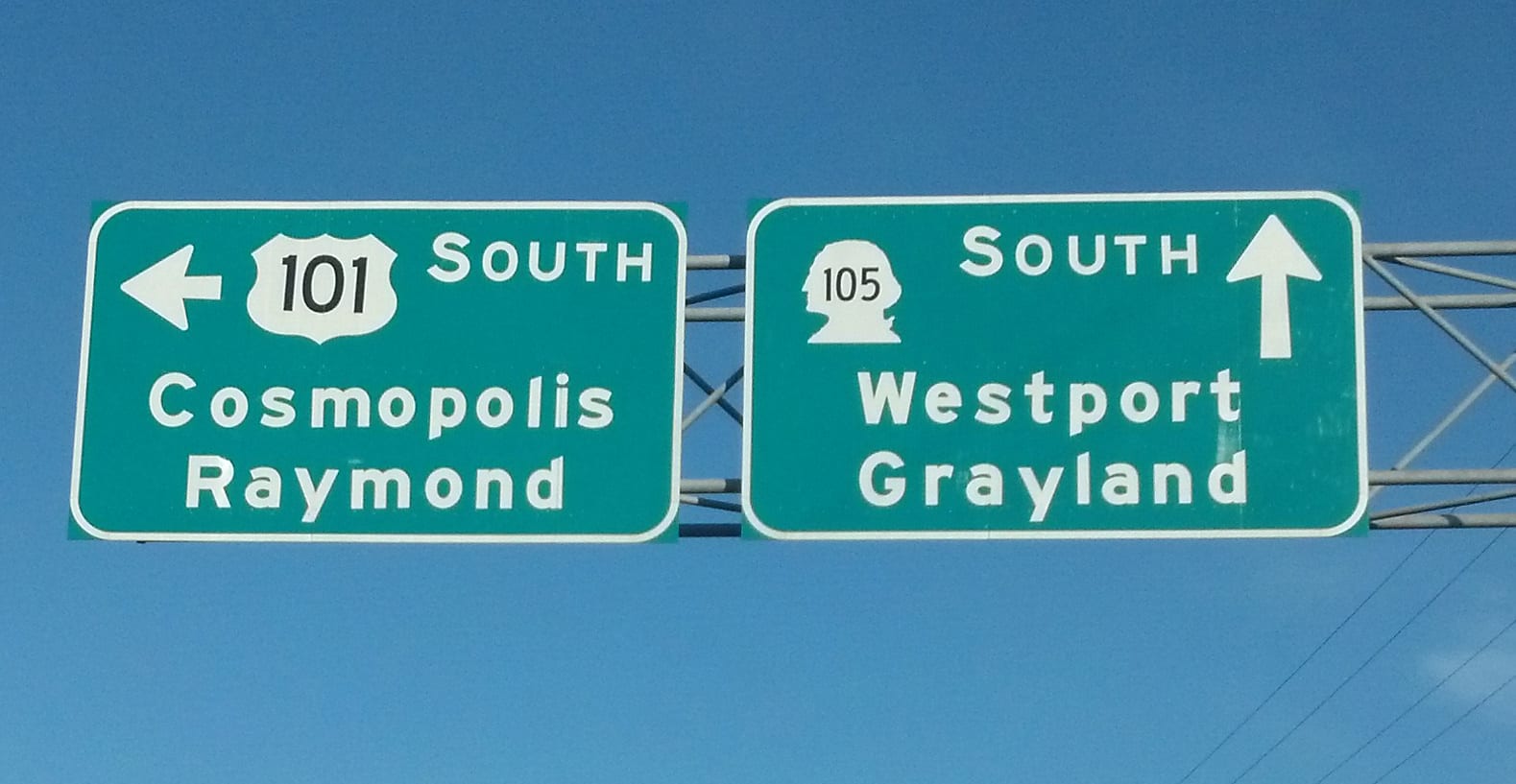
It consists of a typeface that was created to be used in United States and on the interstate highway system during the XNUMXth century.
After some complicated fieldwork, it was finally concluded that Clearview was the typeface to use. you could read better long distance. Several changes were made to make it more readable, including the expansion of spaces that exist between one letter and the next, in addition to a greater height of the uppercase compared to the lowercase.
Frutiger, Helvetica and Clearview.
The wayfinding in addition to the signs at airports, have also been seen in hospitals. For a personalized setting there are also certain types of letters. The combination of colors that attracts me the most are gray with red (gray in the background).