
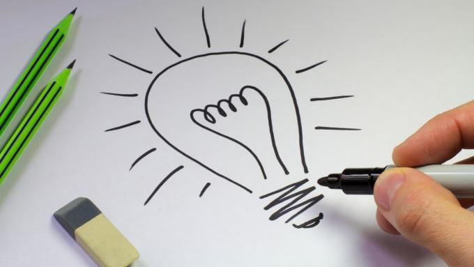
We have not dealt with the theoretical sphere of our profession for a long time and today I would like to take the opportunity to recall some very useful concepts, taking advantage of the rules proposed by Timothy samara. In this first article I will recount ten of them and later the remaining ten since as you can see I have delighted a little in them because the truth is that they seem very interesting to me.
Do you apply these tips to your work? do you agree with them? If you want to tell me about a technique that you use often or want to share some advice with our community, you know, Leave me a comment!
Be clear about the concept, the message
In the same way that architecture works, the functional and contextual foundation is of vital importance. A Church does not have the same structure as a hotel or a golf park. The functions that will be developed within the construction will be of vital importance to define its structure, content channels and user accessibility. A graphic discourse works the same way, it must be provided with enough tools so that the public can wander through them with total comfort and finding the content they are looking for. For this reason we will not tire of influencing it: Do not ignore the pre-production phase. Document yourself, find information and build the concept clearly before materializing it.
You have to communicate, not decorate
True aesthetics acquires meaning when it weighs on our mind, when there comes a point where it suggests some concept, some idea. The true mystery of communication (textual, graphic, audiovisual ...) is to awaken and suggest concepts to the public. The association of concepts can only occur through really expressive elements with a significant and semantic load. Therefore try to refrain from using superfluous elements that do not say anything.

Speak with a single visual language
We speak of style, of a linguistic and artistic code developed strictly by the author of the composition. It is a process that takes time, because ultimately what it is about is to find ourselves as creators. Our language will acquire with experience a characteristic tonic, a dose of our personality that will undoubtedly make a difference and configure us as artists. Your graphic language is you. Forget about mixing strategies and voices of other creators or artists, instead try to absorb that inspiration that certain works awaken and make it yours, translate it into your language and under your own label.

Use a maximum of two or three font families
It is a question of harmony and order. The use of more than three families will lead to certain communication interferences that will reduce the fluency of the communication process. Each of the families employed must have a place, a setting, a message and a function. If we abuse the quantity we will distort the skeleton and ultimately we will mislead the reader.

Hit in Two Beats: Attract and Retain
Persuasive strategies can be as simple or complex as we decide, but whatever our strategy there will be two fundamental steps or pillars that will determine its effectiveness: We need to attract, surprise, we need in the first instance a single look at our work and starting From there we enter the next phase: Now we need to contain that episode of contemplation. Maintaining that attention depends directly on the quality of the content we are proposing and the effectiveness of our own language.

Choose colors with a purpose
You will know as well as I do that colors speak for themselves. Each of them has very specific vibrations and implications. In short, they are complementary messages and that adhere to the graphic construction. You will have to know the palette, evaluate which of the messages it proposes to us are in tune with the overall message of your composition. What nuances support the concept we are pursuing and also what color nuances blur or silence it.

Less is more
Perhaps this is one of the controversies that generates the greatest diversity of opinions in our field. Is simplicity always the answer? I personally do not think it is a fight between artistic currents. I do not think the discussion is whether minimalism is the solution or it is not, and if it were, I would be totally against this statement. Each work and each message has some implicit needs that the graphic language of the author must know how to solve. I think that what we are talking about is developing our synthetic capacity, learning to distinguish what is really important in our composition. Define which elements really have something to say and which of them are flat at the communication level. To develop this ability, take a test: Eliminate all the elements of your design one by one. Of all the absences Which ones leave a content void and which ones don't you miss when you delete them?

Negative space is important
Especially in logos, the negative space usually provides additions that outline the speech and end up giving it power. It is a work on two levels and therefore with greater possibilities. Do not ignore that negative dimension because on many occasions can provide the spark that is missing from that sketch that does not convince you.

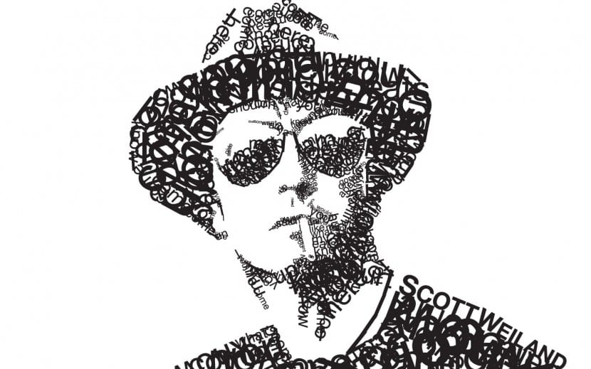
Typography is as important as image
Both the typography and the photography itself or even the illustration have similar tasks and objectives: To be the vehicle of representation of a reality using different codes or rules. We return to sensitivity as an essential point. We must learn to intuit what typeface is in harmony with our spelling or even with our color palette.
Types that cannot be read have no function
Sometimes we opt for fast routes to obtain the distinction of a brand such as the use of strange and impossible to decode symbols that in reality pose a burden rather than a reinforcement. We need to make a hole in the memory of our audience, however if we use symbols or indecipherable types we will be transmitting an image lacking in content. What cannot be understood cannot be memorized and cannot be remembered. Try to seek differentiation in other, more elaborate and complete ways, otherwise you will be falling into a trap.