We had not reviewed the trends at the color level provided by the Pantone Institute in your annual report. This 2015 will be characterized by welcoming the warmer seasons of the year in their freshest and at the same time soft version. You can download the official report from the following link where sketches, quotes and photographs of the designers themselves are attached. It is a document that the community of designers should not overlook and that will help very well to develop harmonious constructions and in balance with the registers that move today in the world of fashion and graphic arts.
The colors displayed in the PANTONE Report of Color are extracted and selected from the Pantone Fashion + Home Color System catalog, the most used and widely recognized system in the world of color in the fields of fashion and any facet of design. In each of the stations, Pantone provides a kind of survey to the professionals of the New York Fashion Week and gathers information on the colors most present and used in the collections and of course the significance, the foundation and the psychology of the color. All this information will compose what will later be known as the Pantone Report that will serve as a reference to image professionals throughout the year.
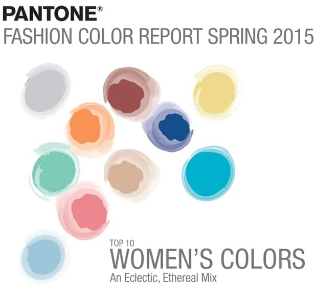
El Aquamarine it is at one extreme of this selection. A tonality that has already become common under different variations and names. With a certain ethereal weight and without abandoning freshness, it emerges as the most successful solution to complement the rest of the cold tones of the palette (both blue and green) that make up the selection. If we continue on our cold front, we find the Dusk blue that evokes the sky and transmits us the wisdom and stillness of the morning. The latter can perfectly match the Glacier Gray a neutral and masculine solution or the Tree top which is a green that breathes harmony. Another of the neutral solutions that we cannot ignore is Titanium, brimming with power and almost weightless. The Scuba meanwhile, it leads us to a state of joy and carefree associating very well with relaxation, calm. On the other hand the green Lucite materializes clear and pure accompanying the Scuba tonality and exerting its relaxing influence, ideal for occupying large spaces or surfaces. Your best combinations might be the Classic blue since it is strong, powerful and provides solidity. It also very well favors the idea of introspection and total calm already proposed by your partner. As if that were not enough, the tonality Honeysuckle manifests itself with the purest tropical flavor ideal to be used with its natural companion, Sandstone.
At the other end of our palette, we find the Toasted almond, a kind of neutral tan that offers comfort, warmth and protection. Remembering the sun on the skin during spring and summer, the Toasted Almond offers an interesting mix with shades such as Strawberry Ice, a coral tone and full of light, or the Tangerine an injection of energy that brings life to our compositions and works very well for working on retro constructions. On the other hand, within the warm tones, we find the Custard, a yellow that awakens warmth, happiness and life. It can be combined in an effective way with the classic Blue or the wine tone that receives the name of Marsala and that seems to connect us with the earth and nature in its greatest amplitude. Within the purple tones, which continue to gain ground within men's fashion, we find the solution Lavender Herb that speaks of avant-garde, classicism and a certain nostalgia.
Without a doubt, it is an interesting selection that can provide us with some of the most expressive and suggestive combinations and chromatic equations. It would be highly recommended that you take the document as a reference and pay attention to the proposals to develop your work. Remember that neutral tones combine with the rest of the solutions and that of course you can always experiment and take risks trying new combinations.
PANTONE 14-4313 Aquamarine
PANTONE 16-4725 Scuba Blue
PANTONE 14-5714 Lucite Green
PANTONE 16-1720 Ice Strawberry
PANTONE 15-1247 Tangerine
PANTONE 13-0720 Custard
PANTONE 18-1438 Marsala
PANTONE 14-4102 Glacier Gray
PANTONE 16-4120 Dusk Blue
PANTONE 18-0135 Treetop
PANTONE 19-4052 Classic Blue
PANTONE 14-1213 Toasted Almond
PANTONE 18-0538 Honeysuckle
PANTONE 16-1328 Sandstone
PANTONE 17-4014 Titanium
PANTONE 16-3310 Lavender Herb