Source: Wikipedia
The design of brands becomes more geometric every day, and it is not surprising that many designers use regular and simple geometric shapes in their forms, because they are the ideal elements to represent in a more abstract and figurative what is intended to communicate.
That is why in this post, we are going to introduce you to the world of logos once again, but also to geometric shapes. How many of the designers have represented their logos through shapes such as triangles. An element that has been highly characterized.
If you would like to know more about this type of design, do not hesitate to stay in this post, because we are going to tell you very interesting details.
Triangle logos: What are they?
Source: 1000 marks
Triangular logos are those logos that are mainly represented by a certain geometric shape, which in this case is the triangle.
Triangles are elements that are mainly characterized by evoking aspects such as growth, focus, support, inspiration, vitality, equality, justice, science and power. Without a doubt, they are very important aspects to take into account among the basic values of a design. They are very representative figures that are usually found in most identity designs.
General characteristics
Your position
Depending on how the polygons are located or represented, they can represent negative or positive aspects. That is to say, it is not the same to see represented a triangle with a fallen position, than one raised and with an upright position. The second will denote much more power than the first. That is why the triangle, if we talk about the psychology of shapes, is a very changeable element, which can sometimes move forward or take two steps backwards without hesitation. It's amazing how shapes can have both meanings.
Its way
The triangle is defined as a polygon that is formed by three line segments where they join each other through three vertices. Many of the sides of this figure determine what we know as an interior angle and maintain a completely convex figure. They usually have different shapes, some more elongated or others more flattened, but they always maintain the same essence. Besides, they also have a certain visual balance, For this reason, it is one of the figures that, in the psychology of forms or in the theory of an image, always tends to offer a certain dynamism and stands out among other elements.
You would be surprised by the number of logos or brands that use this figure as the main design. That's why we've designed a long list of brand logos below that you'll be familiar with right away.
Take note because it is interesting that you know how they have applied this interesting and peculiar shape in their designs, and best of all, how a triangle has managed to become part of the main unit of a brand or company. Leaving in this way a great position in the market and above all a great value and a great differentiation between other brands with which it competes.
The best triangle logos
Google drive
Source: Brand Logos
The famous company and the biggest internet browser, Google. It made a new design in mid-2016, highlighting this part of the Google Drive section, that is, its internal storage. To do this, he used what we figure as a kind of triangle.
each side ofe this triangle is different since it has a different color, but each color is not that it has been chosen at random but also maintains a meaning, since it represents each of its functions: Documents, spreadsheets and the famous presentations that we have all designed at some time. Undoubtedly, a logo that provides the security that the company itself offers its users.
Google Play
Source: 1000 marks
If we continue with Google, we also realize that in their designs they continue to maintain the same graphic line. To give it even more emphasis, they used this figure as a synonym for the famous or peculiar play button, hence its naming. In addition, it not only continued with the same graphic line but also emphasized each of its colors. In this way, he added different colors to his shapes, but always maintaining the aesthetics and color values that represent the company so much.
Fila
Source: aramanatural
You would never think that the famous sportswear brand would also enter the list of logos or triangular marks. But the truth is that yes, the Italian company founded in 1911, has left many values and many sales successes.
Its logo is mainly made up of a round typeface that offers the dynamism and sporty character that the company wants to reflect on its products. Also, that's not all, as they turn the letter A into a triangle with the aim of representing a mountain, a kind of secondary figure that reflects durability, strength or visual balance.
airbnb
Source: Wikipedia
It's one of those logos that you see and immediately it doesn't slip out of your head. Not only does it hide a meaning because of its design, but also because of what the company represents. The designer wanted to reflect a feeling of comfort in its typography and in its graphic element, in this way, the travel company wanted its public to feel the same way every time they used the application.
The logo is composed of a shape that resembles a heart, offering affection and love, in the middle there is a kind of circle where it represents the head of a person with arms raised and then the triangle that symbolizes the initial of the brand. Without a doubt a combination of geometric shapes.
HGTV
Source: Wikipedia
The famous television company, famous for making videos on YouTube about home and renovations, is also part of the top triangular brands. Include a logo above or at the top of the logo, where it symbolizes the roof of a house. By dealing with a color like blue, they have offered the brand all the functionality it represents in its values.
Guess
Guess is one of the clothing brands that has revolutionized the industry in recent years. It is considered a high-end brand for the value of its products and for the quality it offers. But what also attracts attention is its logo, made up of an inverted triangle downwards, denoting a sense of alarm or emergency where it represents the freedom that the company wants to offer its public. Undoubtedly a good idea since Guess has always wanted to address a largely influenced public, which in this case are young people, an audience capable of showing new changes in the urban fashion industry.
Reebok
Reebok is another of the brands that are part of the sports sector. The famous brand has worked with athletes and professional sportsmen throughout its history. Until a few years ago, they decided to change the design of the brand by offering a kind of triangle in their logo. In this way they have revolutionized the objective of the brand, to try to reach a much wider audience., leaving aside the sporty and professional. A brilliant idea that only needed to be represented by a reddish triangle.
Metallica
Source: 1000 marks
The famous group and one of the highest representatives of heavy metal also joins the list. The logo is formed by a kind of watermark where both initial and final letters extend throughout the logo, forming a kind of total triangle in the brand. In this way, it represents a total of strength, energy and power that the group has wanted to transmit since its inception. In addition, its characteristic black color offers even more the strength it needs, not to mention the successful typography. and emblematic that they used for their design.
toblerone
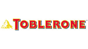
Source: 1000 marks
Switzerland's most famous chocolate brand also features a small triangle in its logo. The triangle we are talking about contains the most important mountain in Switzerland that receives the name of Matterhorn. In addition, a hidden figure is also shown among the white and gold of the graphic element, this time the figure of a peculiar bear. Representing the coat of arms where the brand comes from. It is one of the most striking logos visually speaking. And without a doubt, both its brand and its design have reached an exponential number of audiences from all corners of the world.
Conclusion
There are many brands that have included a geometric figure in their identity designs. As we have been able to verify, the triangle generates a kind of force and power that make the brand even more meaningful than it already has.
That is why, whenever you design a brand, keep in mind the use of this striking figure in your design, as it will make your brand much more interesting. We hope you have learned more about brand design.