
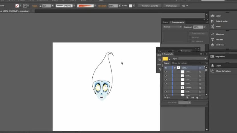
We will continue to work on the hair area. We will distance ourselves quite a bit from the original design and we will make a less realistic but more Burtonian structure. In any case, you can obviously try the alternatives and designs that seem to you. As you know, I will practice some modifications on the sketch, but I suppose that if you are going to work on your own sketch you will have it easier since you will simply have to trace the shapes. In any case, let's get started!
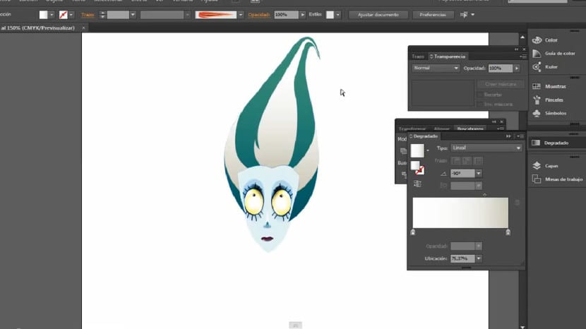
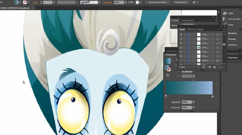
We will go to pen tool and we will give it a black stroke and a transparent or non-existent fill color. The next thing we will do is create the silhouette. Once created, we will fill it with a gradient that starts from a pure white hue to a whitish hue but this time dirtier.
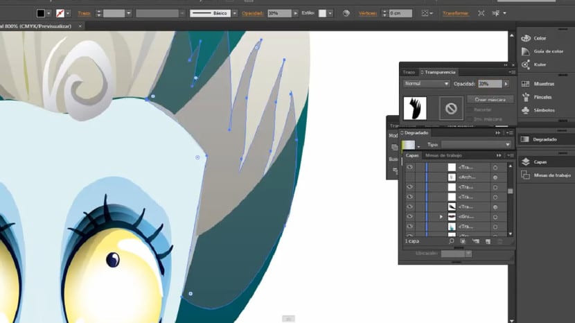
The next thing will be to create the four greenish-blue strands that we are seeing, for this we will create them with the pen tool and of course we will fill them with a linear and vertical gradient or gradient that starts from a bluish hue (at the bottom) quite dark even a greener (on top).
To work on the shine of the hair, we will do it with the pen tool again to create a shine that fits well with the hair's own texture. We will work on creating a shape with several recesses and projections and in the most irregular and natural way possible. We will fill this shine again with a degraded. In this case we can use different combinations, It depends on the effect we want to create and the intensity we want that shine to have and of course the hairstyle, color and look of our character. In this case I will fill it in with a linear and vertical gradient that starts from a green hue at the bottom to a light blue at the top and a blending mode in Lighten. Another good alternative is to create a gradient that starts from black to white and apply a raster blending mode.
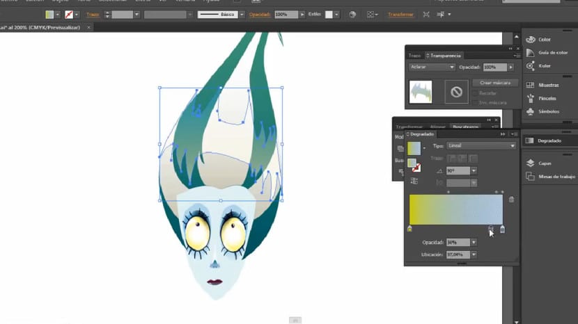
To create the lock in the upper area of the forehead, we will use the pen tool again, emphasizing the treatment on the anchor points to give it a flexible and curved appearance. In this case we will apply a horizontal and linear gradient starting from a whitish tone (on the left) to one more tone grayish (on the right).
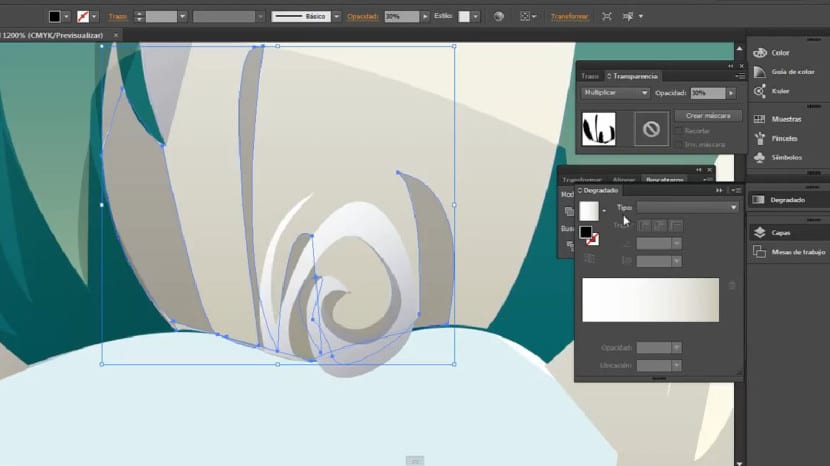
As for the lateral and lower shadows, the procedure has been very similar, only that we have been modifying the opacity of each piece to create more naturalness and greater dynamism in the hair as a whole. The goal is to create nuances, we will avoid those solutions that do not provide a massive, crowded and homogeneous result. We will do it Playing with different blending modes, in the side shadows I have used one opacity less than 30% and with a fusion mode in multiply. It is essential that you bear in mind that these pieces have to be irregular, they have to fit perfectly to the mane alternating incoming and outgoing.
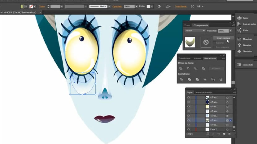
We will create the eyebrows, for this we will activate the layer of our guide, our sketch. In this case we will take the original reference sketch although we will not follow it to the letter, as we will add some modifications. Once we are satisfied with the shape we have created we will fill this piece with a linear and vertical gradient again. In this case, the gradient will start from a light greenish color to a lighter bluish one. Once this is done we will use the tool Reflect (Remember that it is located on the O key, or on the same button of the Rotate tool). Once again, a pop-up window will appear and we will click on reflect taking the vertical axis and then clicking on the «Copy» button. We will look for the ideal place to place those eyebrows, in this case the perfect place is the shadow created in the area above the eyes, this will give much greater realism.
We will create a small volume in the lower eye area, we will work on the cheekbone. We will create with the pen a shape similar to the one we are seeing and fill it with a I degrade let it go from a white to a black hue, we will apply the raster blending mode. Regarding its position, it is recommended that it be in the area opposite the eyebrow, that is, at the lower limit of the shadow since this way we will create a more compact and balanced structure. We will ensure that this gradient is smoothed and assimilates as much as possible to the texture created on the bridge of the nose since both elements are protruding and should cause a sensation of depth.
Easy right?
The facial details are basically finalized here, Has it been of interest to you? Do you have any suggestions, questions or problems? If so, do not hesitate to say so and I will help you with whatever you need. If you dare to make a design similar to the style of Tim Burton following these indications, do not hesitate to share it with us.