
There is a huge variety of tools to design web pages and work in a totally simple and functional way without entering or touching code. They are innumerable, proposed by applications (Adobe Dreamweaver is an example) or directly by online platforms such as Wix. However, for a web designer, knowing the manual procedures is essential. HTML5 and CSS are the fundamental pillars for the layout of websites and landing pages.
However, more often than you might expect, you will have to turn to applications like Indesign or Adobe Photoshop to complement your layout work and give them a perfect finish. Today we will see in this extensive tutorial, how we can layout a web page using Adobe Photoshop. In this first part we will stay in the work to be developed from Photoshop, although in future installments we will see how we can apply this work already directly in HTML code to make it functional.
Starting with the design of our wireframe
To begin with the layout and design of a web page, it is tremendously important that we start by defining what the basic elements will be, this is the skeleton. This structure will serve as a support to hold all the content (whether textual or multimedia). By defining each of the sections that make up our page, we can work on them with complete accuracy and provide a visual design that is as accurate as possible.
It is very important that we take into account the dimensions that our website will have, if it will have a boxed or Full-width. A boxed web page will be inside a small container and therefore a space will appear around it. On the contrary, a full witdth web will occupy the entire screen of the device that reproduces the page. Choosing between one modality or another responds to merely stylistic questions and will also depend on the needs of the project on which we are working. We will work in this example with the boxed mode so it will not occupy all the space provided by the browser.
To create our wireframe, the first thing we have to do is enter the Adobe Photoshop application and include the dimensions we want our page to have. In this example our page will be 1280 pixels wide. However, the size issue may vary depending on the final destination or the device on which we want to reproduce our page. There is no doubt that for a web design to be functional and efficient, it must be responsive and it must adapt to all devices on the market. However, in this case we are going to work to create a prototype that we are going to reproduce on a desktop computer. Even so, the responsive issue will be discussed later, for now, here is a hierarchy of screen dimensions to work with in this example. Keep in mind that in this case we will make a layout of the landing page in Adobe Photoshop and then migrate it to HTML5 AND CSS3. The objective of this little practice is to convert a design created in Photoshop into a usable and interactive web design that responds to the movements of the user.
Measurements for mobile phones
iPhone 4 and 4S: 320 x 480
iPhone 5 and 5S: 320 x 568
iPhone6: 375x667
iPhone 6+: 414x736
Nexus 4: 384 x 598
Nexus 5: 360 x 598
Galaxy S3, S4, S5: 360x640
HTC One: 360 x 640
Tablets measurements
iPad all models as well as iPad Mini: 1024 x 768
Galaxy Tab 2 and 3 (7.0 inches): 600 x 1024
Galaxy Tab 2 and 3 (10.1 inches): 800 x 1280
Nexus 7: 603 x 966
Nexus 10: 800 x 1280
Microsoft Surface W8 RT: 768 x 1366
Microsoft Surface W8 Pro: 720 x 1280
Measurements for desktop computers
Small screens (used for example in netbooks): 1024 x 600
Medium screens: 1280 x 720/1280 x 800
Large screens: width greater than 1400 pixels, example 1400 x 900 or 1600 x 1200.
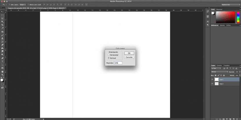
To start distributing the elements and assigning sections within our web mockup, it is very important that we take into account the proportions to ensure a readable and melodic finish. It will be essential that you use the options of rules and guides that you can find in the top menu View. To work in a proportional and exact way, it is best that we work from percentages. We will click on the view menu and then on the option «New guide» to choose the modality of the division. In this case we will make four vertical divisions at 25% and we will take them as a reference to place our images in the footer and the image of our logo in the header.
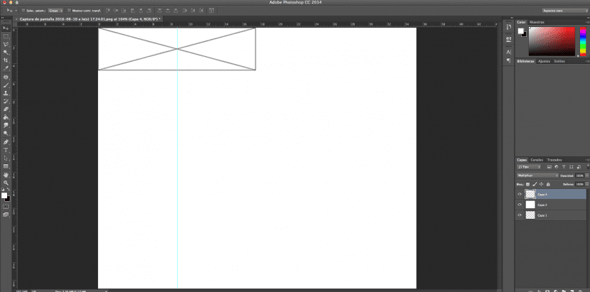
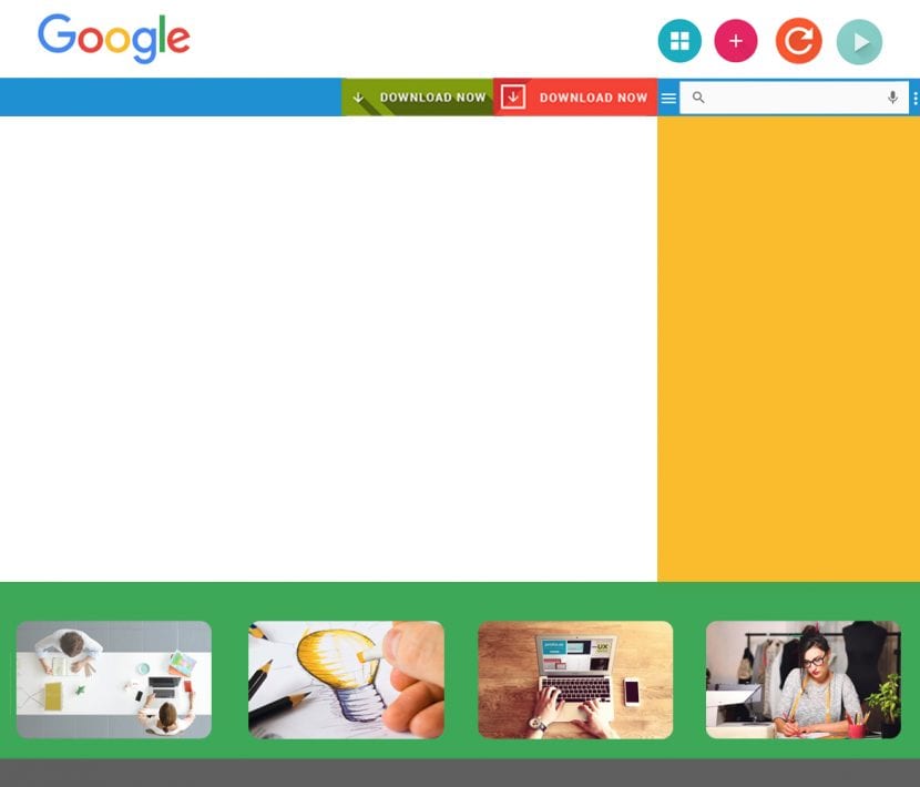
There is a code to designate each of the areas that will occupy our model and the function that each of them will have. For example, to indicate the area that an image will occupy, we will create rectangles with a kind of cross. To indicate that we want to include videos in a certain area, we will include the play symbol inside our container. In this first example we are only going to work with images, in the upper capture you can see the area that will occupy the logo from our website.
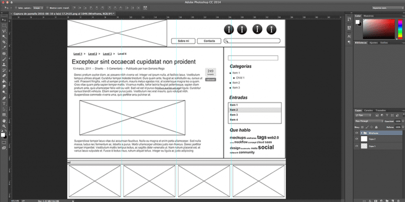
This would be the end result of our Wireframe. As we can see, it is divided into a header composed of the image in which the logo will be found and which will serve as a link to the home page accompanied by two tabs, a search engine and four buttons on the search box. In addition, already within the body, we have included a side bar composed of a dividing bar and a series of categories that categorize the type of content that will be on our website. Another section with a numbering that includes the entries that will exist on our site, and finally a list with the most representative meta tags on our site.
In the content area, which will be defined by a section that will include self-manageable content, we will find the content of our articles. In this case, breadcrumbs or the breadcrumb (which indicates the organic structure of our website, the title of the article, the metadata, a paragraph as a body of text, within which an image is included.
As a footer we have included four images that will serve as a link to other areas of our page. Here we can include logos or other interesting sections. Although in reality, this area will act more like prefooter, since the footer itself will go a little further down with the use policy, legal notice and copyright.
Once we have defined the basic structure or skeleton of our page, we will have to go to the next level. This will consist of the proper design of each of the areas of our website. In other words, we will begin to "fill in" each of these areas with the content that will finally be inserted on our website. It is recommended that we do not design these elements before working on the wireframe because it is very likely that if we do it in this order, we will need to modify their proportions later. We run the risk of distorting our images and having to redo the design of each of the elements, which will become either a waste of time or a lower quality result.
In this case, the design of our website will be extremely simple. We will use the material design precepts, since we are going to use the Google logo to exemplify this practice. I must clarify that the purpose of this tutorial is to illustrate the technical knowledge, so the aesthetic result in this case is irrelevant. As you can see, little by little we have been filling the space with all the areas that we have previously determined in our scheme. However, we made a small modification at the last minute. As you may have noticed, we have reduced the size of our logo considerably and we have included a dividing line in the lower header area that connects perfectly with the upper menu. In this case we have used buttons and materials from a resource bank. As designers we can design them ourselves, (especially this option is recommended if we want it to present a very similar tonic to that presented by the brand image or logo).
It is important that we bear in mind that to lay out this example we are going to work on two different levels. On the one hand, we will work on the objects and on the other hand the appearance of the website. That is, on the one hand in the skeleton of our website and on the other hand in all floating elements that this skeleton will support. You will notice that there are areas that will not be floating at all, such as the area that our sidebar will occupy, the preefooter or the dividing bar that divides the header from the body.

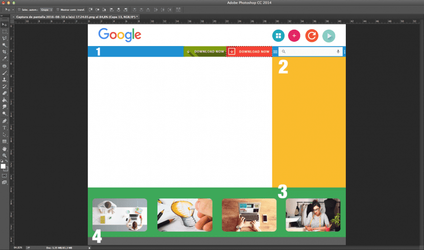
Structures 1, 2, 3 and 4 will be part of the background from our website, so it will not actually be necessary for us to export as such from Adobe Photoshop, although we can do it, it is not necessary. When it comes to Flat colors (one of the essential features of flat design and material design, they can be applied perfectly through code using a CSS stylesheet). However, the rest of the elements must be saved for later insertion in our HTML code. In this small diagram we have also reproduced the areas that belong to the background of the page so that we have a clear idea of what the final appearance of our site will be.
As you will be able to realize, the purpose of creating this scheme in Adobe Photoshop is to obtain the real dimension of each element, and clarify the arrangement and structure of each element. Of course, the textual content has no place in this phase of the process since it must be supplied from our code editor. We must also point out that in this practice, we are going to work with buttons and static elements, although generally these are usually applied from frameworks such as Bootstrap or directly from Jquery.
Once we have created each of the elements that will make up our web page, it is time to start exporting them and saving them in the images folder located inside the HTML project folder. It is important that you get used to exporting from your wireframe, because it is very likely that you will need to modify some of the original elements based on the skeleton configuration. (For example, in this case, we have changed the size of the original buttons, the logo and most of the elements that are part of the composition, including the images in the lower area).
It is important that we learn to save any item independently to save them with the dimensions they have and in a precise way. Any error, however minimal, can influence all the elements that are part of your web page. Keep in mind that they will be related to each other and must have perfect dimensions so that they can be entered from HTML in the final web. In this case, we will need to independently cut and save the following elements:
- Our logo.
- All buttons (those that are part of the main menu and the rest).
- All the images.
We can do it in many ways and perhaps you will find an alternative that is more effective for you. But if it is the first time that you are going to make this type of layout, I recommend that you follow the following tips.
- First, you must go to the folder where the PSD file that contains our wireframe is located and duplicate it as many times as the elements you are going to export. In this case we have created 12 copies from the original and we have saved them in the same folder. Next, you will rename each of the copies and assign each one of them the name of the element it contains. Our 12 copies will be renamed: Logo, menu button 1, menu button 2, search bar, upper button 1, upper button 2, upper button 3 and upper button 4. The remaining four will be renamed as: Image 1, Image 2, Image 3 and Image 4.
- Once this is done we will open the file with the logo name.
- We will go to our layer palette and locate the layer that contains our logo. Then we will press Ctrl / Cmd while we click on the thumbnail of said layer. In this way the logo will have been selected automatically.
- The next step will be to tell Photoshop that we want it to cut out that logo in a precise way. For this we will only have to make a call to the cropping tool from the key or the command C.
- Once we have done this we will click on our Enter button to confirm the cut.
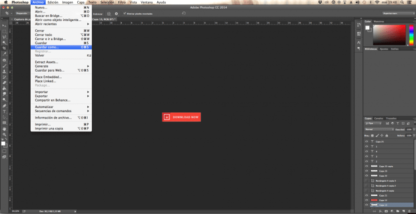
- Now we will go to the top File menu to click on save how. We will select the name, which in this case will be «Logo» and we will assign a format PNG, for being the file that offers the highest quality on the web.
- We will repeat the process with all the copies and the elements. When you've trimmed, make sure the rest of the layers in our palette are invisible or eliminated. In this way we can save each element with a transparent background.
In this case we are selecting our menu button 2 from the layers palette. You can see in the screenshot how the limits of our button have been automatically selected.
Once we select the cropping tool from the C key, our canvas is reduced only to the dimensions of our button.
Now is the time to save one by one all the elements that are part of our website and include them in the images folder and that we will use later. We will make calls from our code and we will continue with our layout but from now on from our code editor.
Although there are many tools and alternatives to layout a web page and that make the process totally intuitive, it is very important that we learn to do it in a manual. In this way we will learn what are the fundamentals behind the design of a web page.
Summary:
- Design the structure of the website paying special attention to the content you want to transmit and the sections that you must create on your website.
- Work on your skeleton or Wireframe from Adobe Photoshop indicating in which areas the contents will appear and their format.
- Relying on the measures and brands that you have previously developed, begin to design the surface of the web. Includes all elements (both floating and fixed). Don't forget to include the corresponding buttons, logo, and images.
- Cut out all the elements that are part of the project one by one. Make sure they have the right measures and that they won't cause you problems later.
- Save all elements in format PNG in the images folder inside the project folder HTML.
- Keep in mind that this project will have an output to the web window so it is very important that you take into account the color mode and apply RGB.
- Get inspired by other websites that you admire before you get down to business, and don't forget to discuss this with your team members. In case it is a project for a client, try to stick to the briefing as far as possible.
hahahahahaha and at the end of all this, you go to the start button, turn off equipment, and you go to a fucking professional who will make you a website that is not a fucking shit;)
The tutorial praece me well, but maybe in the next one you will make it more detailed, I am still starting in this design, and when I see the images with the final result there are some steps that I do not know how to do. thanks.