
Twitch has shown what is the rebranding of its brand to celebrate how well he is doing with that energetic community that has made it the ultimate gaming streaming service.
This rebranding has been cooking for a year and it is the biggest change of the brand since it was established back in 2011. The rebranding includes a new color palette, a “block” typeface, an improved version of the mascot and another typeface that appears to be a one of the best retro fonts ever.
Lo retro with a streaming service Gaming is scary and that is why Twitch has bet on it. Purple is the color that is capable of representing the creativity of the community and that energy that has inspired us to be the platform that it is. These are Twitch's own words.
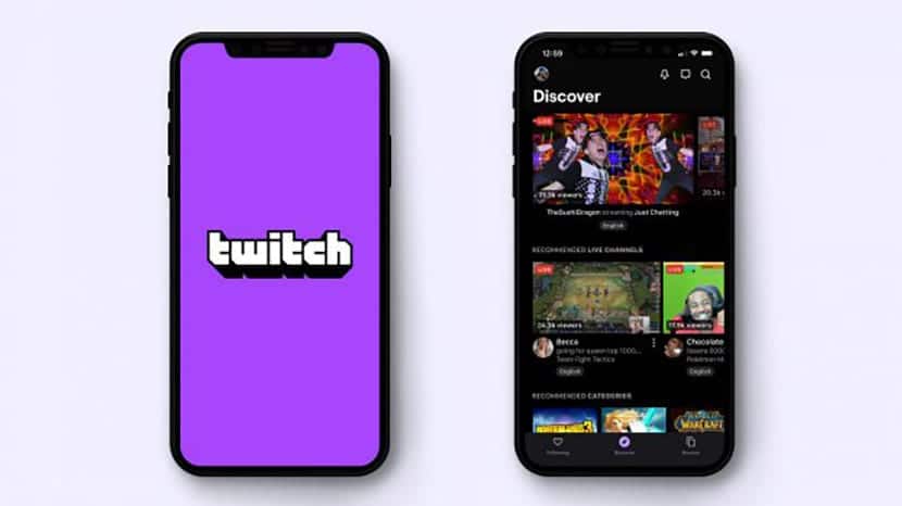
Although this time purple is even a little brighter and more vibrant to capture that radiant energy. We can also talk about a modified version of the Roobert font.
All the letter shapes remain "blocky", but they have been improved to bring that more retro and arcade look of the 80s and 90s. The Twitch icon, known as Glitch, has also received some changes. At the moment we do not know it, so when it makes its appearance we will let it be known in these parts.
A Twitch that continues to dominate the landscape of game streaming platforms and that has had the competition of a YouTube with its YouTube Gaming, and a Facebook Gaming, which do not seem to stand out; in fact the first one has ended up ceasing its services due to the lack of public. Now to wait for that new icon.
Don't miss these tips on brand rebranding.