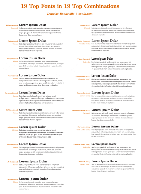
We have already commented other times that in a text, one layout or any design that has fonts, it is not advisable to use too many typographies combined, at most two or three should be used sources different But if we want to do a good typographic combinationa of our text, sometimes it is advisable to use two sources to facilitate reading or highlight titles or subtitles from the rest of the writing. Next I want to make a relation of different combinations of sources that work very well paired in a layout and that can serve as an example when you are not sure which one to decide on. In most cases, you pair one type of dry stick with another with a finish is a very wise choice, but I prefer that you see it for yourself.
The web bonfx presents various possible combinations with the sources most famous and used that exist in the market in its variants of bold, condensed, regular, etc.
Images: typographic sketchess

