
Source: Blue Stripes
For the design sector, fonts have always been a good element with which to combine design and functionality. For years, many designers have studied and analyzed fonts, letter by letter, and have carried out various interesting and general projects with them.
It is not very common that we see typographic posters hanging on some of the walls of some museums, but nevertheless, there are typographic designs that, for decades, have caught our attention due to their high degree of composition.
That is why in this post, We bring you some of the best typographic designs, in addition, we will explain what they are and what features they have. We will also show you some designs to inspire you.
Typographic Designs: What are they?

Source: Pinterest
When we talk about typographic design, We are talking about typographies, fonts or letters. In general terms, we talk about everything that surrounds sources: line spacing, spaces, fonts, styles, etc. Typographic design comprises a very important task in the graphic design sector.
The term typographic design, in short, refers to a whole set of elements where the main protagonist is undoubtedly typography. It is a good option if what we want to highlight in our project is a certain font. Well, each of the fonts that exist understand a story and are designed with an established objective.
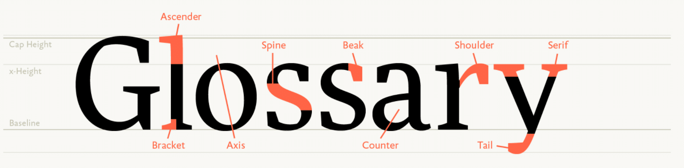
Elements to consider
Source: Luis Cordina
backbone of the fountain
When we design a certain typographic design, we must take into account mainly the column or the skeleton of the font. And it is not that fonts have bones, but rather we must look at their physical appearance.
When we talk about column we talk about the internal part of each source. It is named skeleton because, like human beings, they are made of a proportion and an anatomy that is important to analyze during the design phase. PFor this reason, basic aspects such as the width or height of the letters come into contact here.
Proportion
If we continue investigating the physical aspect, we come across another important element to analyze, the proportion of the typography. In the proportion, aspects such as the width of the letters enter, a very important aspect that is taken into account in corporate identity projects.
Each typeface is designed and was created in such a way that it had a different width than the rest. Aspects such as width create the unique personality of each typeface. For this reason, whenever we are going to download a font, it is important that you take this aspect into account.
X value
The X value is more scientific than artistic. Well, it understands the height and width measurements of a typeface. For this, it is important that you design a kind of guides. The guides are a series of lines placed in a landscape or horizontal way.
Contrast in the strokes
Contrast is another point to consider. When we talk about contrast, we mean how we can offer you much more character and personality to our typography so that it is not manipulated. The contrast will help make the font much more attractive and it is a physical aspect that will be found decisively in the strokes.
Forma
The shape is defined as the existing space shown between each letter. There are two types, form and counter form. The counterform, on the contrary, are negative spaces that are illustrated and represented in each one of them. They are main and important elements, since they offer a good design and a great personality to your fonts. In addition, it is also important that you take it into account for your project.
Ductus or modulation
The ductus is an element from calligraphy. Although at first glance it may seem that it is not a suitable or considered term for typographic design, it is quite the opposite. It is an aspect to take into account as well, since within this term we also find the modulation and the gesture with which a stroke can speak to us and transmit diverse sensations. In short, it is an aspect that must be taken into account if we are going to work with different fonts, especially in the world of brand design.
bandages
Whenever we refer to the term ligatures, something that joins immediately comes to mind. Well, in conclusion to this term, we can define it as the union between two or more characters. This element is very useful in corporate identity works where the intention is to offer a more serious and comforting aspect to the font. If we don't pay attention, some of the most exclusive high-end brands usually include this small union in their letters. Well, it is not something that has not been intentional but rather the opposite. It can be useful if you are looking for concepts such as luxury and seriousness.
Serifs and serifs
If we continue with the previous analysis of the fonts, we come to the conclusion that they are also composed of serifs and serifs. The auctions are small ornaments that are found at the end of each stem or arm of a certain letter.
There are many types of serifs, in each typographic family they are classified: transition, didones, glyphs, quadrangular or angular. Each one of them presents a different aspect and with a personality and character different from each font. They are one of the elements that are most often highlighted if we fully analyze a certain typeface.
The axis
And last but not least, we come to the axis. The axis is defined as the slope of each letter. As it is an inclination, we can observe it in two types, completely vertical (there is no external or internal modulation or inclination) and completely inclined.
If what we want is a round typeface, then we will talk about its axis. Well, the axis is very present in each of the round letters. In short, it is also a very important aspect to keep in mind for headlines and corporate identity designs.
We hope that these elements that comprise typographic design have been of interest to you.
Examples of typographic designs
Sheet
Pliego is a typeface designed by type designer Juanjo López. It is a typeface that is characterized by its high legibility range, which makes it a suitable font for comfortable reading. It is a recommended font for long texts and in terms of its physical appearance, it stands out that it has a certain humanistic tendency, along with a texture that presents a certain uniformity. In short, despite presenting serifs, they make it a typography with a certain air and contemporary and current appearance. It is one of the highly recommended designs.
Bauzahlen Font
This typeface is one of the most creative. Not to mention one of the typographic designs with the most personality. It is a font designed by Ángel Hernández and is characterized by being designed solely through geometric shapes such as triangles, circles and rectangles. It is a typeface that at first glance is inspired and influenced by the Bauhaus school. The maximum representation of many artistic currents and artists in their highest category. In short, it is a typeface with a lot of personality and suitable for being included in big headlines, especially for posters.
moranga
Moranga is a font designed by Latinotype, an agency dedicated to type design. Also designed by Sofia Mohr, it is a typeface with a certain contemporary and current air. It uses a retro style that makes it one of the most modern and creative fonts of the moment. Every aspect of the design of these fonts is inspired by the 70's. A time where many advances predominate. It is undoubtedly one of the fonts where different variations of the same font have been designed, which makes it a functional and easy-to-use typography. It is suitable for reading and for running text.
Dance floor
Dance Floor is a typeface that has been designed by Guerrero Cortés. The typography has a geometric aspect that characterizes it a lot. It is a typography It can evoke the world of video games and transport you to the video games of the 80s. Pure Pac-Man style. It is the perfect typography for animated themes.
These are some of the typographic projects designed by some designers. We hope they have been of great help to you for your projects and inspiration for your next works. Undoubtedly, each of them has completely different characteristics.
Conclusion
Typographic design shows how a font conveys the message it wants to communicate and how it wants to communicate it. For this reason, it is important to take into account both the elements that surround it from the outside and those more internal that cannot be seen and that are defined as abstract.
We hope that you have learned a little more about what typographic design is capable of and above all that you dare to design the best typographic design that has been designed so far. For this, it is very important that you document yourself in advance and carry out your own analyses.