Fuente: YouTube
If we talk about corporate identity or brand design, we realize how brands have evolved in the market thanks to their designs. It is very common to see logos of different types.
But especially, we must emphasize those who have gone down in history for their typography. The choice of a good or functional typography constitutes 90% of the success of an identity in the design sector.
That is why, in this post, We talk about what these types of logos are like and what characteristics they present. Also, at the end of the post we will suggest some of the best tools to be able to design your own.
Typographic logos: what are they
Source: Direct Marketing
When we talk about typographic designs, we refer to a brand design that is fully determined by one typeface or several. It is important to take this aspect into account since a good choice of typography is ideal for its success.
They are usually logos that are mainly characterized by their minimalism and simple essence. That is why they stand out from the rest and are differentiated by their design. Below, we show you some of the main characteristics that we must take into account when designing a logo.
General characteristics
Make it simple
Simplicity is synonymous with functionality in design. Therefore, it is always advisable to make a design that is as simple as possible. Everything that can contaminate the image of your brand, it is important that we know how to undo it at all times and in this way that only those elements that represent the brand in its entirety remain.
In short, try to study, investigate and choose a typography that is easy to identify, read and that is representative, due to its shapes or appearance, but as long as it is functional in the way it communicates.
Be original and creative
Creativity is fundamental and very decisive if we talk about a design that starts from scratch. However, a brand that is considered original, it is a brand that has never been seen before and that meets the characteristics of being a unique logo.
The simple fact of knowing that a brand is original, positions it in a more favorable way in the market. In addition, in image psychology, it is said that a brand that has never been seen before is much easier to remember than one that we visualize on a daily basis.
make it important
Branding work is something very hard and difficult if we talk about having a success that remains for years. But everything has its trick and this time the trick is the effort. A designer who does research for a year will get a better result than a designer who has only done research for three months.
That is why each project we carry out is important, and with it, the result that comes after. We advise you not to settle for the first thing you get and to go further. Set limits and challenges. It will be the best for your successes.
The best typographic logos
Coca-Cola
Source: Logomundo
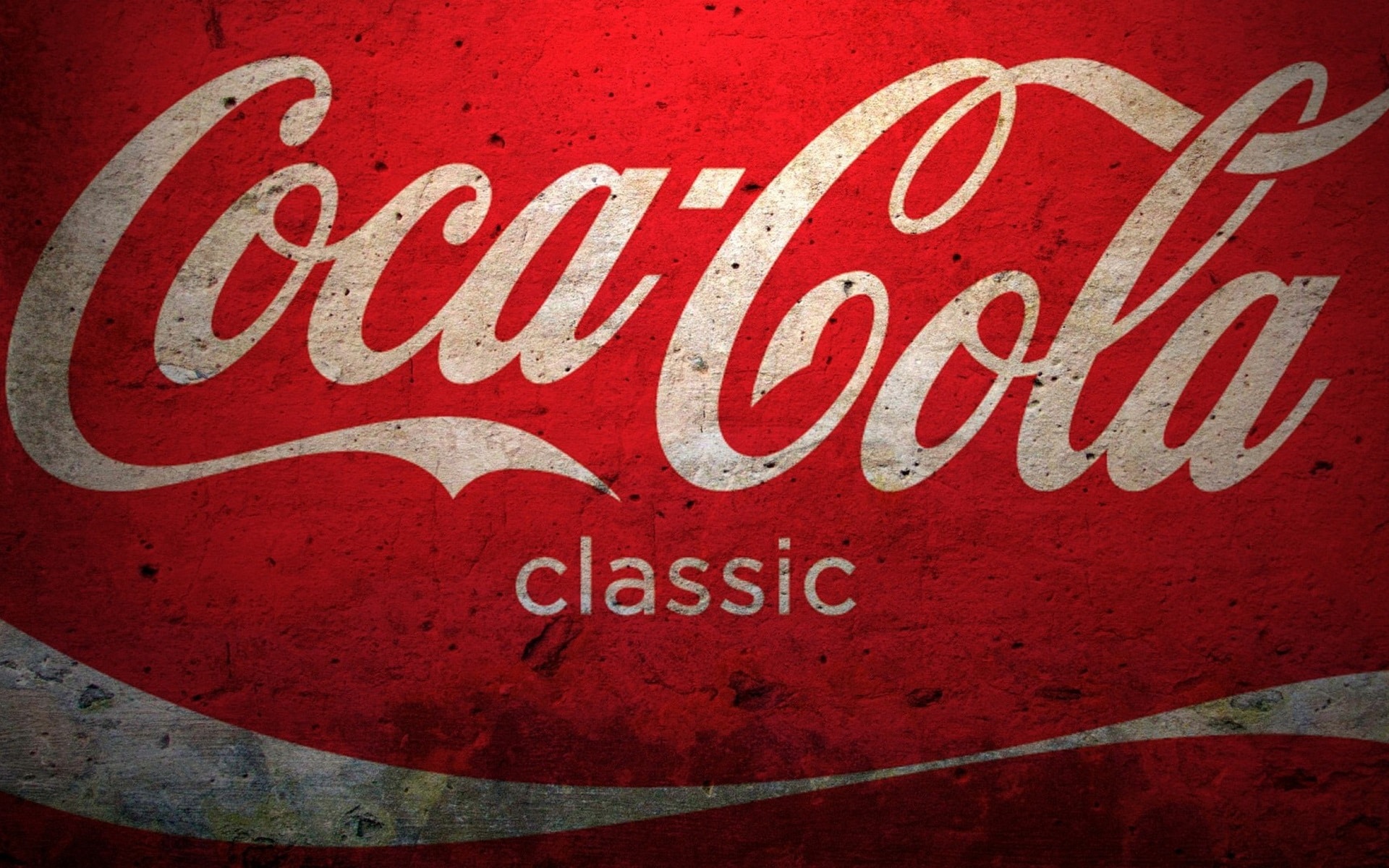
The famous brand of soft drinks has been around the world and never better said. And it has not been because of how its product has been sold, which is also important to emphasize, but also because its logo and the design that has been used have gone down in history.
The logo is made up of a typeface known as script or handwriting.. It maintains a demure appearance despite being a soft drink brand. In addition, something that also characterizes is its red color. It has its own range that, together with its typography, has become one of the most important and consumed brands on the market.
Spindrift
Source: Logosworld
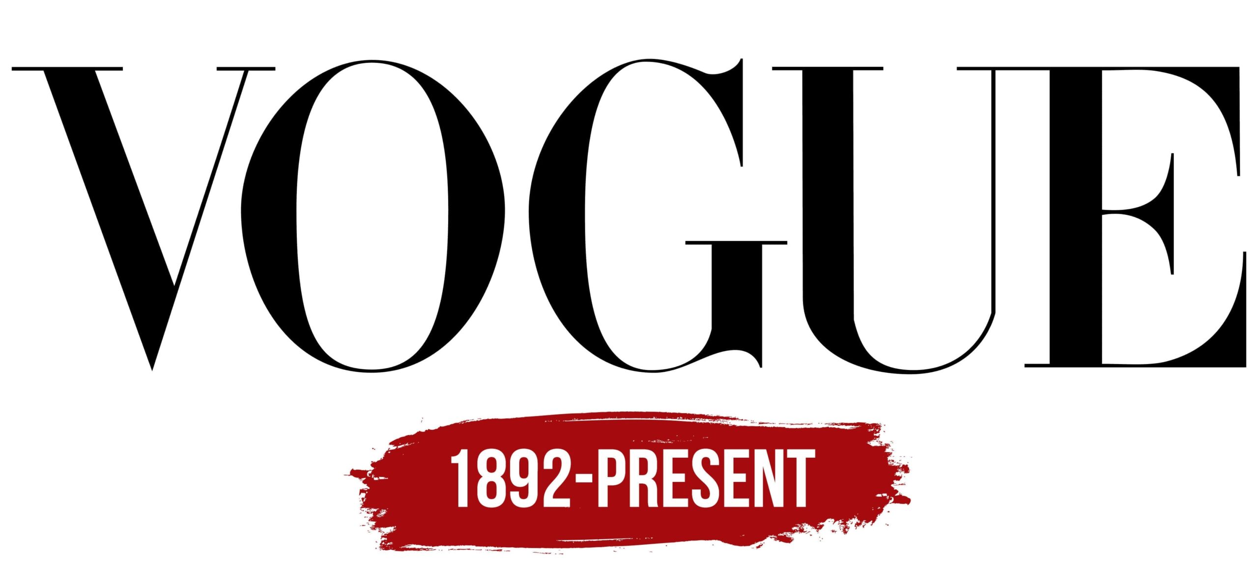
If we move away from the beverage sector and move on to the more editorial sector or the world of contemporary fashion, we realize that Vogue also used a typographic design for its brand. The famous fashion magazine has gone down in history not only because of the design of its magazines, but because of its logo, because of its demure and formal image. A simple typeface that denotes all the luxury and marks a before and after in the fashion industry.
Cadillac
Source: intelimotor
Cadillac is a car brand listed as one of the most important high-end. Its logo denotes and expresses each and every one of the characteristics that its cars have: luxuries, professionalism, quality and a high amount of money in each of its vehicles.. This is how they decided to design a brand that, together with a handwritten typeface in italics, managed to collect some of the most representative aspects.
Undoubtedly, they are designs that have been very successful within the automotive industry, and for this reason, they have obtained good recognition.
Yahoo

Source: Wikipedia
Another of the brands or logos that do not fall short on this list is Yahoo. The famous internet browser has been recognized worldwide for its striking and representative forum of questions. Just like your forum has been, so has your logo design.
A simple design, with a rounder and livelier typography. But always maintaining the characteristics in its typography. Its reddish color has accompanied its typography very well at all times, making it one of the most functional brands or designs, without a doubt.
Disney
Source: Wikipedia
We could not leave the famous Disney log, a logo full of magic, fantasy, animation and a place to return to be a boy or a girl again. Without a doubt, the design of his logo complies with the image that Walt Disney wanted to offer him to the public.
Whenever the famous logo appears on screens, we smile knowing that it has been part of our childhood for many years. It is one of the characteristics that make it one of the best designs in the film industry, its long duration. Who wouldn't want to be a child again?
The best programs
Illustration
We couldn't leave that tool behind to start the list. It is one of the tools or software that are part of Adobe. And it is not that it is the star tool, but it is the best option to design your brands. It has a series of tools that make it the best option.
By being able to work with vectors, you can design in all possible ways and with everything you want. In addition, it is already determined by default by a list of fonts or packages with which you can start working or projecting your design.
Canva
Surely you have already heard of Canva. It is one of the free options for beginning designers and designers. It has different templates where you can work on your designs in a more comfortable way.
The only problem is that when working with some of their templates, we can find brands that are already registered and that resemble or are exactly the same as ours, which takes away that point of originality and creativity in the design process. You can also design other more editorial elements such as business cards etc.
placeit
Placeit is another tool that has also been very useful during the logo design process. It is an online platform with which you can have access not only to logo design, but also to the design of some mockups, online designs for certain content or social networks, or even video editing.
It is one of the most complete tools that will be of great help to you to start. In addition, it also has a free or beta part, which means easier and free access where you can make your designs quickly.
Photoshop
It is not the most suitable option to design a logo, but it also has the possibility of doing so. Although we do not work with vectors, which makes identity work very difficult, it is also possible to create them and also convert them to PNG to incorporate them in this way on other funds of interest.
It is another of the software or applications that are part of Adobe, and, despite its drawbacks with identity design, it also has its preferences in terms of its tools. Since it has different editing tools and brushes.
Conclusion
More and more designers are betting on this type of design for their logos. Typographic logos have gone down in history for how their fonts are. What few are unaware of is what a simple font can convey in our design or in our minds.
For this reason, design is also a psychological aspect that, if we manage to reach our target audience, can become a complete success, or on the contrary, a complete disaster. In short, we hope that you have learned more about this type of logos and designs, and dare to design your own.
The correct thing to mention both men and women is to say: «designers», as a woman I do not feel «invisibilized» by something as insignificant as a letter and those who feel that way was because they ate that story, it is a pity that this page entered that game.