
Source: Pinterest
Posters have always been present in our lives, in one way or another, they have been participants in many events. That is why, in every poster, there are always elements that take more prominence than others.
In this post we are going to introduce you to the world of typographic posters, and so that you understand from the outset that they are, let's say they are a kind of communication media, where a lot of prominence is taken on the typography above other elements, such as colors, graphic elements (figures) etc.
Not only are we going to explain what they are, but we are also going to show you some of the best examples that have been designed throughout history.
We start
The poster
The poster is defined as a means of communication of a specific idea that has to be seen and understood easily, the poster is usually disseminated in spaces traveled by a large public and frequently places of passage so there is little time to analyze its information . Throughout the history of the poster, its functions and areas of use have been changing and evolving, the history of the poster is linked to the artistic evolution of representation and printing.
It is a type of design that is based on the ingenious combination of image and text making the image attract attention. Art has had a great influence on the poster due to the informative capacity of the image and the power of attraction it has, however it is psychology that has explored the most in the service of advertising in the behaviors influenced by the mechanisms of human perception .
What communicates
The design of the poster depends like any design product of several elements:
- What is there to present? (Ideas, products, events ...)
- Who is it addressed to (intended audience)
- Places where it will be spread.
Once these elements have been identified, the designer documents himself to specify how the main idea of the poster materializes in images.
The role of the text as a means of information is secondary in the poster, it has the function of reinforcing the image. But the design has used the texts for more than to build coherent messages and has achieved very suggestive images as main elements in the posters. Here you can find some Tips and materials for using typography in poster designs.
Poster types
There are different types of poster, this varies depending on what exactly is intended to be communicated and who we are addressing.
Newsletters
It is that poster that is planned to communicate events, conferences, courses, social gatherings, shows, etc. This type of poster can be presented with only text, for which large letters on a contrasting color background are recommended. Texts should only provide the necessary information.
Formative
It is used as a means to promote the establishment of habits of hygiene, health, cleanliness, security, order, etc. It is also used to promote attitudes of confidence, activity, effort, awareness, etc.
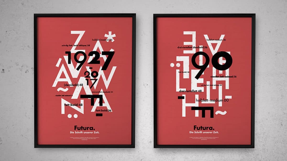
The typographic poster
Source: Graffica
The typographic poster is nothing more than the definition that we have shown you previously, but adding that, despite being totally informative, it should be noted that the only thing that takes center stage is the typography.
Here we show you some posters, whose fonts are very recognized in the graphic design sector.
Typographic posters
Baskerville
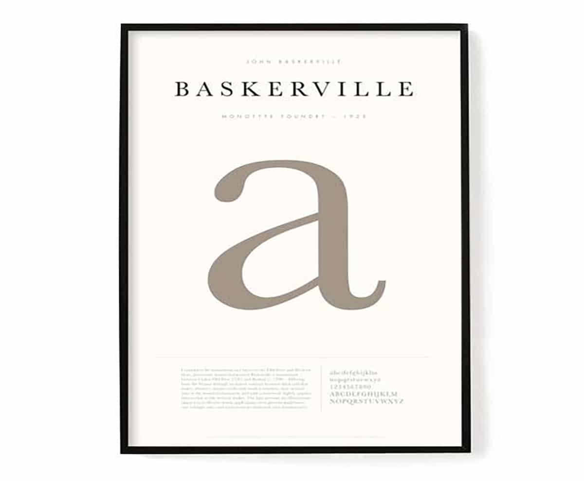
Source: Etsy
Result of improving a typeface designed by William caslon. Increased the contrast between thin and wide sticks, making serifs sharper, curved sticks more rounded, and characters more regular. The result was greater readability, the most characteristic being the bottom suit of the capital Q and the serifs of the italics.
Didot
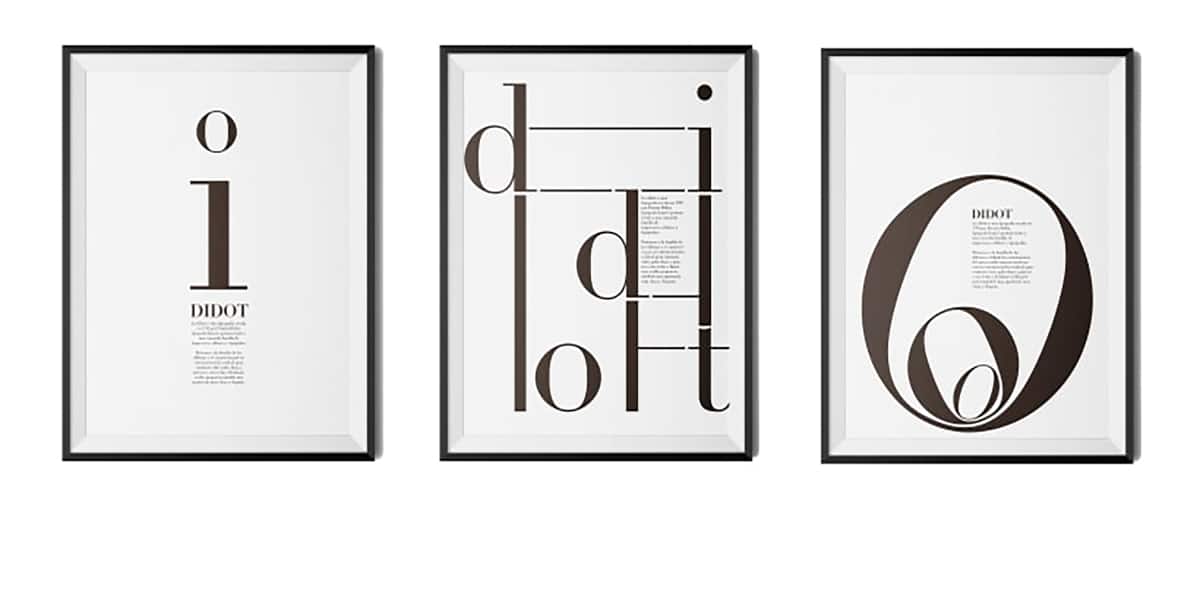
Source: Domestika
It was designed by Firmin Didot in 1783. At that time and for 100 years, various members of the Didot family worked in Paris as designers, some were also printers, typographers, writers or inventors. By 1800 they owned the most important foundry in France. Pierre Didot printed books with the fonts designed by his brother Firmin.
New Modern Roman Style
The Didot typeface defined the characteristics of the new modern Roman style with its extreme vertical tension, great contrast between thick and thin sticks and its straight and fine serifs giving it a very clear and elegant appearance. Its success was such that it became the type of France and the national standard for French publications. It was the typeface that Giambattista Bodoni used to create his own Roman in Italy, and although they are very similar to each other, the latter conveys greater rigidity and robustness while the Didot is more elegant and warm.
It was used to print a Latin Bible in 1785 and the Discours de Bossuet in 1786. In the following years Didot increases the contrast of his type and becomes the only person in the history of typography to engrave a family of fonts in half-point increments.
Typographic authority
This type makes him a typographical authority in France and as a consequence Napoleon Bonaparte appoints him director of the Imperial Foundry, a position he will hold until his death in 1836. The modern type of Firmin Didot becomes, in the type of France and in the national standard for French publications, and although this acceptance was not universal in fact even today many publications follow the Didot model.
bodoni
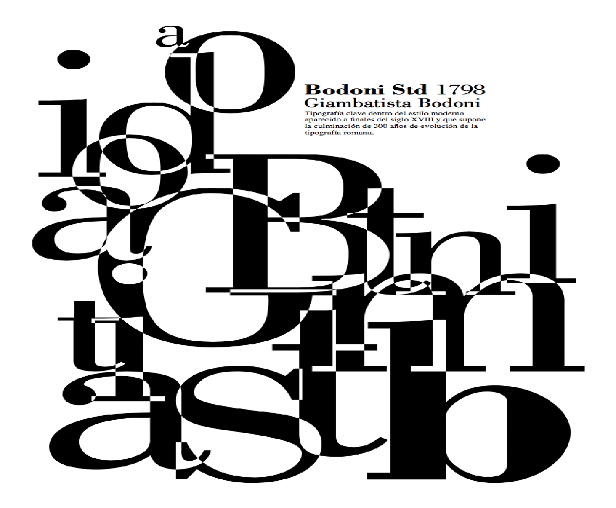
Source: Domestika
Key typography within the modern style that appeared at the end of the 300th century and which represents the culmination of 1740 years of evolution of Roman typography. Its designer, Giambattista Bodoni (Parma, 1813-XNUMX) was named King of Printers thanks to the exquisite quality of his prints.
Typographic success
Bodoni editions were enormously successful due to their excellent quality, using rich illustrations and elegant typefaces. Members of the European aristocracy, collectors, and scholars enjoyed his books for which he personally mixed the inks, used the best quality paper, designed elegant pages, and printed and bound them beautifully.
Around 1798 Bodoni designed a type with a great contrast in its strokes and thin serifs that meant a revolution for the typographic community and that was the starting point of the so-called “modern” typefaces.
At present, more than 25.000 original punches are preserved in the collection of the Bodoni Museum in Parma (Italy).
bauhaus 93

Source: Pixar
Design by Herbert Bayer
The prototype of this typeface was designed by Herbert Bayer, a professor at the famous Bauhaus school in Dessau, Germany, in 1925 in his efforts to create a Universal typeface.
Its design responds to the convictions and style of the school, seeking functionality in the elimination of elements, leaving the typography in its most elemental appearance.
Redesign in 1975
Edgard benguiat together with Victor caruso they redrew the typeface in 1975 for the ITC. The result was a letter composed of geometric shapes, very simple and monotonous, reflecting the style of the time but which did not pass the test of time, losing the universality and objectivity it intended.
It can be used in designs reminiscent of the 20s and the Art Deco era with simple lines.
Courier New
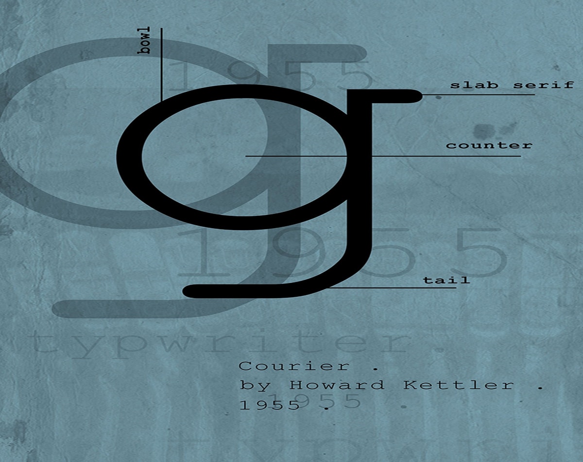
Source: Pinterest
Design by Howard Bud Kettler for IBM
Howard Bud Kettler made the original design. In 1955 IBM commissioned him to create a specific typeface for its new office machines. Since the company failed to register exclusive copyrights, the typeface quickly spread, becoming a standard in the typing industry.
Adrian Frutiger redesign
Adrian frutiger later redrew this typeface for the IBM Selectric series of electric typewriters, creating the Courier New. The latter, in its 12 pt size, was the official source for the writings of the United States Department of State until January 2004, year in which it was replaced by the 14 pt Times New Roman. Reasons for such a change included the intention to "modernize" the appearance and "improve the readability" of their documents.
Conclusion
As you may have seen, there are many designs that are available from different sources, which, today are the most used by graphic designers.
It is interesting to know that, although they do not communicate any relevant information, they are very useful to present conferences or publicity about the source that is shown. In many design schools, these types of posters continue to be designed, because a lot of importance is constantly attached to the design of the font that is chosen.
Therefore, we encourage you to choose one of the fonts that we have shown you, or do a personal search through your browser, and start designing and letting yourself be carried away with the design of each typeface, add color to your poster and fill it with life. Once you have it, just create a good composition and display the name of your typeface on the poster.
It is that plain and simple.
Feel like?