
The Han Solo movie posters they have bet on the power of typography as the main element in the design your advertising posters. A successful bet on the part of the creative team since it shows the strength and energy that the protagonists of this film.
A deye-catching design that breaks with the most classic posters that have been created for each of the films in the universe Star Wars. A new look you are looking for highlight typography, meaning and the importance that this graphic element has always had in Star Wars because we cannot forget that typeface that introduces each of the films, one simple typography but that has defined this whole universe.
Posters of Star Wars have always stood out for their visual load, posters heavily loaded with elements to show the user a very attractive composition with the aim of encouraging him to go to see the movie at the cinema. After so many posters with a more common style, they show us a different graphic line where they bet on the force conveyed by typography.
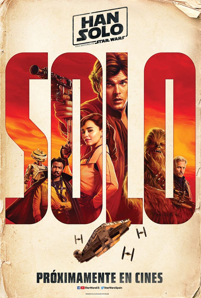
In the upper part we see a general poster of the film where a dry stick typeface, this typeface is very similar to the original typeface of Star Wars. The composition is clean and leaves us a clear idea: lo more important in this movie is the character Han SoloThis is achieved by leaving aside all kinds of extra visual elements.
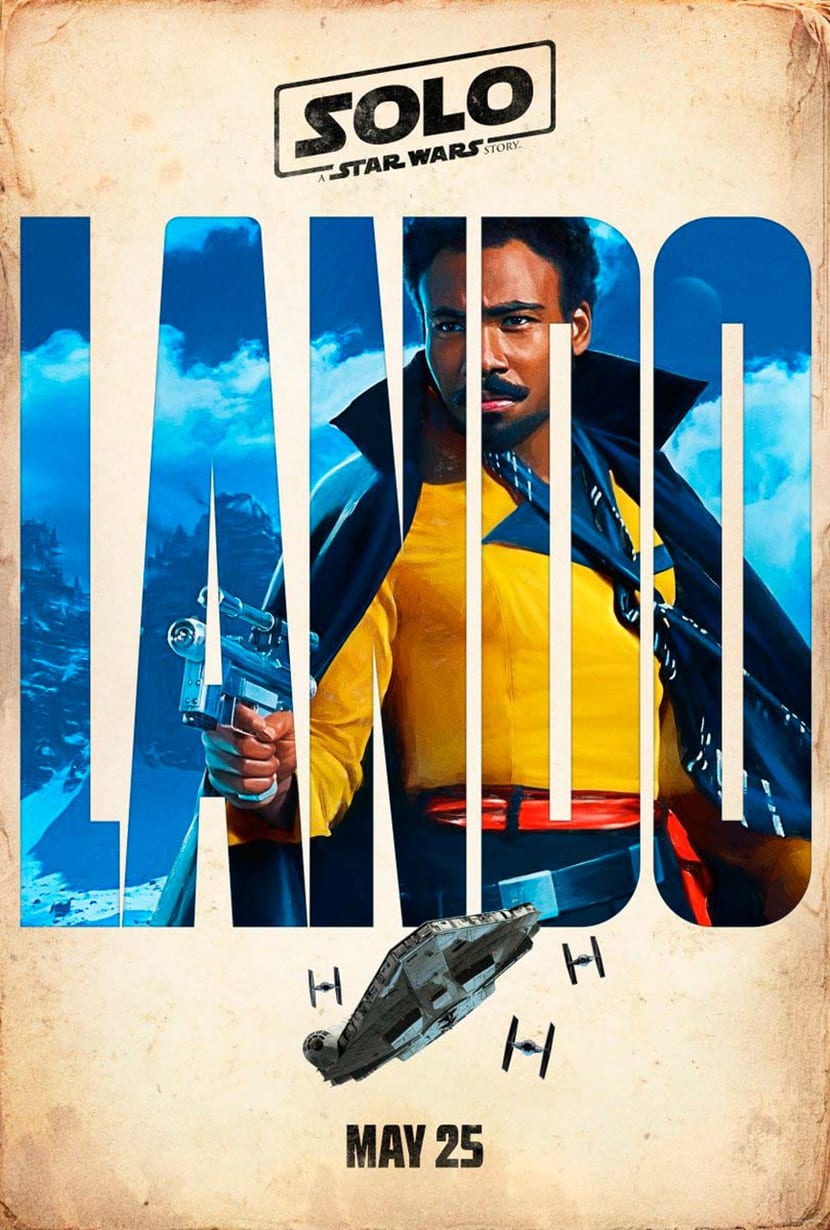
La next line of posters They show us different texts, each of them represents a specific character. This idea is quite good because with the same model we create a design line that can be applied to each of the characters. They have managed to highlight the importance of each of the characters in the film thanks to the use of a large font that occupies the majority of the poster.
Although the design seems simpler, it still has a high degree of creativity and graphic work, if we look closely inside the letters We can see illustrations of each character, it is the filling itself that shapes the typography. Without a doubt, this idea has been very successful on the part of the creative team.
One more time Star Wars surprises us with a good dose of creativity, now we just wish the movie was as good as the posters.