You may be putting together a newspaper, for example, for high school or college. Even for your work, if you want to get something out of your sector. And the first question you ask yourself is: what typeface to use for a newspaper?
Actually, there are many types, some better for headlines, for cover, for text... So we have taken a look at the main newspapers in the world and we know their typography, and we also want to suggest some more. Let's do it?
Typography for newspaper: these are the ones that use
A typeface for a newspaper must meet a series of requirements, such as: be easy to read, take up little space (you know it's limited) and be recognizable, because that way, even from afar, you will know if it is a newspaper or another.
The newspapers themselves, both in Spain and in Europe, often use their own typefaces by commissioning designers to find a typeface that, in some way, also carries part of your personal brand.
Here we leave you some examples that will surely come in handy because, although you cannot use them, you can find similar ones.
El País
If we stay in Spain, One of the newspapers that is proud to be one of the most widely distributed is El País.
And this one also has its own typography. Before they used Times but in 2007 they changed to Majerit, a font with a classic and contemporary style at the same time.
El Mundo
In the case of The World, the font he uses, since 2009, is Imperial and, unlike others, in this case they opted for a font size and line spacingor larger, half a point more compared to what they were using.
Now, we know that you use other fonts for the titles, such as Valencia Extra Bold for the front page headlines and Neo Sans STD for the sports section.
The Times
This newspaper is from England and was the "cause" of the Times New Roman font. Yes, actually, it was the newspaper that commissioned these typefaces in 1931.
Obviously, they don't currently use this, but they do use a more modern variation, Times Modern, which was created in 2006 by Brody Associates. A few years later the Monotype studio retouched it to the current one they use.
The Guardian
Also English, it has its own typeface, Guardian Headline, where they were in charge of creating letters that did not take up so much space but that it still have the unique and recognizable appearance that it had been showing for years.
Il sole 24 ore
This Italian newspaper changed its font in 2010 for a more readable font. The result was Sole Serif, based on the Venetian characters, but without losing his comfort in reading.
Together with this letter, you also have Sole Sans, which improves the previous one and whose use is even better for when it is necessary to add diagrams, graphs or smaller tables (because it reads better).
What typeface for a newspaper do we recommend?
After reviewing the fonts that are used in the newspapers that carry more baggage in the market, it is time to recommend some of the best.
Antic Didone
Is a public domain font characterized by being serif. It is ideal for newspapers and also for magazines due to its ease of reading. In fact, for the texts of the articles it would be quite good. It has another variety that is Antic Slab, with a thicker line.
you can download it here.
Italian

Another of the fonts for a newspaper that we recommend is this. It is also in the public domain but, instead of serif, it is sans serif. It has a vintage style which makes it attract so much attention. Also, it can be used for both titles and article text.
you can download it here.
Built-Titling

This font is more suitable for headlines because it is thick. (although later it is somewhat narrower than normal). It is sans serif and you have it for free.
Yes, is only available in uppercase, which would only serve you for the cover or for specific sections.
you can download it here.
Klaber Fraktur

If what you want is give the newspaper a gothic and medieval touch, this letter font can be quite interesting. It is a font that, although it can be difficult to read if there are many words, for the front page of the newspaper, for example for your name, it can come in handy.
The downloads here.
Kalends
Of Calendas they say that is a classic typeface perfect for headlines due to its elegance and ease of reading. The fact that it can work in small sizes makes it even perfect for some items that are not very large.
As for its free you have it free in regular style, but if you want the complete family (with various styles) then you have to pay for it.
you have it available here.
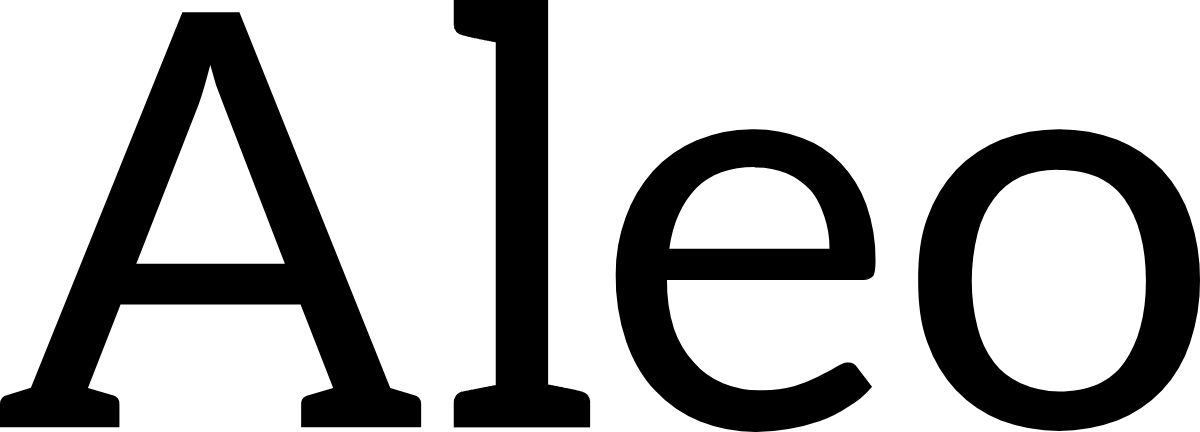
Aleo

This is another typeface for a newspaper to consider. ANDIt's a font with several styles, all of them free (for personal or commercial use), and although many see it only for headlines, the truth is that you could also consider it for newspaper articles.
Is contemporary style with 6 different fonts.
The downloads here.
Fenix
This font is perfect for long texts because it has very easy to read strokes, based on calligraphy, but with some very interesting details to see. It can be used in both large and small sizes and you also have it for free at a private and commercial level.
The downloads here.
Corbet
The last of the fonts that we recommend is this, a modern sans serif font with a very comfortable and easy reading. It can be used privately or commercially and works well in large and small sizes, which is why it is highly recommended for the font of articles or even for headlines (interior ones because it might not stand out as much on the cover).
you have it available here.
As you can see, typography for a newspaper is varied. But our recommendation, apart from the fact that you try several, is to make sure that you can use it commercially, especially if you are going to distribute the newspaper and it is not given for free, but for a fee. This way you won't get in trouble. Do you have any recommendations apart from the ones we have listed?