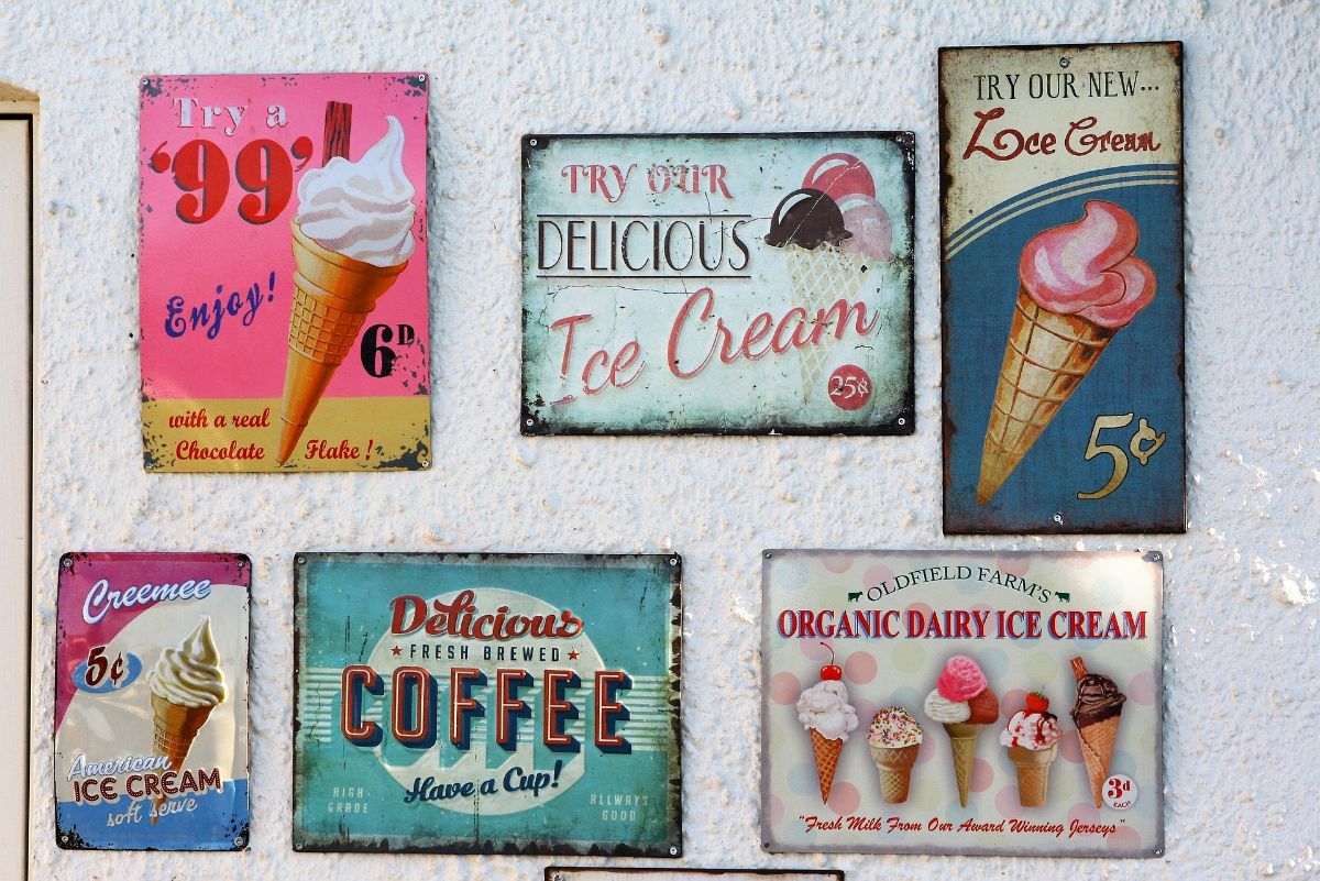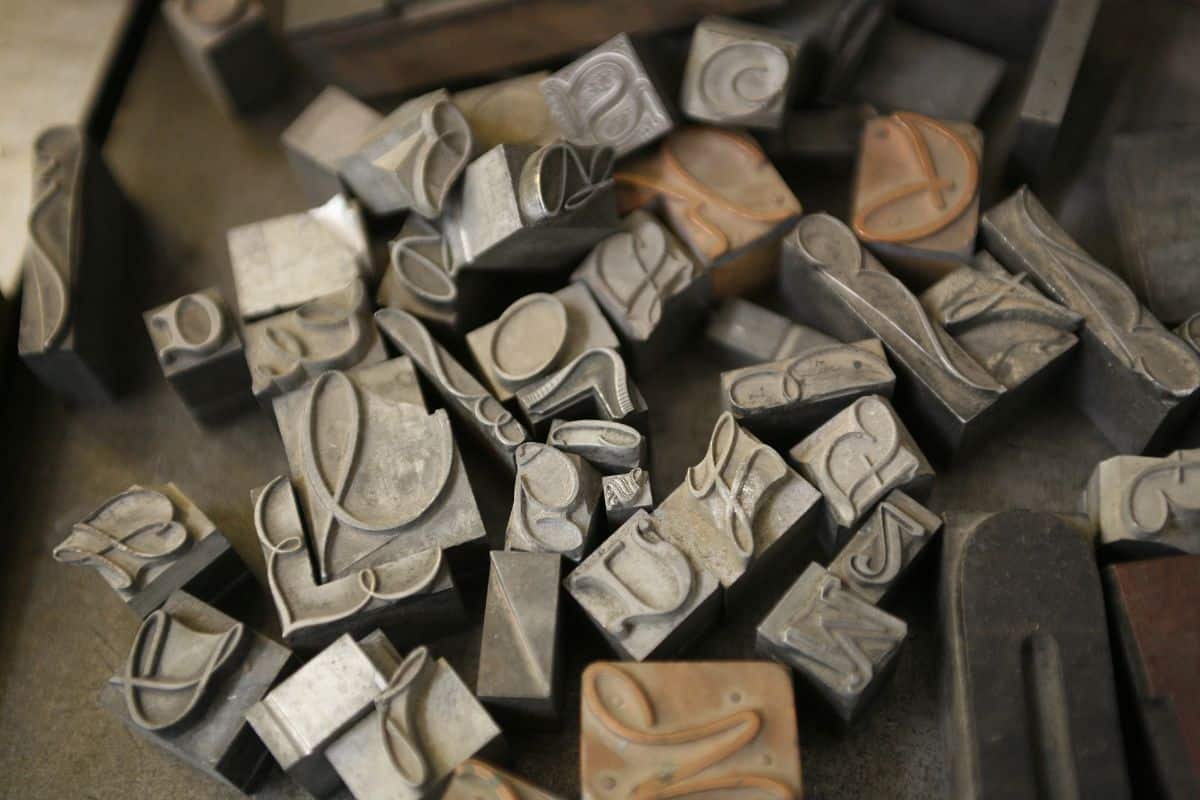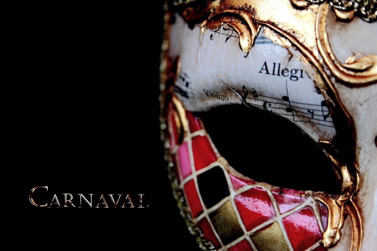
When designing an advertising poster, it is so important that you know what you are going to put as the typeface for posters that you are going to use. You already know that, depending on the audience you are addressing, the composition itself, etc., the typography must be one or the other.
To help you increase your resource folder, We have thought of bringing you some of the fonts for posters that can come best for you. This way you will have many sources to work with to find the ideal one for that project you have in hand. Shall we show you?
Why poster typography is so important

Before we show you different typefaces for posters, we want to emphasize the reasons why you should give importance to this part of poster design.
One of the most important reasons is that the typography itself helps convey the message you want to offer. Depending on the project you have in hand, you can choose a font that enhances the final design. In fact, a bad choice can ruin all the work you have done.
Also, you should keep in mind that that handwriting is legible, clear and simple, capable of attracting the public to see the poster and to be able to read it without having to spend a lot of time reading it.
Otherwise, if you make it too hard, it won't get the message, and no matter how pretty it is, it won't have the desired effect.
The best fonts for posters

You have to take into account that, when looking for fonts for posters, you should try not to use different fonts, because that will generate confusion in the reader. It is better to choose only one, that matches well with the image and message that you want it to have, and that is simple and at the same time interesting to see.
Apart, should be easy to read, be in tune with the message (Imagine that you are going to make a poster for a rock festival and you use typeface for babies… it will not match), and highlight the most important and what the viewer should remember.
With all that said, here we go with the best fonts for posters:
Avantgarde
We start with a font that is not easy to use, because if the message you have to put is quite long, this font is not the most appropriate.
You can use it on posters vintage but with few words since, being all together, it can make it more difficult to read.
This typeface dates from 1967 and yes, it is related to AvantGarde Magazine, since it was taken from the logo of this magazine.
bodoni
This typeface is one of the most classic, but works very well because it is considered a "modern serif". It was designed by Giambattista Bodoni in the XNUMXth century and has evolved to this day to become a refined, elegant typeface that still works very well on posters.
Alternative Mantra
Its creator is Cynthia Torres and it is a sans serif typeface. However, If you don't want such a "modern" and "eye-catching" font, you can use Regular, which is more classic. Everything will depend on the type of project where you want to use it.
To come up
AdrianFrutiger was the creator of this typeface for posters, as well as the next one that we are going to show you. In the XNUMXth century it was one of the most used because it is very simple, with letter spacing and easy to read while drawing attention for being a little softer in the stroke and clean. In case you're wondering, it's Sans Serif.
Frutige
As we told you before, AdrianFrutiger is also the creator of this type of font. In fact, he bears his last name and it has different variations. The most used is the normal one, because it is known that, even from a distance, it is quite easy to distinguish the different letters and it is not difficult to read it.
Futura
This typeface was created by Paul Renner and is based on Avenir, but has a thicker stroke and with a smaller separation between letters (they breathe well, but they are closer together). In addition, you have examples of brands that have used it, such as Opel or Ikea.
Naïve line
Here is a typeface for posters that It gives the feeling that it has been written by hand. Its creators are several: Fanny Coulez, Julien Surin and Louis-Emmanuel Blanc, all of them from the S&C Type studio. And what does this letter tell us? To begin with, it has a very smooth line, it even seems that it is made by hand, and that is why you can highlight it, for example, in posters that have to do with crafts, craftsmen, etc.
coldiac
If the project you have in hand is high ticket, that is, it borders on luxury, or just plain fancy, then this Serif typeface might be just what you're looking for. If you look at it you will see that it has a very elegant font and only in the serifs does the thickness increase a bit, but otherwise it maintains a good balance.
morish
This typeface is very 70s. And as you know, those years, along with the 80s, are coming back into fashion, so for posters it would be quite interesting. For example, for more children's themes, for handmade products it can look great.

Morton
If the work you have for a poster is related to a formal event, This typeface can give it that formal and serious air that you are looking for without being too "repellent" or backing down. For example, for exhibitions, conferences or networking events, it can be a good option. In addition, it has different variations that are not bad at all.
FS Pink
Don't be fooled by its name or by thinking that being "pink" means that it is only for girls. It's not really like that. It is designed by Pedro Arilla, from Monotype Studio and It has a certain 70s feel to it but it works very well for both female and adolescent audiences.
Helena
Taking into account that handmade fonts are now popular, this cannot be missing from your resources. It is a letter created by Noe Araujo and it will seem that the letters have been painted with a brush. Ideal for handicrafts, or for those that require a bit of "closeness".
As you can see, there are many poster fonts that can come in handy for your projects. Do you recommend any that you use a lot?