
Typography, content hierarchy and typographic contrasts to obtain designs that communicate correctly in such a way that what is important stands out from what is not. Typographic contrasts offer us the possibility of highlighting texts for create a reading type different depending on our content hierarchy in which we must first define (before starting to design) once we know what is important in our design we will go on to work on these typographic contrasts.
There are many types of contrasts and each of them offer us different possibilities when designing, the most normal and advisable thing is not to go overboard with its use because we can create a composition full of very striking contrasts but without any logic. In every bad design we always find fonts with thousands of styles, crazy bright colors and a whole series of used graphic resources without any control In this way, our message is lost and our identity as a brand or product loses credibility and valuation by the user.
When creating a design, the first thing we must plan and being clear is our goal, define what our goals are and what we want to communicate. For example, if we want to create a poster about an event, we must decide what is most important in that event: the date? The name of the event? organizers?... once we have this clear is when we must move to design.
You can see information about ttypography and typographic contrasts in this video:
Before designing
- Decide what is most important in your design
- What do you want to highlight? Is something more important?
A whole series of questions you should ask yourself to be able to filter that hierarchy of content and arrive at a logical result that allows you to reflect in the design what you really want to convey.
Do I want to convey something concrete?
On many occasions we will find projects where we must highlight something certain very specific, for example if we were not designing an organic food container we would still be interested highlight the word "eco" and put it to full size. If this company were a well-known brand of organic natural food, the most important thing would be to highlight the name of the brand and in the background show the word eco. That is why we must first define the importance of each design element as that will be what will mark our graphic line of work.
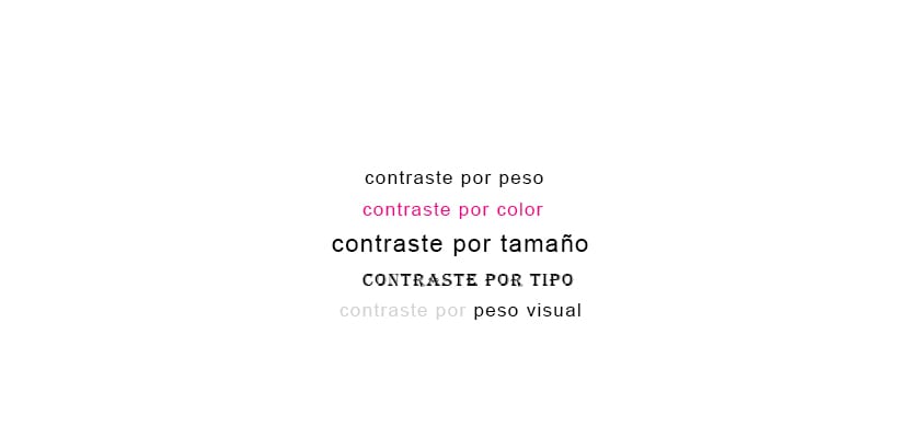
Typographic contrasts
There are several types of typographic contrasts depending on the needs we are looking for.
We have to know that a contrast is nothing more than the difference between a set, this can be achieved graphically in different ways: photographs, texts, color, etc. In this case we will focus only on the typographic part.
- Weight contrast
- Color contrast
- Type contrast
- Body / size contrast
- Visual weight contrast
With these contrasts we can create different compositions that will allow us to highlight our texts according to the degree of importance of each one of them.
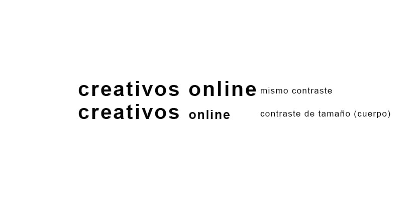
Weight contrast
Words have different weights visuals depending on the space they occupy, the common visual weights that we can change in the typography are for example: narrow, black, bold ... etc. When we apply this typographic contrast we realize that one word is stronger than another, this is something very used in highlighted texts.
If we look at the image below we see how the second line of text has contrast between both words, in this case the word creatives was wanted to stand out more than the word online. 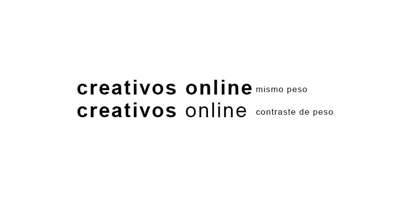
Color contrast
The color contrast achieves further highlight a text but we must be very careful of do not impair the readability of the textIn the case of using this type of contrast, we must ensure that the text is read correctly and what has notand too many colors In the design. The most effective is to highlight with a single color, we must avoid creating a color chart. An example of this type of contrast is the one used in all product offers: very striking red text with the word offer. 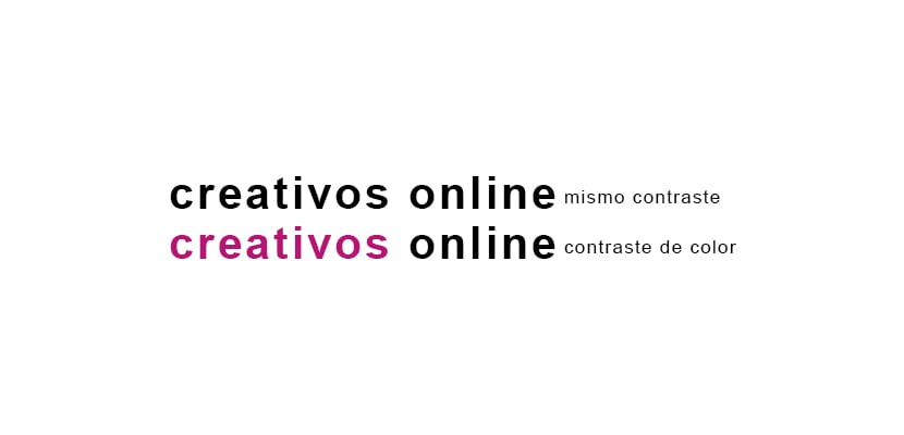
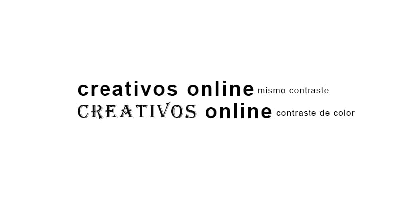
Type contrast
Each typeface has a determined style, if we use two types of fonts we get that the words stand out among them. Many times a different typeface is used to represent different content, for example, a magazine may have a certain font for the titles and another for the subtitles.
Body contrast
The contrast of body or size is one of the most used when we design, this contrast allows highlight text quickly and clear thanks to the great visual weight that typography achieves when it has a great body compared to the rest. Magazines, newspapers, packaging, posters and endless media use this contrast to highlight an important item in a design.
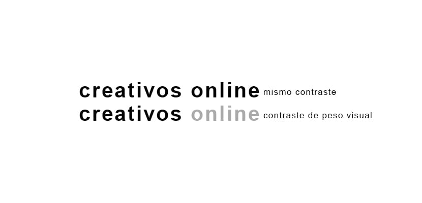
Visual weight contrast
Every typeface has a determined visual weight, according to him body have the type, the color and degree of opacity, a text can be more or less striking to the eye. This could be applied in a design when we have a important headline and just below a secondary one, the secondary may have a lower percentage of color than the primary, thus making the text more eye-catching.
Content hierarchy
Once we are clear about the typographic contrasts we must stop to think what is important and how we should plan our design. Before starting to create this hierarchy, it is necessary to know a little about this system.

In the example we see at the top we can visualize the importance of the word hierarchy, in this case as the post speaking about this issue, it has been wanted to highlight that word by means of a body contrast. Secondarily with a smaller body and a color contrast an also important secondary text is highlighted. The rest of the texts are less important than the texts on the left, but as a whole they also have hierarchy and degrees of importance.
In rural areas of India, families in charge of a blind minor frequently isolate and deprive him/her of the care and attention they provide to their other children; such situation becomes even more severe among lower-caste families, orphans and if the blind child is a girl. magazines we can find these typographic contrasts that vary depending on the importance they have, it is ideal to see many visual references before starting to design as these references will help us to educate our eye and better understand the professional way of working.
Can you see the types of contrast?

In the case of the magazine that you see in the image above, we find contrasts of different visual weights, on the one hand we have the photography and on the other hand the text, when we make a design where we can highlight a photo we will have to do it in the same way that we have seen previously in this post: first think about what to show, what is important and how to show it for communicate correctly.
The world of design is full of rules necessarys to be able to correctly issue a message in a creative and effectiveIf we can be clear about what we want, we already have half the way resolved to arrive at a good graphic proposal.