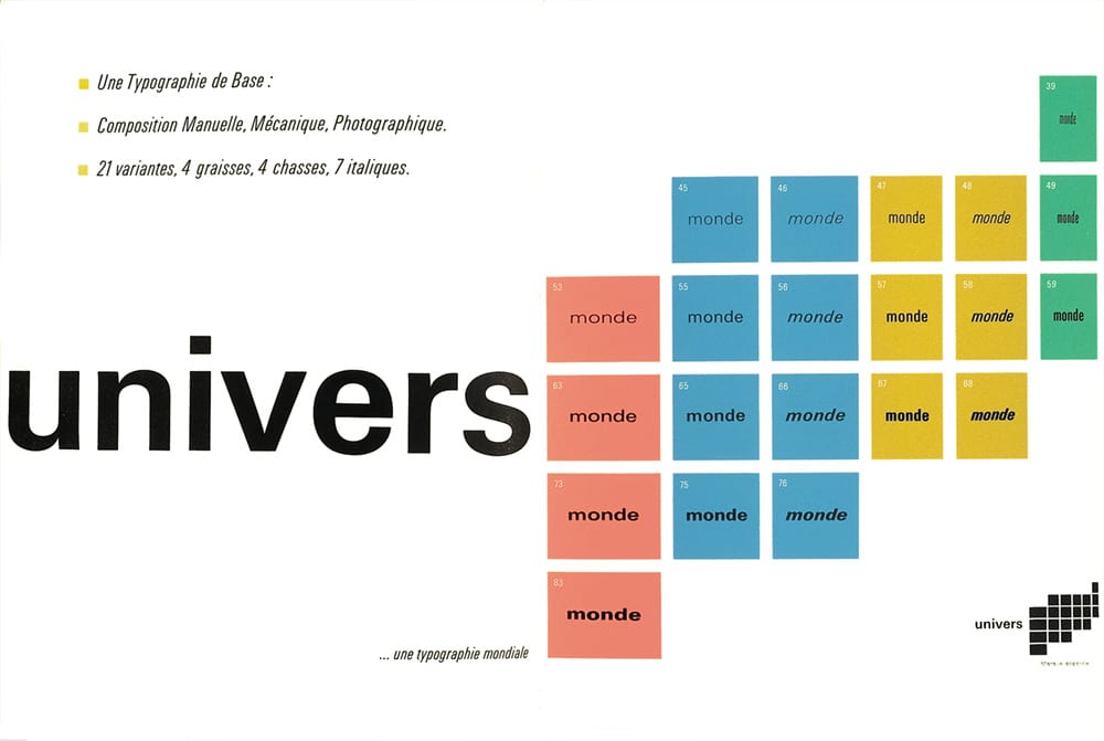
One of the sans serif typefaces most used and that was born after the success of the Helvetica is the source Universe. It was created and designed by Adrian frutiger for Duty & Peignot which was released on the market in 1954. Universe was unfinished typography that was adapted to the modern times that were emerging in the middle of the XNUMXth century. It was intended to be a universal type, hence its name, and it was designed with twenty-one variants named in a different way so far, instead of being defined as "bold", "condensed", extended ", etc ..., each type was renamed with a numbering that was determined in a sample sheet, although the idea was not very successful.
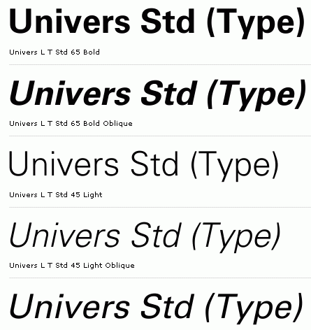
Another of the great differences of this new font is that it was designed in a version for photocomposition and another version for metallic types.
Below you can see the numbering and name of each of the twenty-one types that exist within this typographyWith this way of naming the sources, it was intended to make a universal numbering applicable to the rest of the types.
It has been used at the business level in the creation of logos and corporate images by brands such as Swiss International Air Lines or Deutsche Bank.


images: luca-mendieta, typographers, some tough guys