One of the essential elements that give a linear meaning to graphic text is that of visual hierarchy. But contrary to what we might have thought, hierarchy as a compositional factor not only has a functional character but also contains added implications of an aesthetic nature. And it is that the hierarchy provides harmony and beauty in addition to functioning as a tool that supports the organic structure of the visual text.
We must not ignore the potential of this factor as it acts as a regulatory element, rationing the information by compartmentalizing it in degrees or levels so that the reader will be able to assimilate, digest and understand the content we propose in a much simpler and more fluid way. Its primary function is then to provide a guide, a reference or line through which to follow the information as if it were an open door to the body of our concept. It becomes important and of course extensible to graphic design, photography, painting or web design. Below we will delve a little more into the concept of visual hierarchy with an infographic proposed by our Designmatic colleagues, I hope you enjoy it and do not forget that if you have any questions or contributions, you just have to leave us a comment.
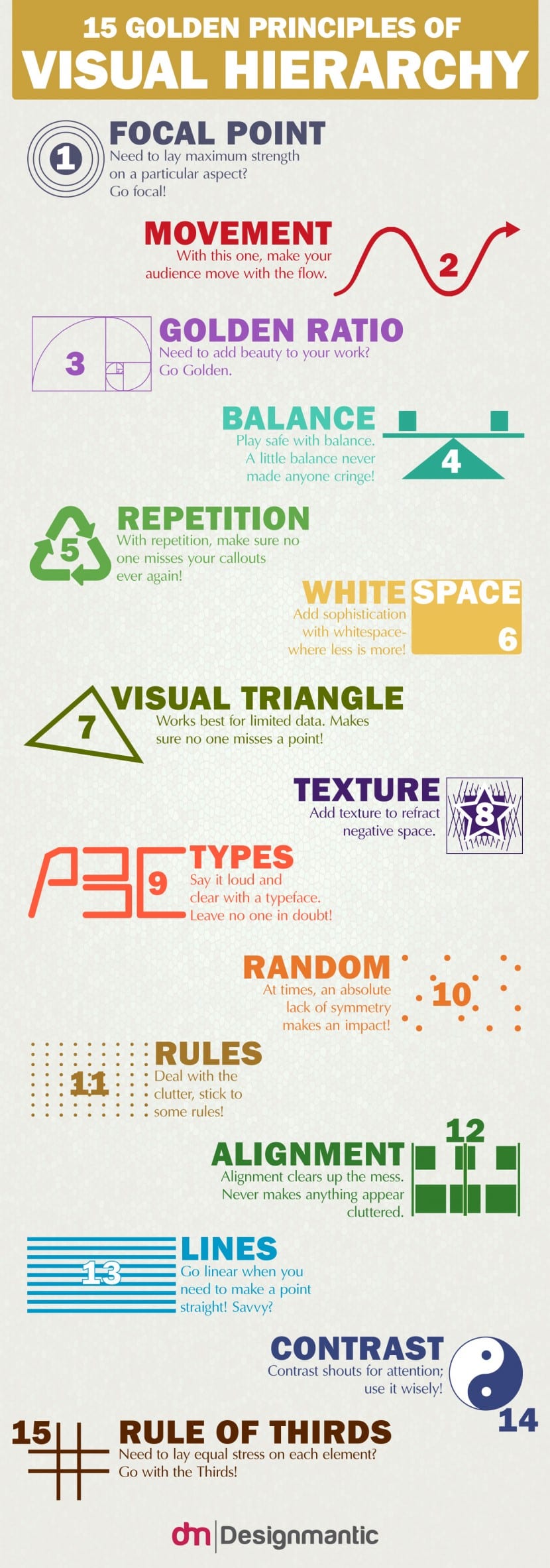
Focal point
On some occasions we have spoken of the focal point or compositional center as the germ of the entire construction and as a point of attraction that calls the viewer at first. This area is tremendously important and it is necessary that you make sure of its existence in any of the projects you are developing. To check that you have built a suitable focal point, do a little test: Show your design to one or more people and ask them what is the first point that catches their attention in the first three seconds they look at it. If all agree on the same point, it will mean that you have carried out your work effectively. If not, you should work on your composition to make sure that this point is present as it is essential to capture the attention of the public.
Movement
Movement is intrinsic in the concept of hierarchy since when there is hierarchy it means that there is flow and that we will have to follow a journey to capture the message and not only that, but with our movement we will enrich the content and add new data that will provide a feeling of increase. As we wander through our discourse we will perceive a movement, a growth and a strengthening of the proposed concepts. Make sure that in your constructions during this movement there is a path of enrichment where the reader as he advances or deepens in your message feels a journey and an increase in nuances.
Golden Ratio
The Golden Ratio is and has always been synonymous with beauty. If you are looking for harmony in the proportion of all the elements that make up your design, a good way to guarantee that this harmony exists is by using the golden formula. Using it often is something that can help you achieve that harmony.
Equilibrio
Compensating the elements and areas that make up the discourse will also be important and will of course have an impact on a smooth and clear experience. Balance must be present in many facets: Spacing, size, orientation, positioning, tones ... Balance facilitates understanding and therefore will make your design at a functional level affordable and effective.
Repetition
Patterns can help us create rhythm, regularity, and intensify that sense of movement. It can also become a great textual resource since in this way we can ensure that the public will not overlook some details or content that we have proposed in the design.
Whitespace
We actually mentioned it in our article on Timothy Samara: White space acts as a protective area for our message. It protects it from interference because through it we ensure that the elements that make up the discourse do not mix with each other, each of them must have a margin of safety or a "sacred" space that is impossible to transgress.
Visual Triangle
The triangular shape is a clearly hierarchical symbol and is widely used visually because its structure gives a very effective sense of balance. The fact that it is supported on its own base makes it impossible for our structure to be unstable, it also provides simplicity which, depending on which cases, does not hurt.
Texture
It is a way to add nuance and dynamism. Playing through the textures we will achieve that the viewer can differentiate the elements with a simple glance from each other and with respect to the background, also by adding textures we can refract the negative space of our composition.
Typography
The size, the color, the family and their arrangement as well as their readability will be essential to provide a hierarchy, an order and a fluency in the reading process.
Random
We talk about order, about balance ... But what happens if we decide to break with all this? Will we get an unstable, messy and disastrous composition? The truth is that no, the world of design is so wide and offers so many possibilities that in this way we can also obtain a sense of rhythm and expressive power, although yes, we must know how to play with the elements and all their expressive possibilities.
Rules
That is why we influence the rules: We can create chaos under which there are a series of rules that ensure the success of the construction.
Alignment
It is strictly related to the concept of order: Aligning each and every one of our elements will give us a feeling of cleanliness, we will perceive a surface that is easy to wander.
Lines
The lines are axes of movement, they are the backbones of the reading process or path. They will direct or give directions to our readers to find the message and to understand each of the elements that make up our text.
Contrast
It is another way of providing importance, grading information and defining which elements need to be highlighted in the first instance and which of them need to be kept at a much more secondary level.
Rule of thirds
As we already know, it consists of dividing our composition into different areas through two lines on the horizontal axis and two lines on the vertical. If we do this we will find a space divided into nine rectangles. Counting on this guide or grid we will be able to orient each and every one of the elements that are part of the composition in a fairly clear way.