![]()
Safari is the web browser Apple Lossless Audio CODEC (ALAC),. Whether you have an iPhone, a Mac or any brand device, the browser you have by default is this one. But what do you know about him?
As a creative, you are interested in knowing a little more about other brands and logos to see the evolution they have had, the changes that professionals have made... with the aim of realizing those details that can help you in your work. And that's what we want you to see in the Safari logo. Go for it?
What is Safari?

As we told you at the beginning, Safari is actually a web browser. Was developed by Apple for all operating systems that will work with macOS and iOS, that is, for Mac computers, for iPhones, iPods or iPads.
It saw the light in 2003 and did so to replace the default browser, which was Internet Explorer, from Microsoft (its competition). This is updated approximately every two years (a complete update, not a minimum).
Today, Safari is said to be the second most used web browser in the world.
A curiosity that you may not know is that, At first, the Safari project was not called as such but they named him Alexander. When launching it, it was proposed to name it Freedom, but in the United States this name was not accurate (because there were some feminine hygiene products that had the same name). Thus, in the end they determined the Safari one.
Who created the Safari logo?
We know that Creator of the Safari browser was Don Melton for the computer and the young Francisco Tolmasky, from Portland, Oregon, for iOS. But regarding the creator of the Safari logo, the truth is that, no matter how hard we searched, we could not find an answer.
What does the Safari logo mean?

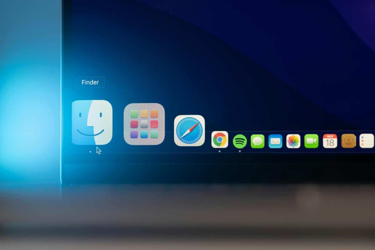
If you look at the Safari logo you will see that it is a compass. Well, the meaning that Apple gave it and that it is given now is that of a tool to help you guide anything you need: information, documentation, data... It is as if they wanted to indicate that, using the browser, you are going to have the problem you need to solve when searching the Internet.
If you look at the design, you will see that the compass has many details, and the red arrow marks the northeast which indicated that, even if you lose your way, Safari will always give you the information to go straight.
The changes that Safari has had from its beginnings to the present:
Since Safari was launched in 2003, its logo has not undergone major changes. The truth is that there are hardly any despite the years that have passed. But we talk about each one.
Home
![]()
The first Safari logo was unveiled at the web browser's debut. Its about realistic drawing of a three dimensional compass composed of a wide silver metal frame, a white base and the compass circle in blue and white tones with the arrow half white and half red. It is tilted to the left and the arrow faces right.
This logo has been quite long-lived because It was maintained from 2003 to 2014.
Of course, you must bear in mind that It was not the same logo they used in macOS as in iOS.
That's right, on iOS the logo was maintained from 2007, which was when it came out, to 2013. That first logo followed the idea of the Mac logo, but in this case it focused only on the compass, presented in a square shape with rounded edges. The background was a map of the world, mainly America, while the arrows were equally inclined.
First change
The first change in macOS came in 2014, when they decided to give it a facelift. From 2014 to 2020 the original logo was varied and underwent one of the biggest transformations it has ever had, but always maintaining the theme of the compass as a symbol.
What was done was to create a abstract avatar but that simulated a compass tilted to the left. The indications of north, south, east and west were lost and the arrow was changed to a more linear one with a bit of three-dimensional body thanks to the shadows created. It was still tilted slightly to the right.
In the case of iOS, the change was made a year earlier, in 2013, where the compass changed completely. For a start, The logo remained a square, only the compass was not, it became circular, leaving white spaces. The compass also lost the indications of north, south, east and west, and only kept the two-color arrow that had a more minimalist design.
Second change
In 2020 the Safari compass changed again. And the truth is that he did it almost recovering the iOS logo that we told you about before. You see, the compass stayed the same, only the arrow was made to lean the white part more to the left. But instead of it being a circle, they made it the logo was a square with a gradient between white and gray, and rounded edges. This made the compass was smaller (to fit the square) and have blank spaces.
In the case of the iOS logo, it changed again in 2017 but minimally. What they did was simplify it further. To start, they removed the square background and made the arrow a little smaller at the ends and gave it a little volume through the shadows.
News
Currently, the Safari logo for macOS is the one that was created in 2020 which is still present in browsers.
About iOS, the logo that is still valid is the one from 2017. For now they have not changed it again.
We don't know if the Safari logo will change again, although it most likely will when it needs to evolve to adapt to the times of that time. But what is certain is that it will continue to maintain that characteristic compass and whose meaning it does not seem to want to lose.