
Source: Studio
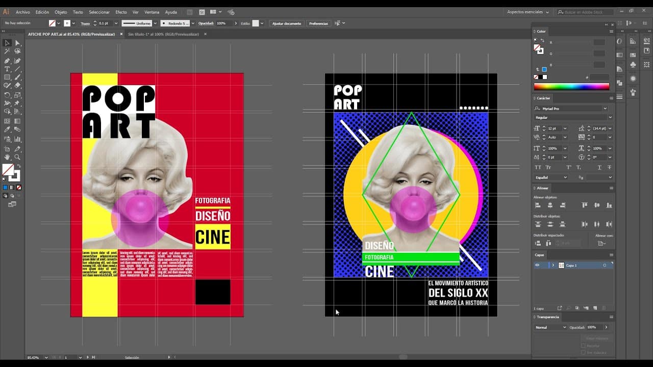
When we design a poster or a project where we must organize each point, it is necessary that each of these elements that are going to constitute our project be well organized hierarchically. It is what we also know as text hierarchy, a good way of keeping information in order, so that the public reads our information as we want, transmitting the message that we have designed or created.
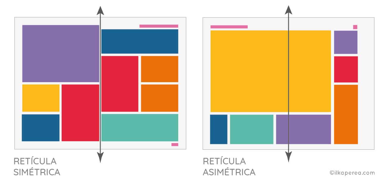
Every time we view a magazine cover, we realize that both the headline and the subtitle and the other graphic elements are correctly positioned, in a straight line and share the same spaces with each other.
Well, in this post, We have come to talk to you about grids, and how they are found in the middle of graphic design or editorial design
The grid: what is it?
Source: Studio
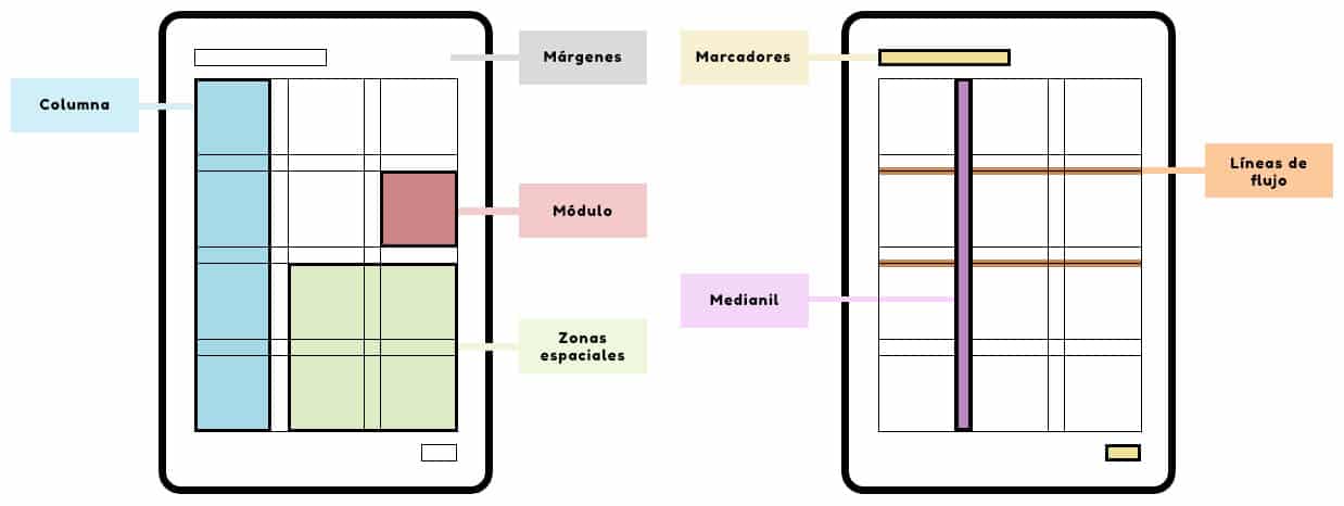
The reticule, or also known as gray in English, is defined as a kind of lines that are superimposed between them and that in this way manage to organize all the information that is present on a sheet, cover or poster.
We can also define it as a tool that allows us to order all these elements in their correct space and their correct composition. Therefore, the grid has become in recent years a very important tool, not only in graphic design, but also in editorial design.
When we talk about editorial designs, we refer to the design of all those media that can be printed, such as book covers, posters, brochures, etc. All these media contain a lot of information that, roughly speaking, the public we are going to address will read it. and they must understand it as we understand them, or rather, as we want them to understand it.
It is for this reason that the grid is mainly responsible for meeting all these needs. And it does it in the best way, connecting several horizontal and vertical lines on a type of sheet or medium that serves as a template, to later apply it to our design. DIn this way, our design will always be correctly proportioned and with a correct composition of each and every one of the elements that make it up.
Features
Fuente: YouTube
- Grids allow us to give order and be clear with the information that we are going to expose.
- When we design with a grid, we are being objective, so what is seen from the outside will always prevail.
- It is a good way to learn to manage space and create good compositions with the different elements.
- Thanks to the grid we give the value to the important or the importance to the importance, rather.
- It is not only a good helper for organizing information, but also it distributes it efficiently, so that we are always constantly connected with the message.
Reticle types
Source: Angela
manuscript grid
It is a large rectangular grid in which it has been designed to place large blocks of text that occupy large spaces. It contains a primary section where these voluminous and large texts go, and It also has a secondary part where you can place different footnotes.
It is the grid that is usually used in the design of book covers or the interior of a book, since it has the possibility of being able to number the pages, thanks to the fact that it also has this type of detail.
Without a doubt, it is the perfect option if what you want is to design your own book exclusively for you.
column grid
As its name indicates, it is a series of grids that have several columns and many horizontal lines, so that in this way, the grid is formed from columns for its use.
It is a grid that provides a lot of flexibility and flow of information, so it is very important to keep it in mind if we want to design a page for a newspaper or a magazine. It is without a doubt the type of reticle that you will need for this type of purpose.
You can find it online or design it yourself in programs like InDesign.
modular grid
It is the grid that is most often used and employed in editorial design. It is a design where small divisions prevail and where both the image and the text are given prominence.
It is ideal to create magazine pages, posters or online and offline media designs.
hierarchy grid
It is a grid that manages to maintain the fluidity of the information that we want to present in our design. ANDIt's a good way to create order and create an interesting aesthetic on each of the texts.
Without a doubt, it is another option that you can also use for your designs.